Brand Identity for a Pilates Studio in the Illawarra
Our Process
Paul walks through the project goals, challenges, solution and results for this brand.
The challenge
The wellness market is crowded with brands that look the part but feel like nothing. Clinical. Interchangeable. Forgettable. Pilates Collective had real community depth and a genuinely elevated studio culture. The challenge was translating that into a visual identity that could speak to different people without losing its singular voice.

Process
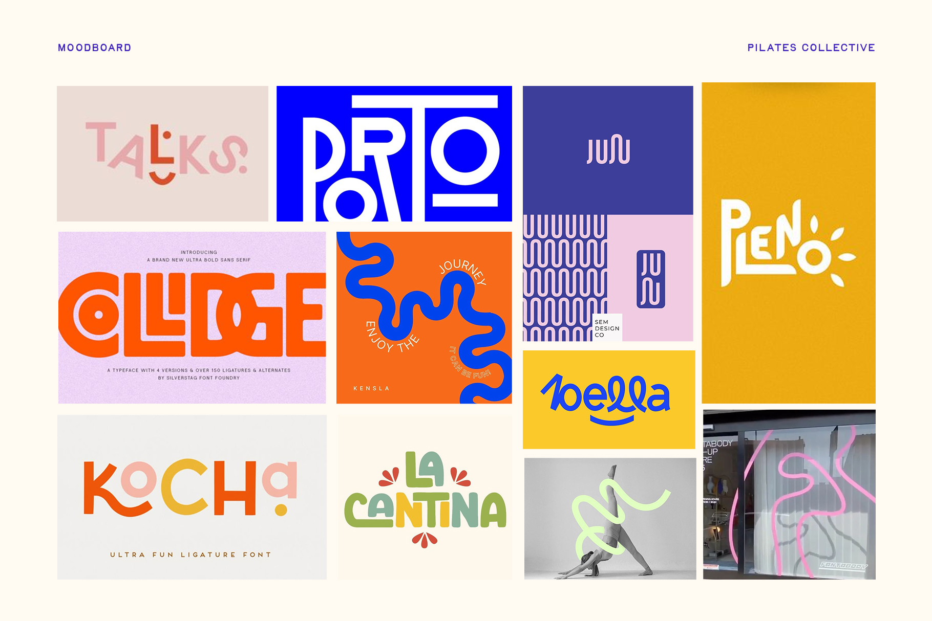
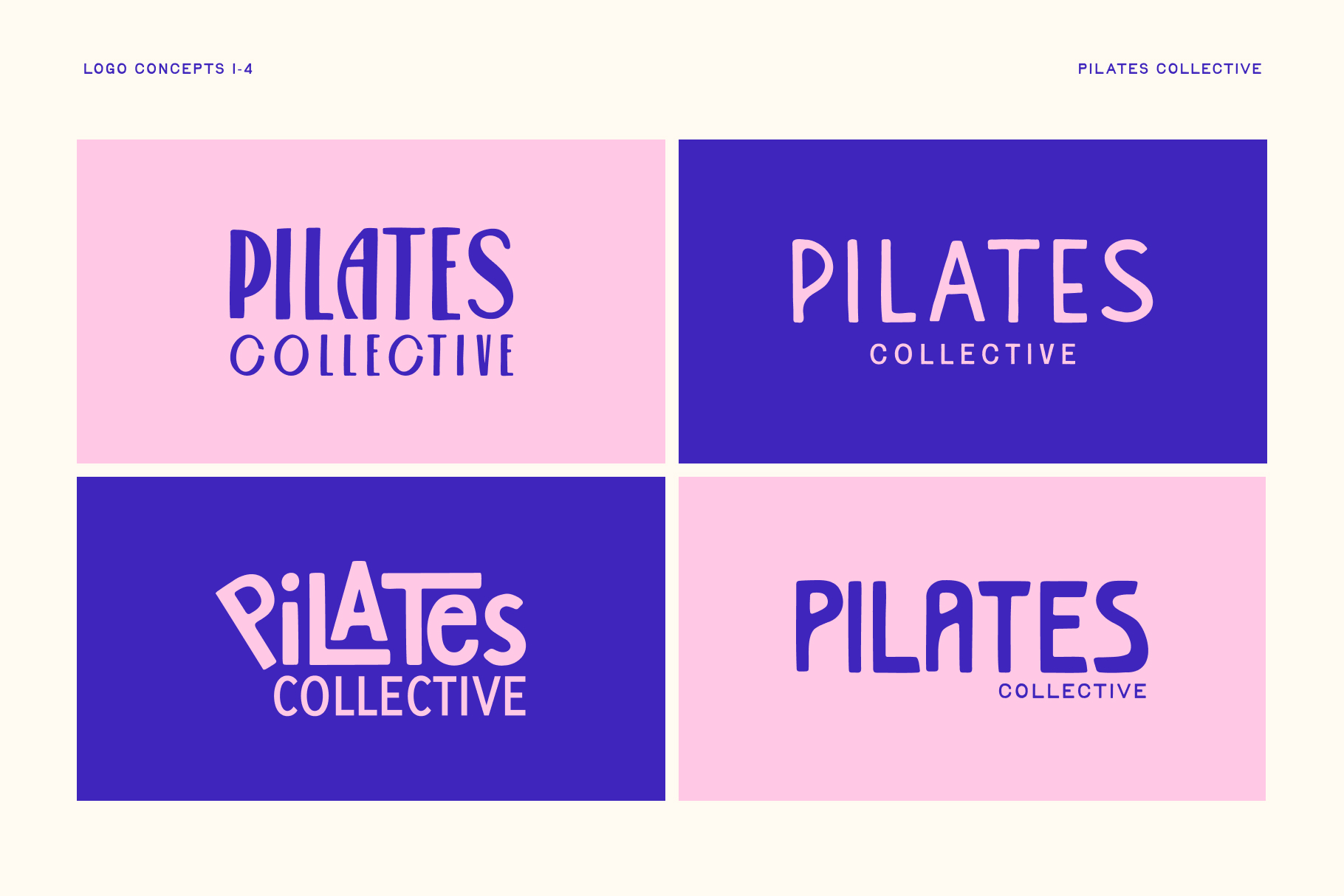
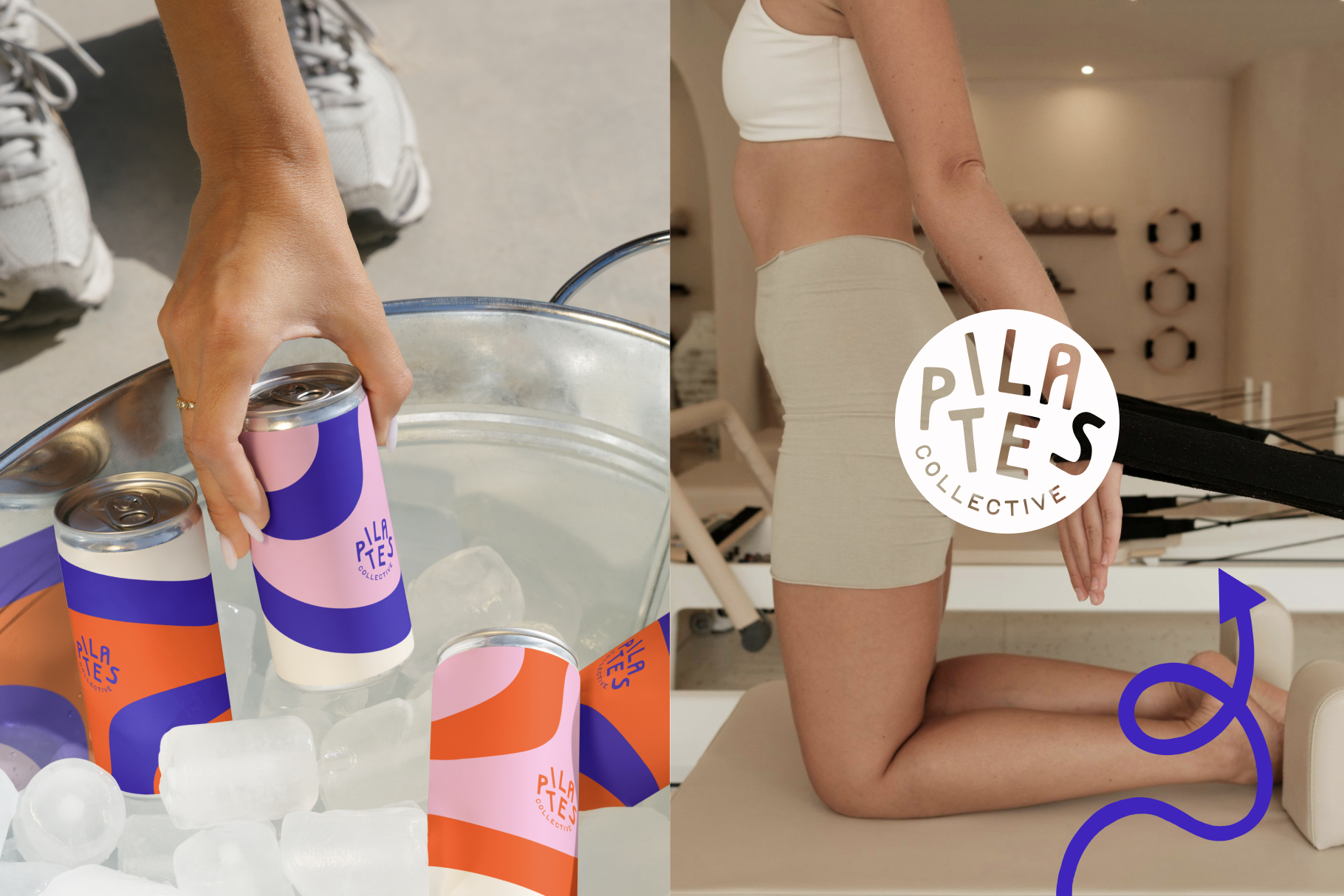
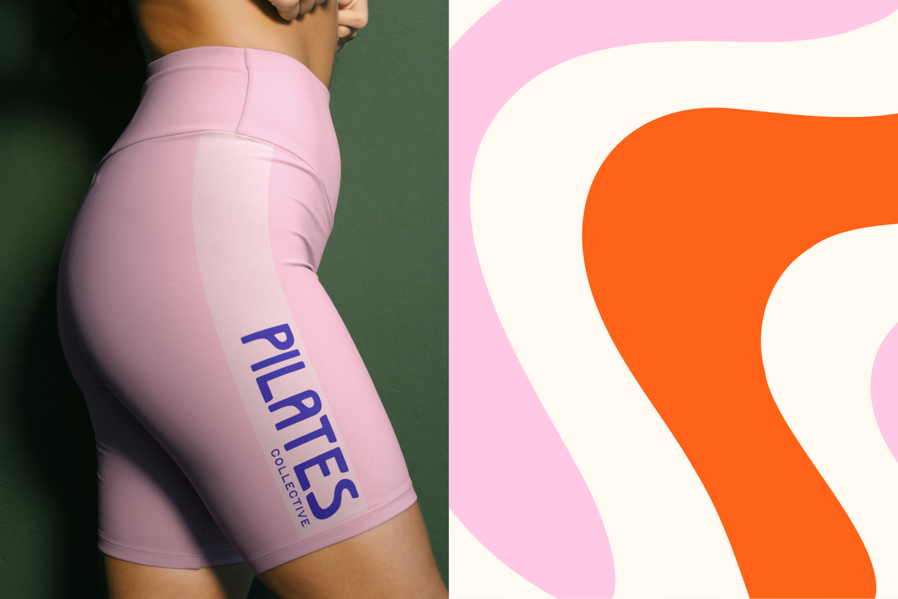
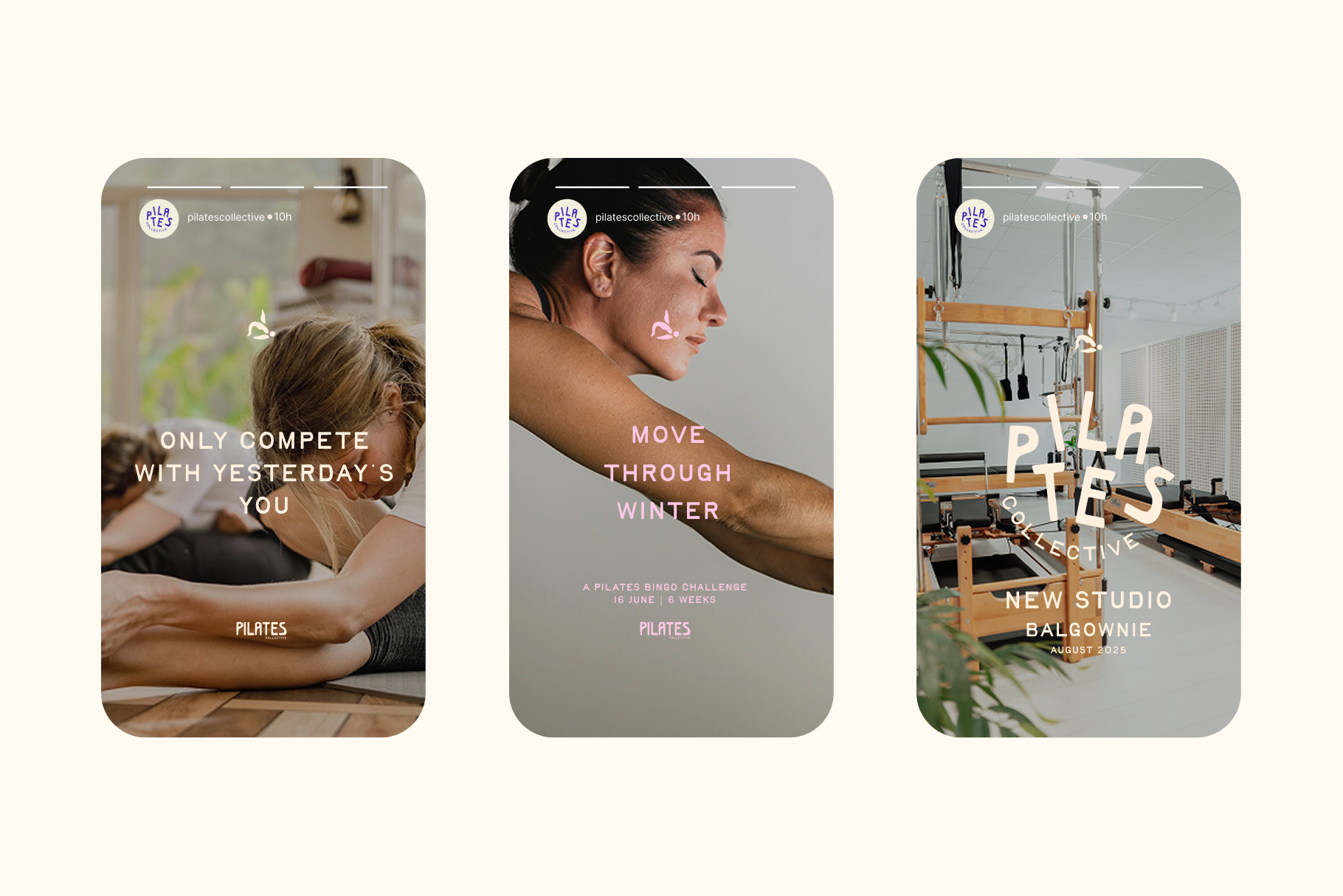
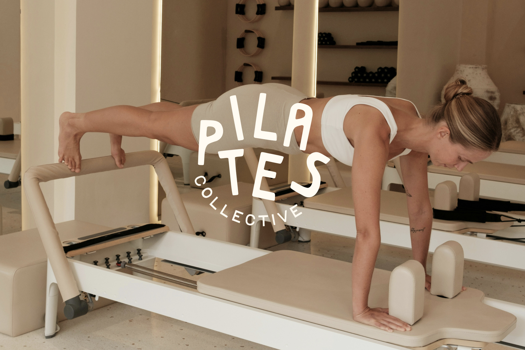
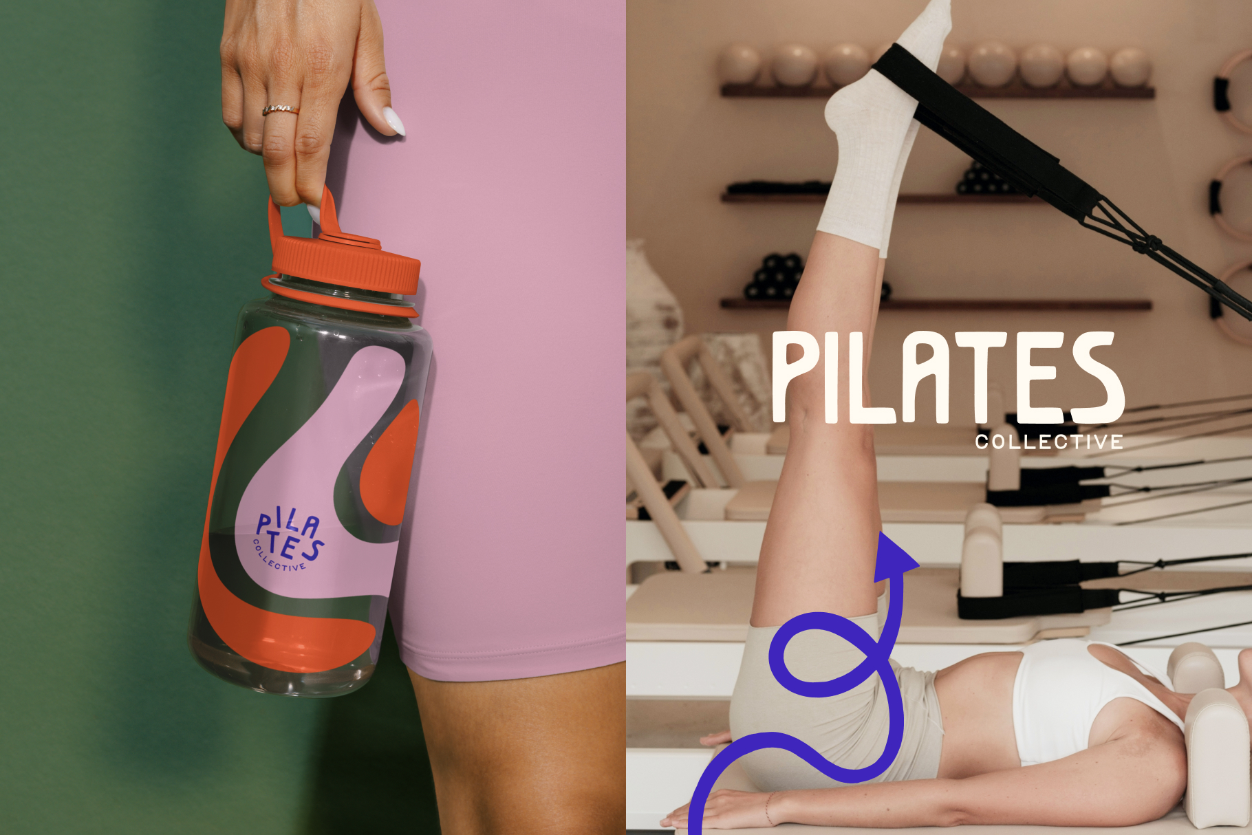
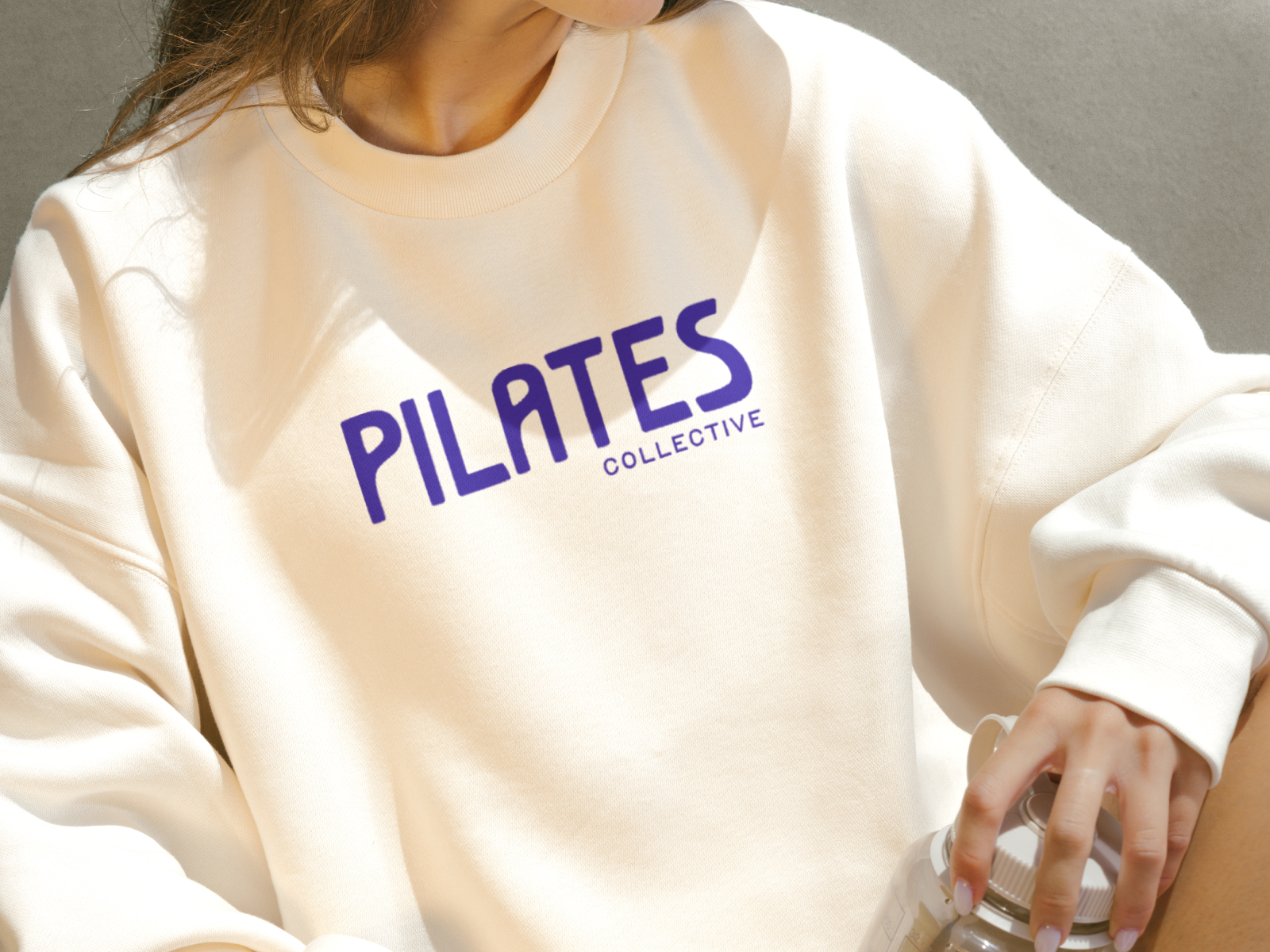
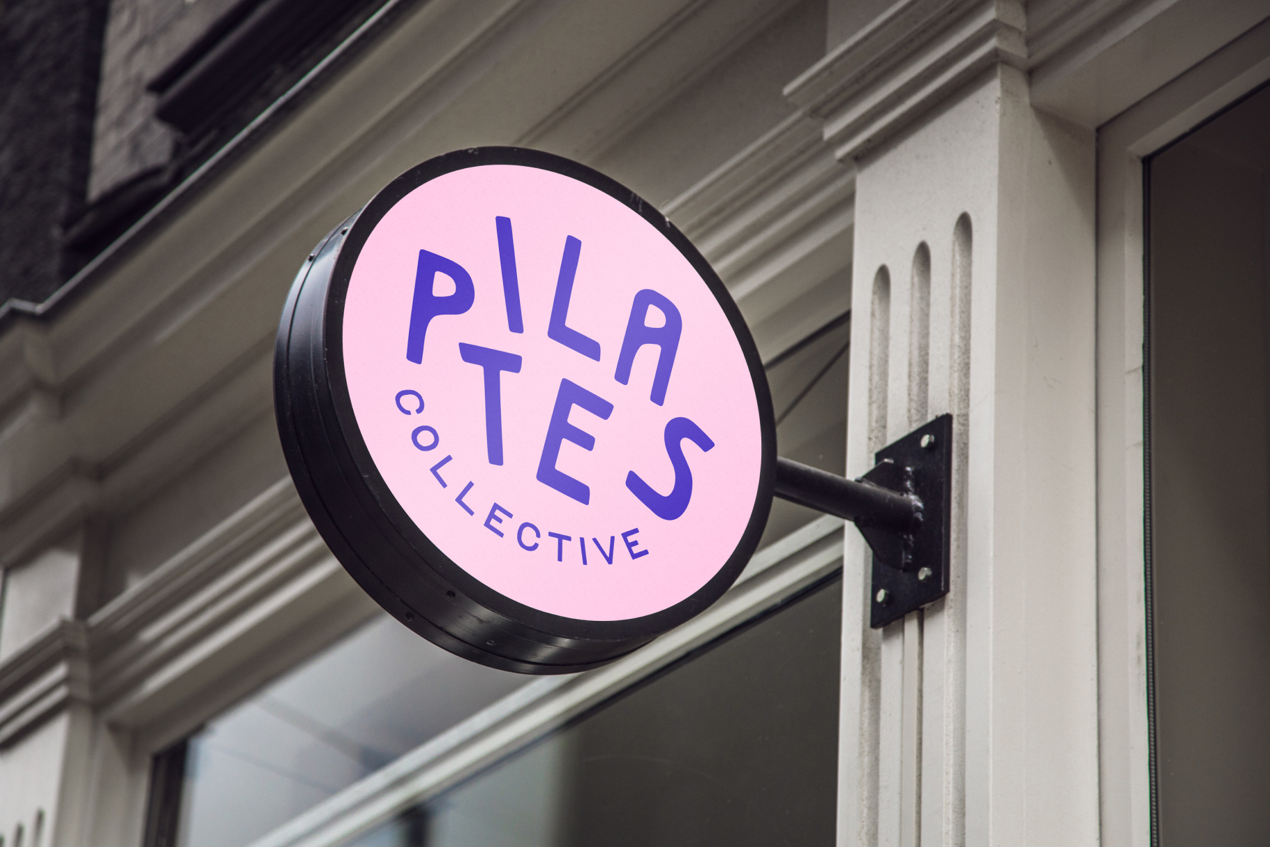
We developed brand concepts rooted in elevated lifestyle rather than fitness. Exploring typography, colour, and identity systems that felt curated, warm, and unmistakably Pilates Collective.
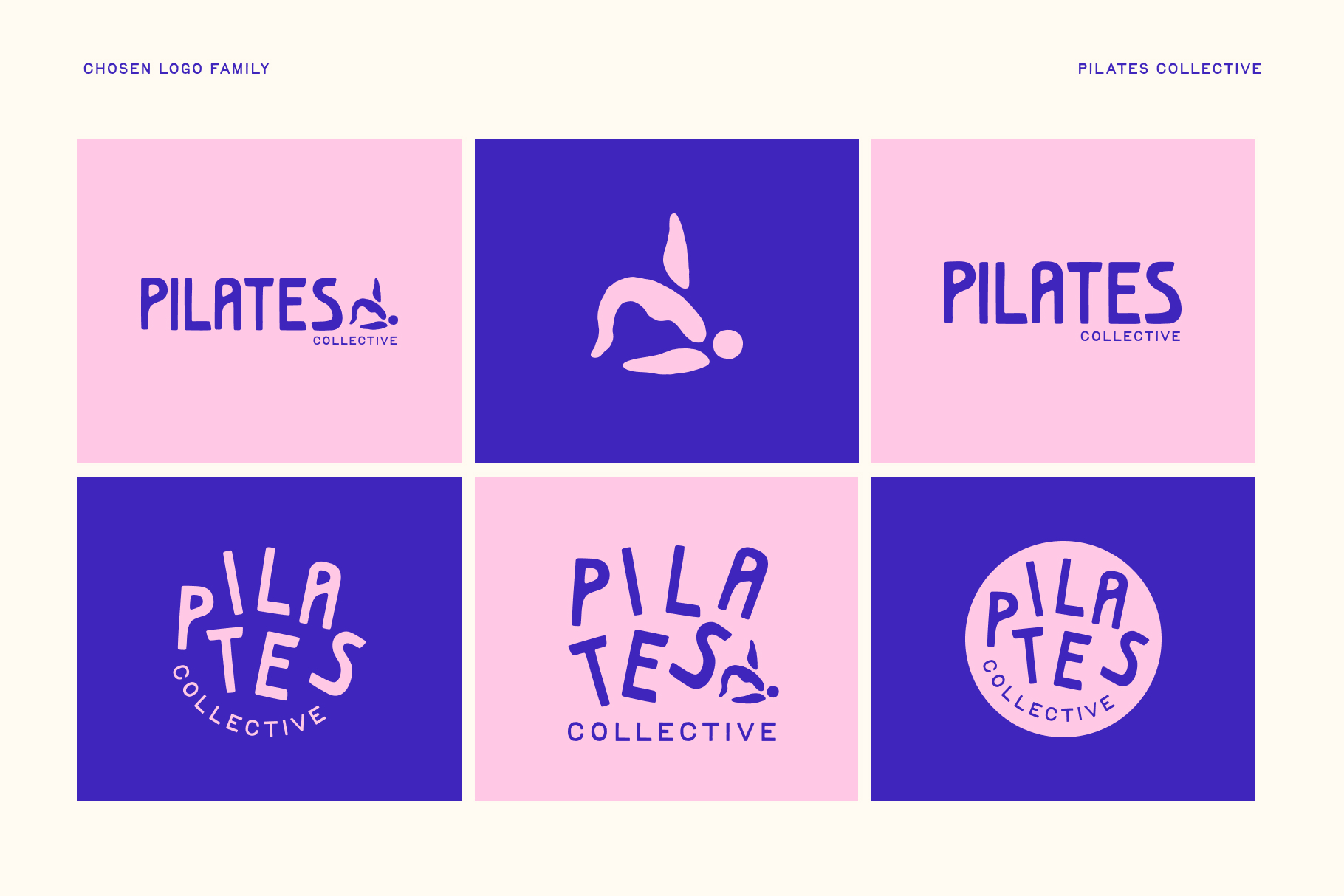
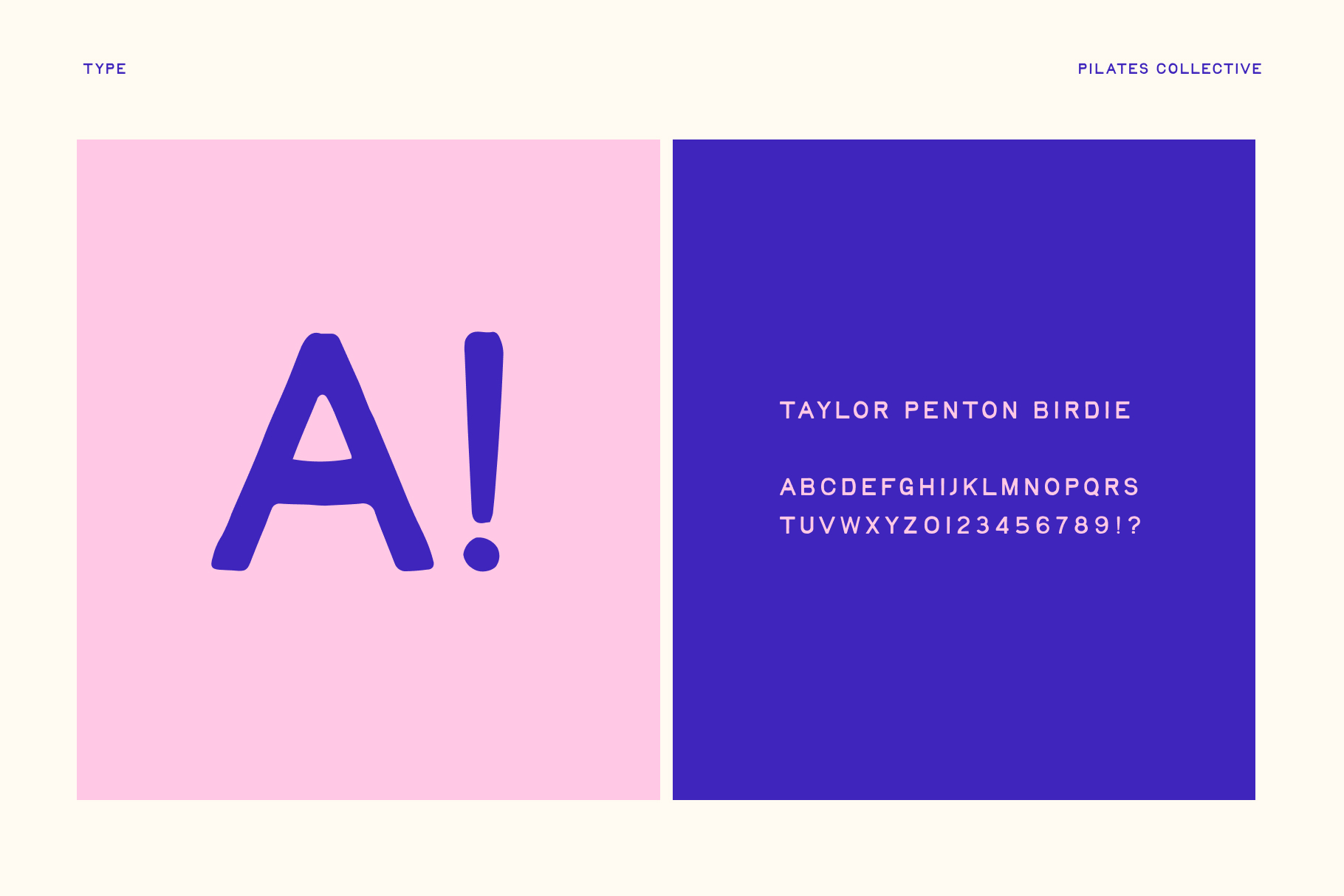

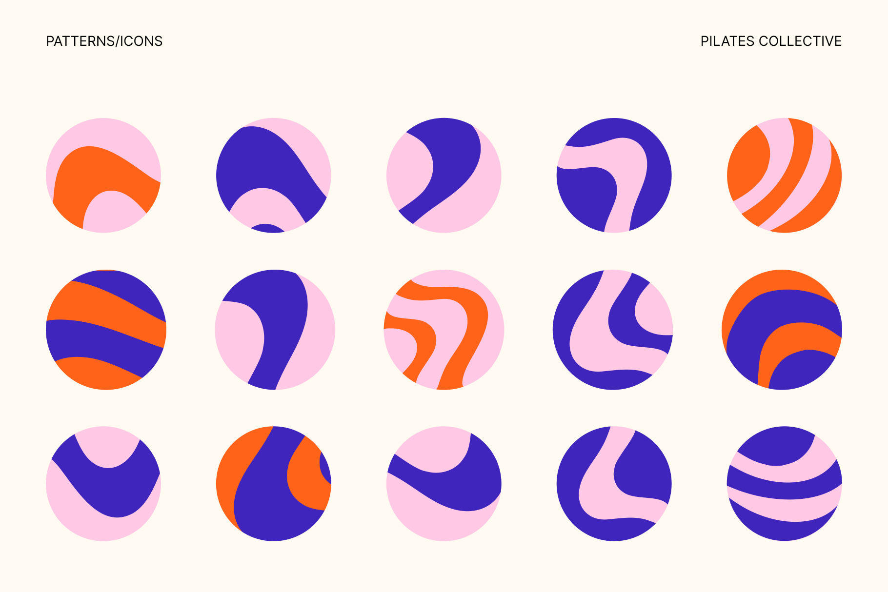
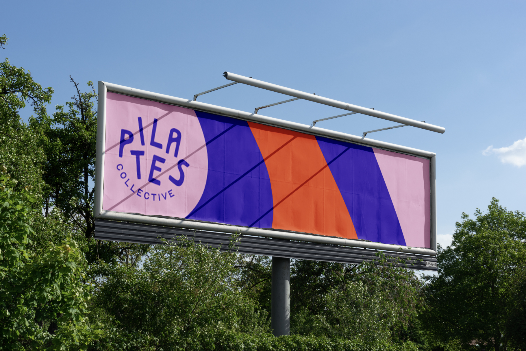
Solution
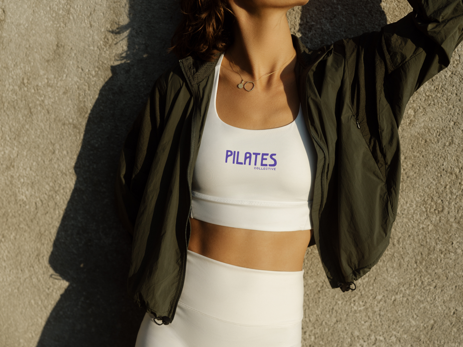
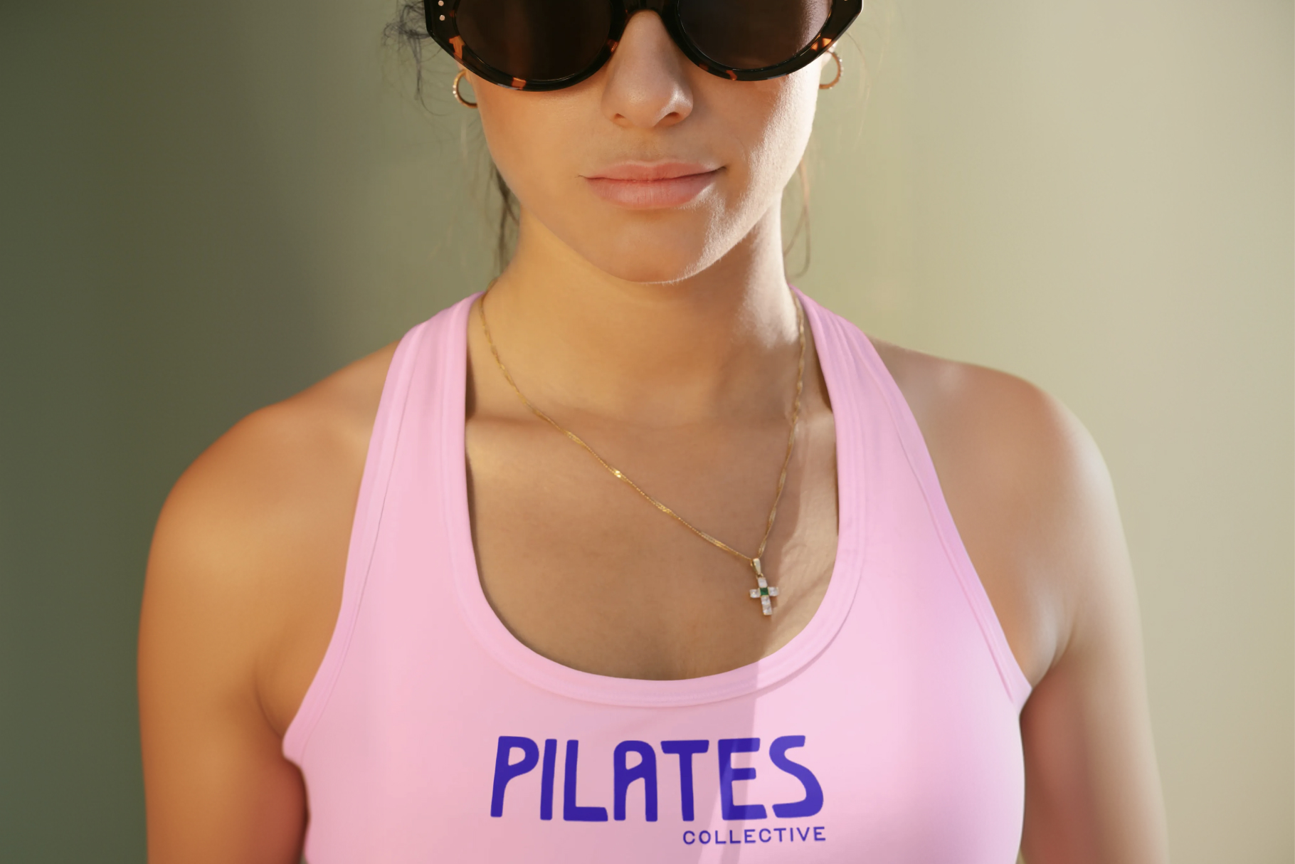
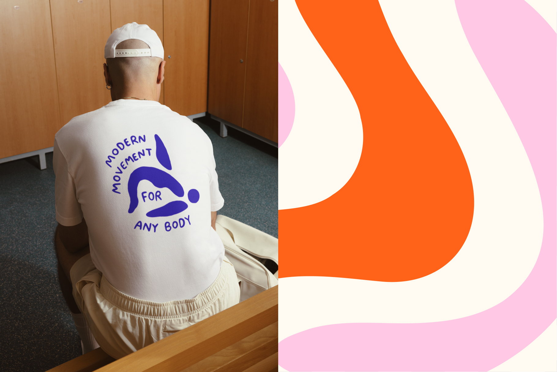
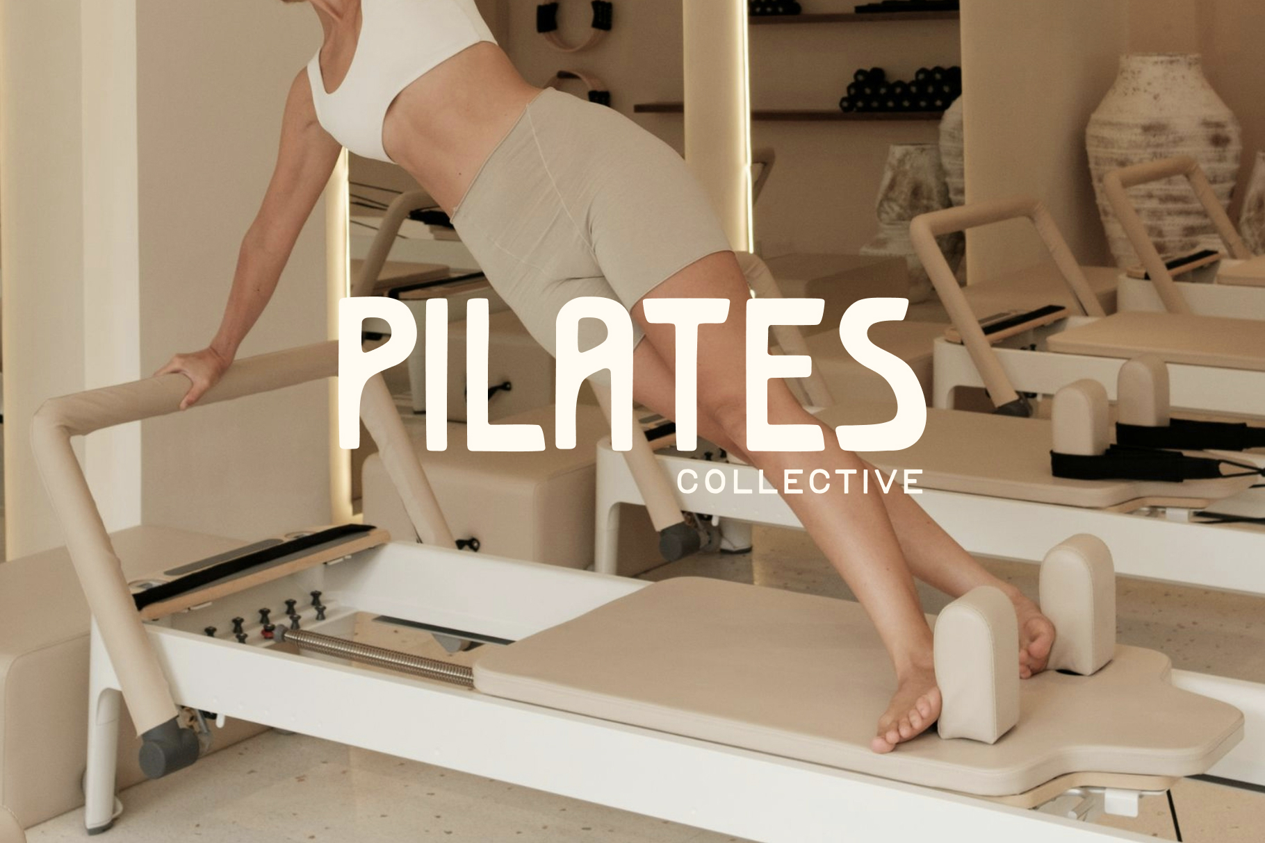
The identity we landed on is confident without being cold. Refined without being distant. The visual system borrows from the language of premium lifestyle, giving the brand a presence that feels at home in a studio, on a tote bag, or across social media. Every element, from the logo through to merch and collateral, was designed to feel like something worth owning and a community worth joining.

Results
Pilates Collective launched with a brand that immediately set it apart in the local market. The identity resonated across all three audience segments, building recognition and trust from day one. With two locations established and Calderwood on the horizon, the brand is built to scale without ever losing what makes it special.

Reccomended Projects


This Could Be Your Brand
Take your brand from DIY to dynasty in just 1 month with our Iconic Brand Blueprint.