Brand Identity for Bakehouse
Our Process
Paul walks through the project goals, challenges, solution and results for this brand.
The challenge
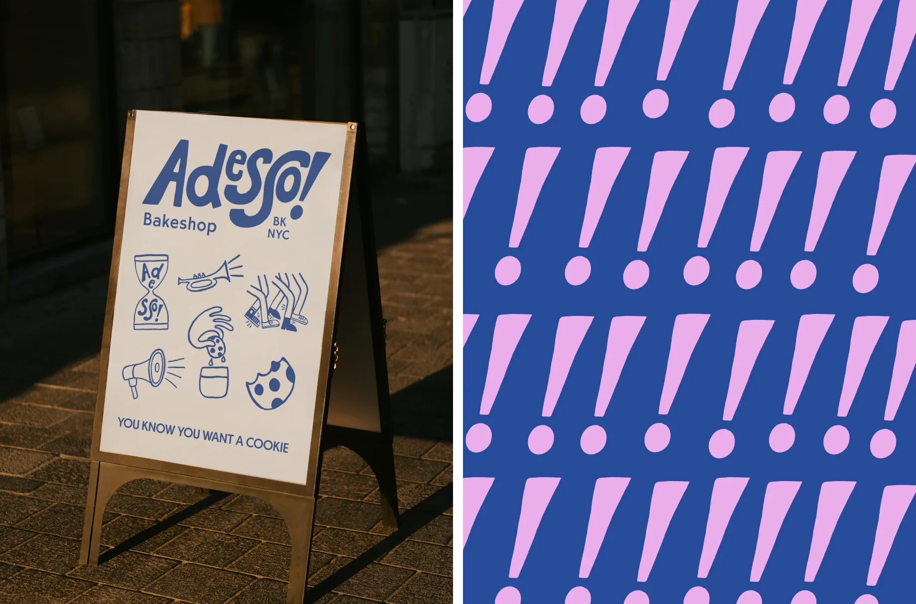
It’s one thing to have the tastiest cookie in the game, but standing out in a busy food market is another story. Let alone a food market in Brooklyn, New York - one of the busiest and most competitive food scenes in the world. A unique and thought provoking brand identity is the best way to differentiate and stand out in a crowd. Having a hand drawn brand identity adds an authentic, personal touch that represents the artisanal nature of food and drink brands.
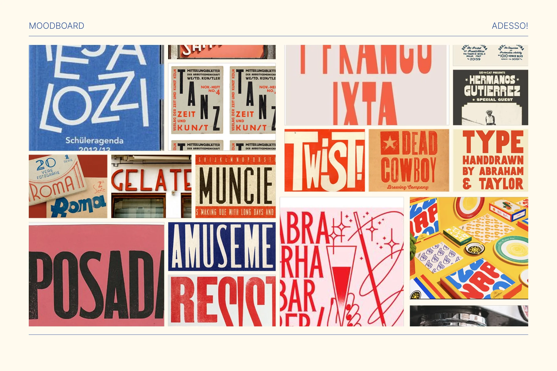
Process
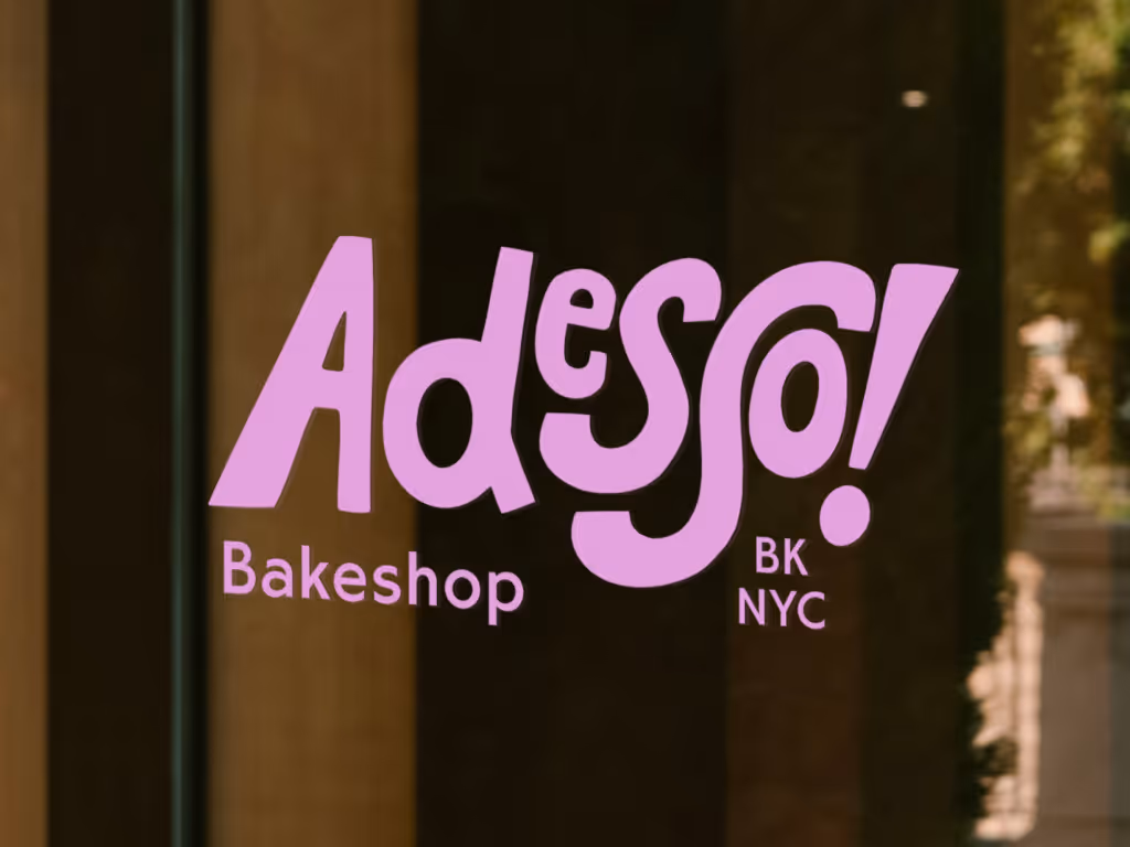
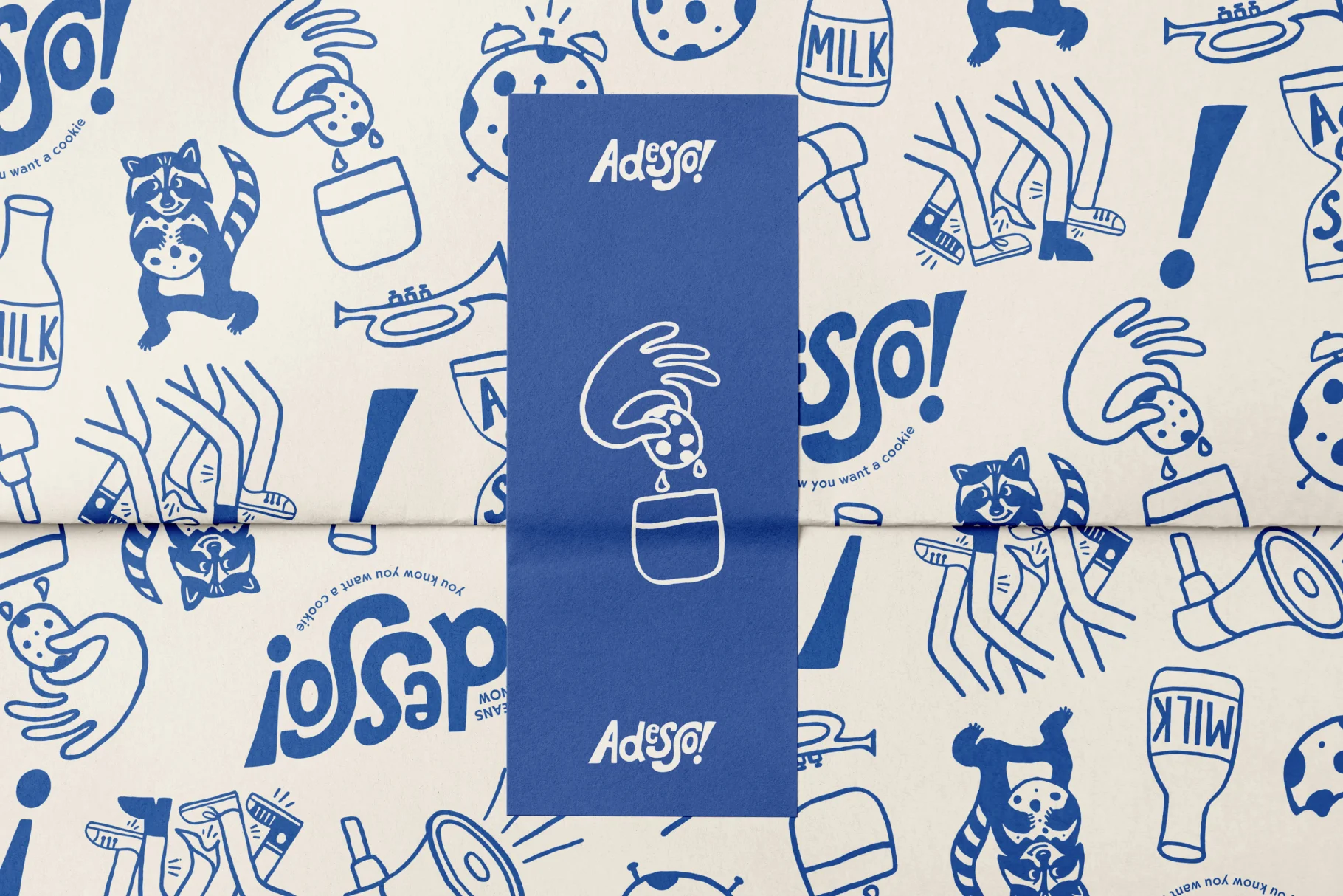
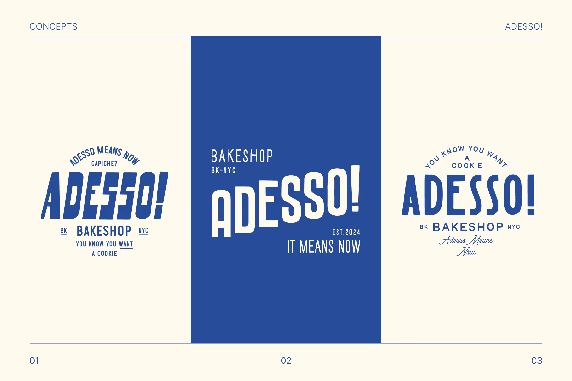
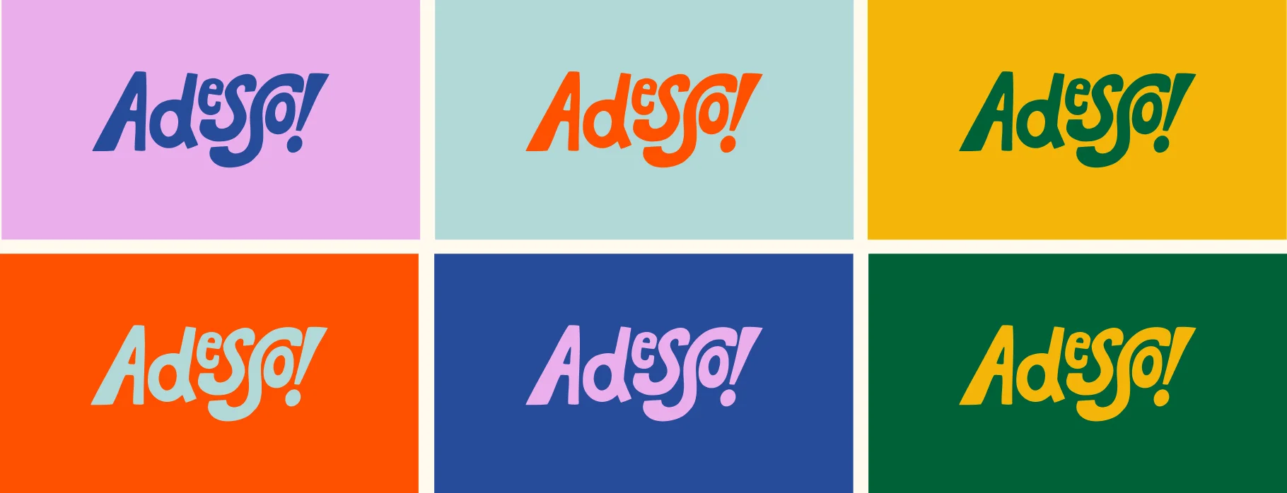
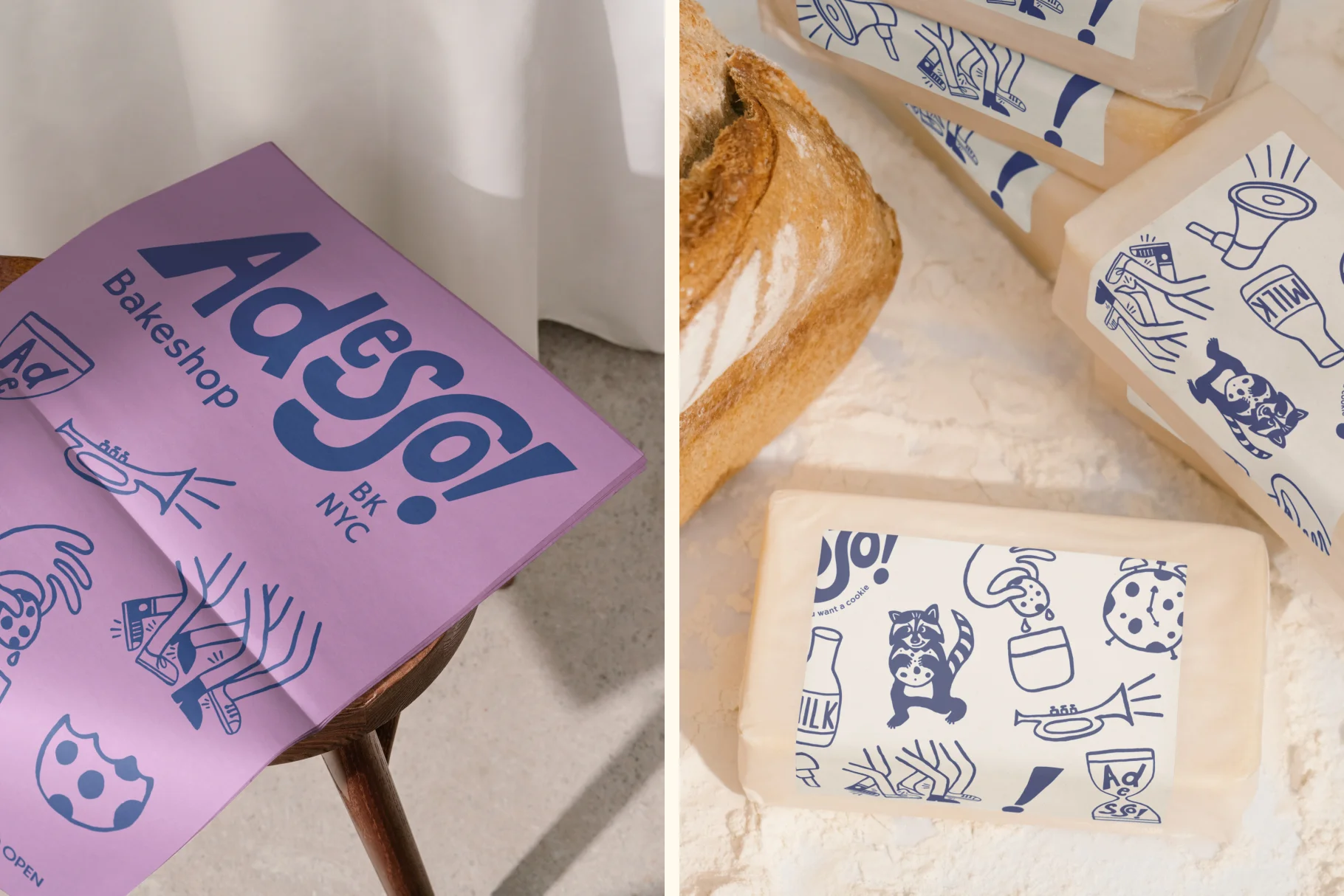
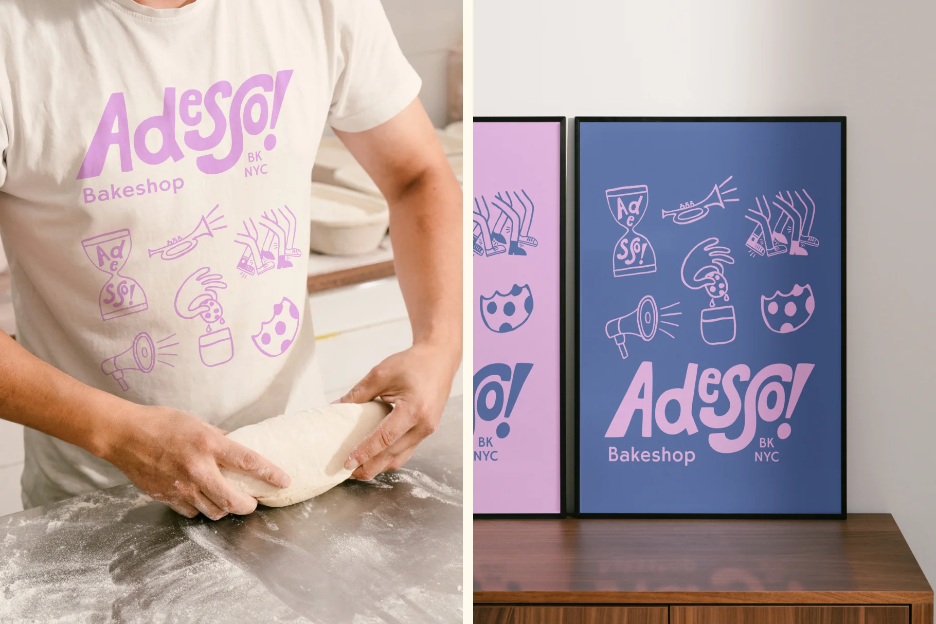
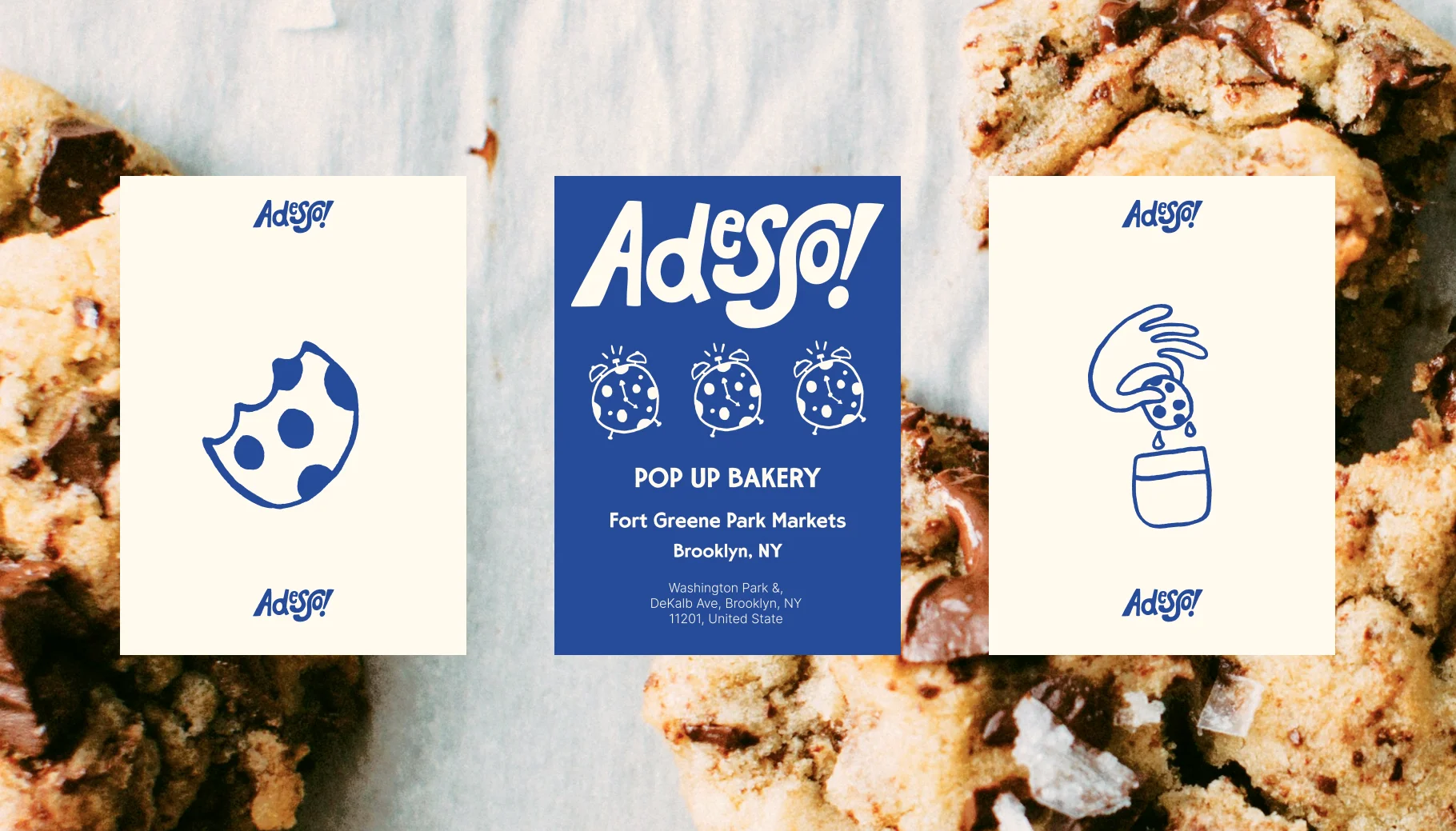
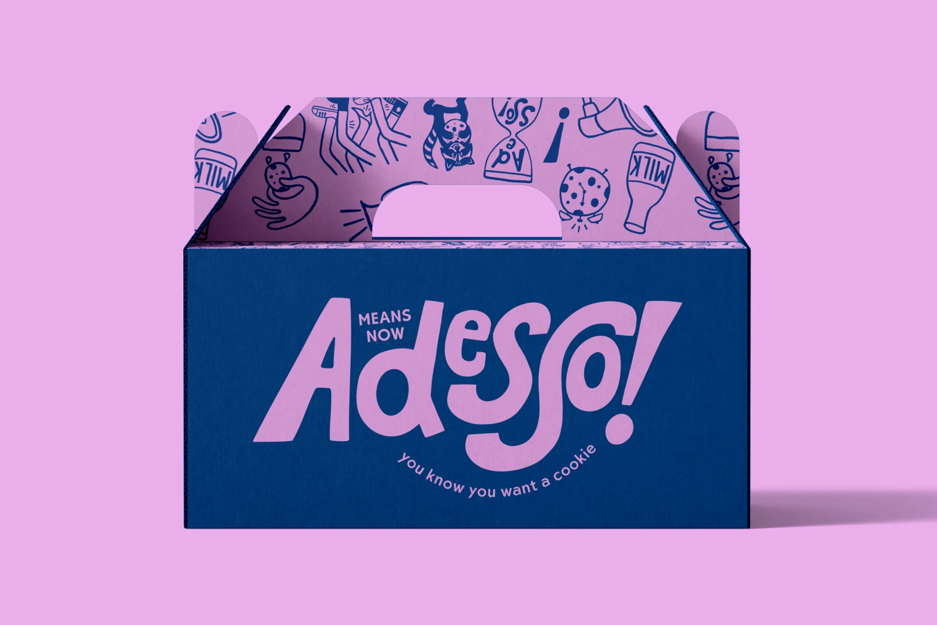
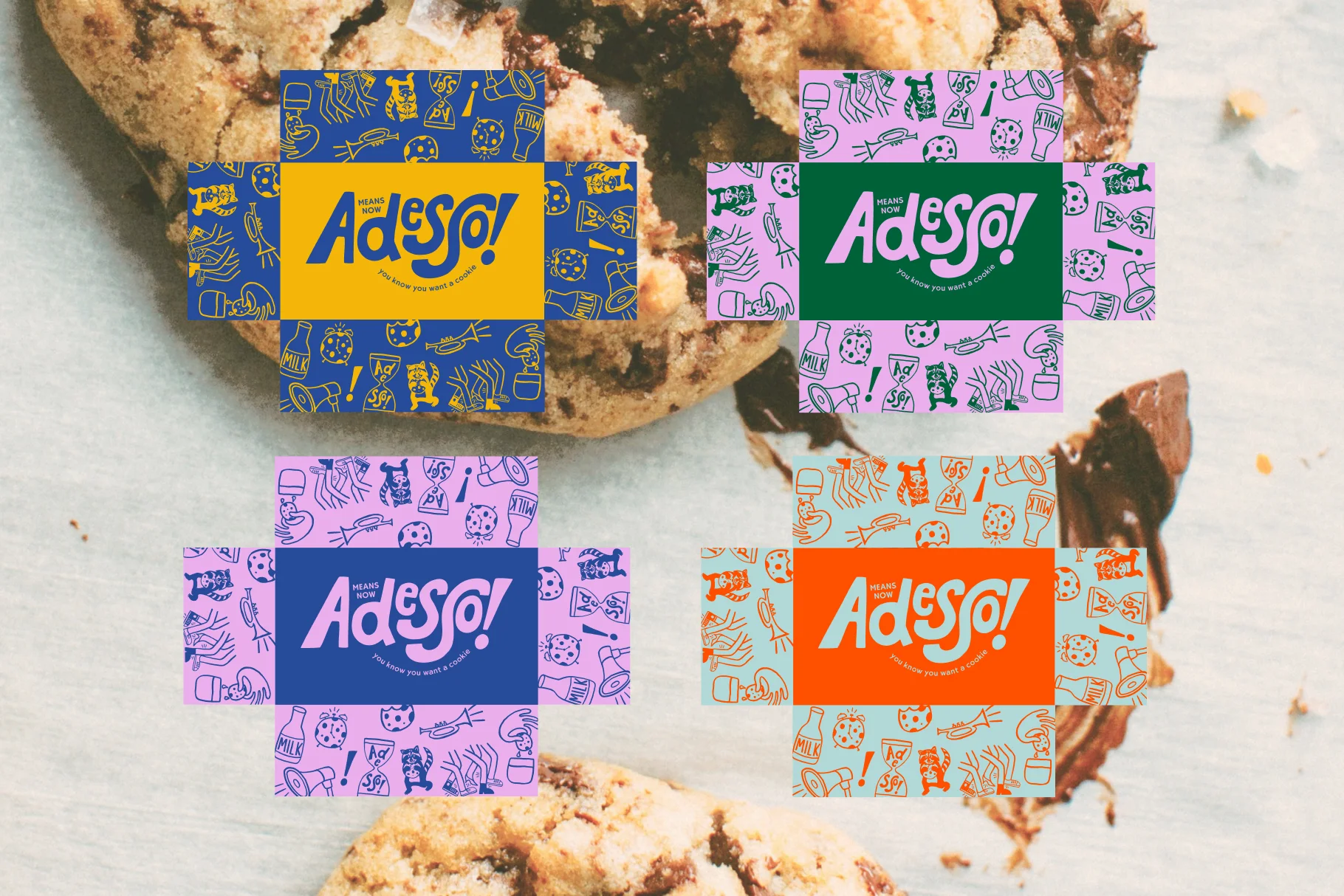
For this brand identity, we drew inspiration from condensed, vintage Italian letterpress typography — embracing the idea of leaving imperfections in. These subtle flaws add just the right amount of chaos to reflect Adesso!’s vibrant and creative menu. We developed three unique concepts, each packed with personality and individuality, ensuring we could work closely with our clients to bring their vision to life and create a brand identity that truly resonates with them.
Solution
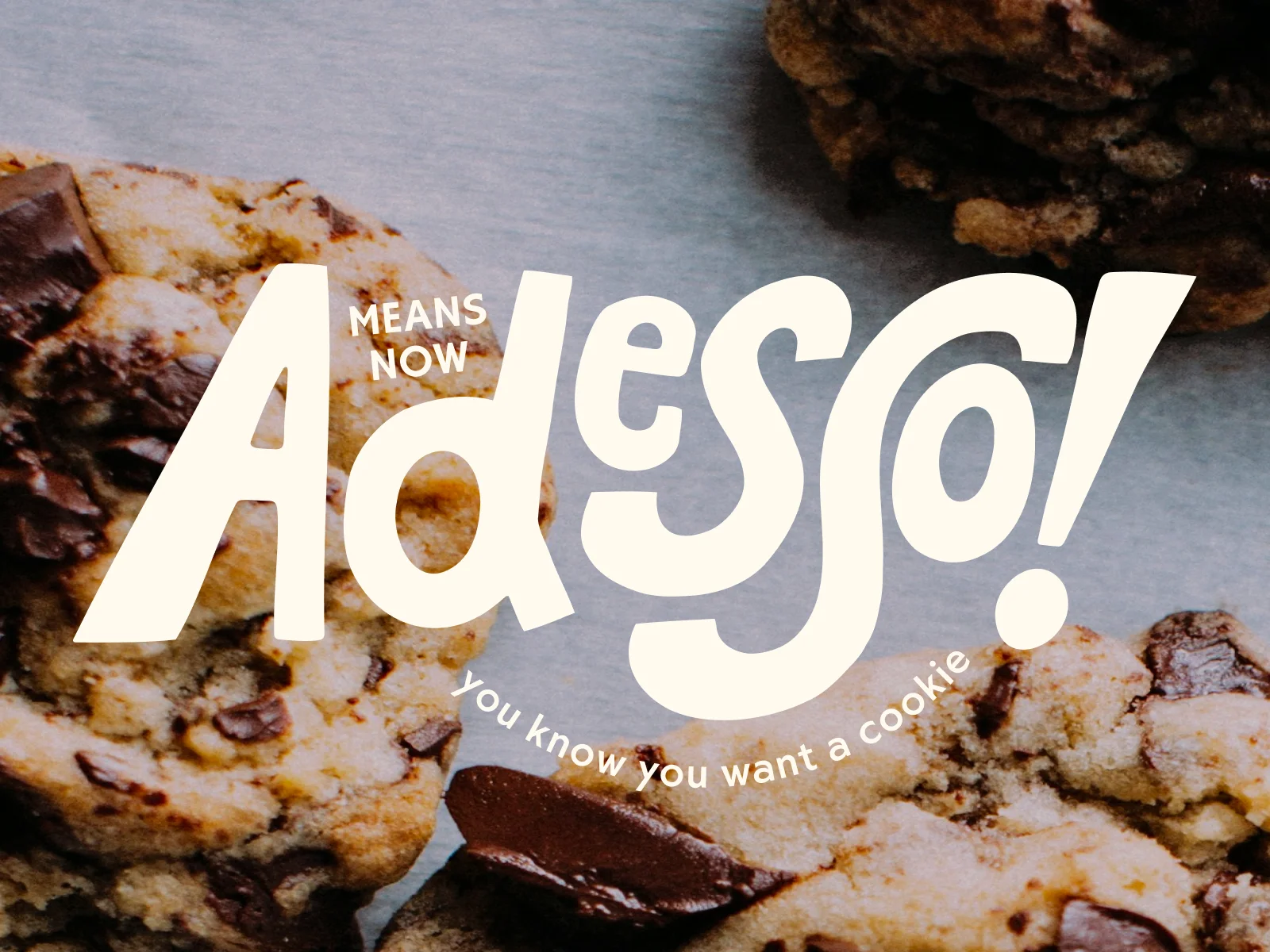
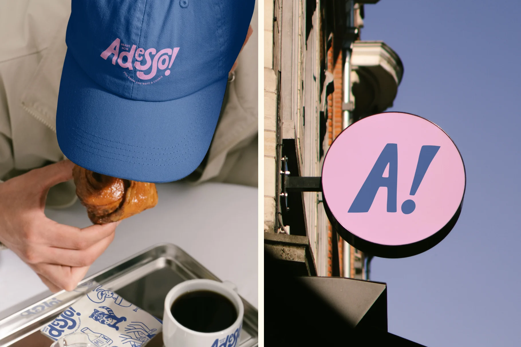
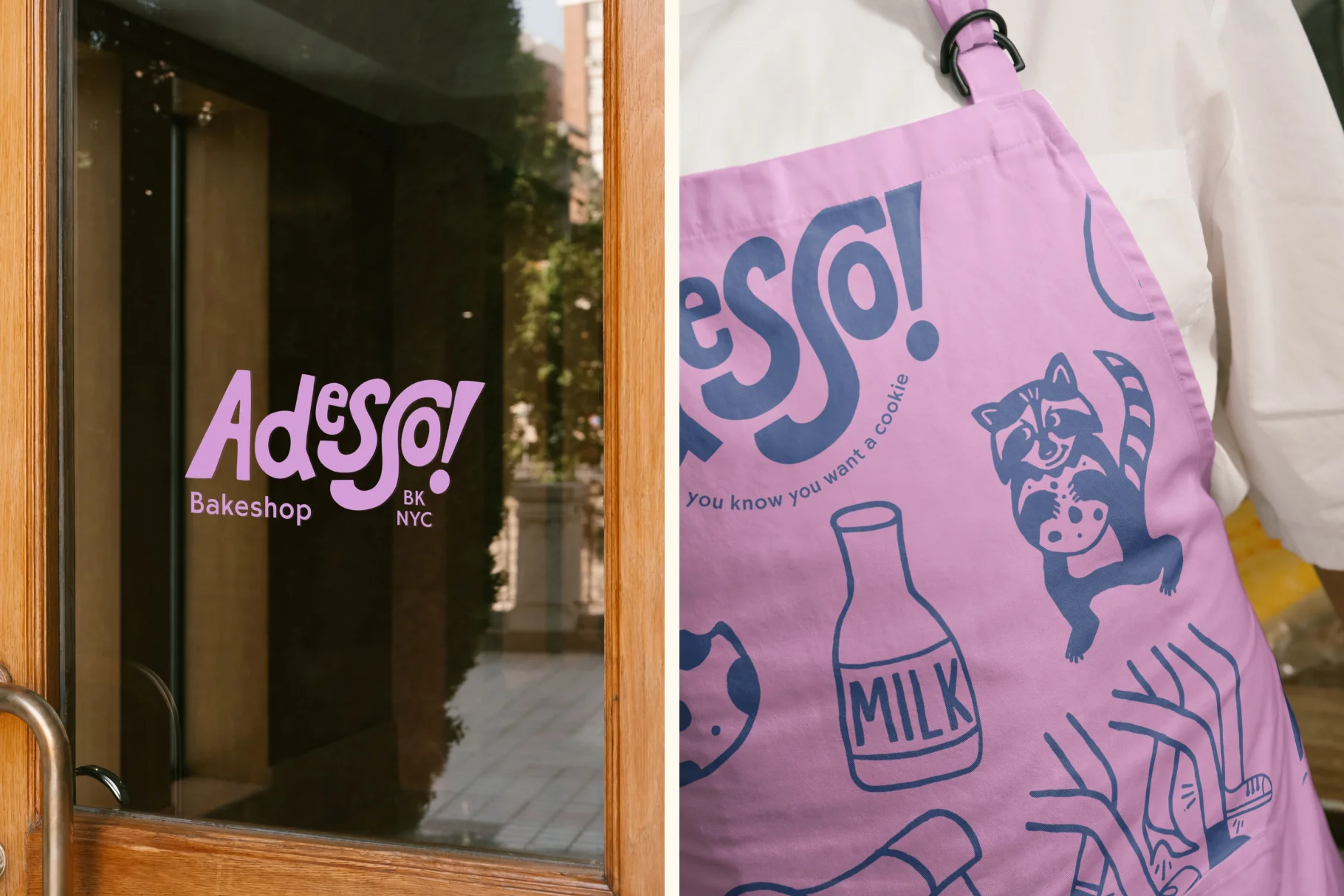
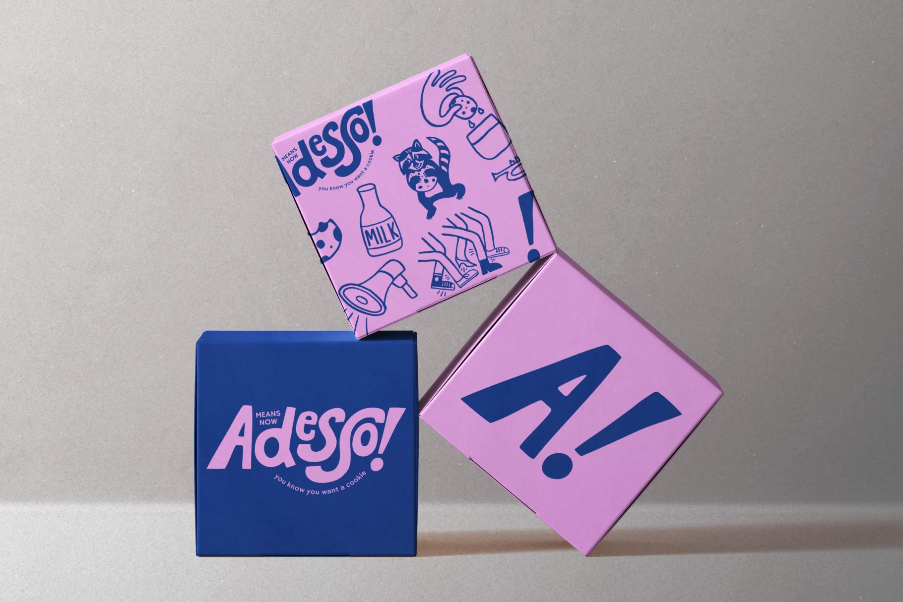
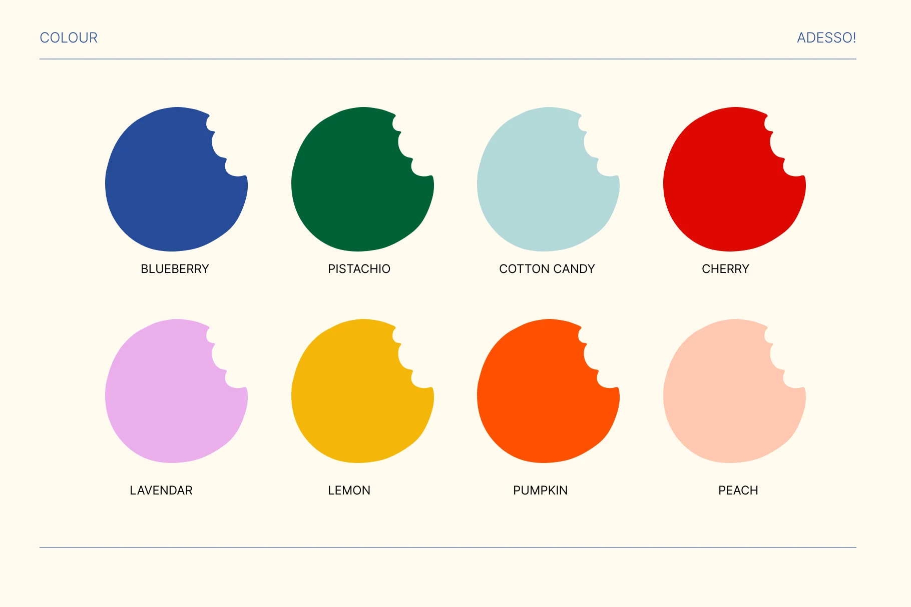
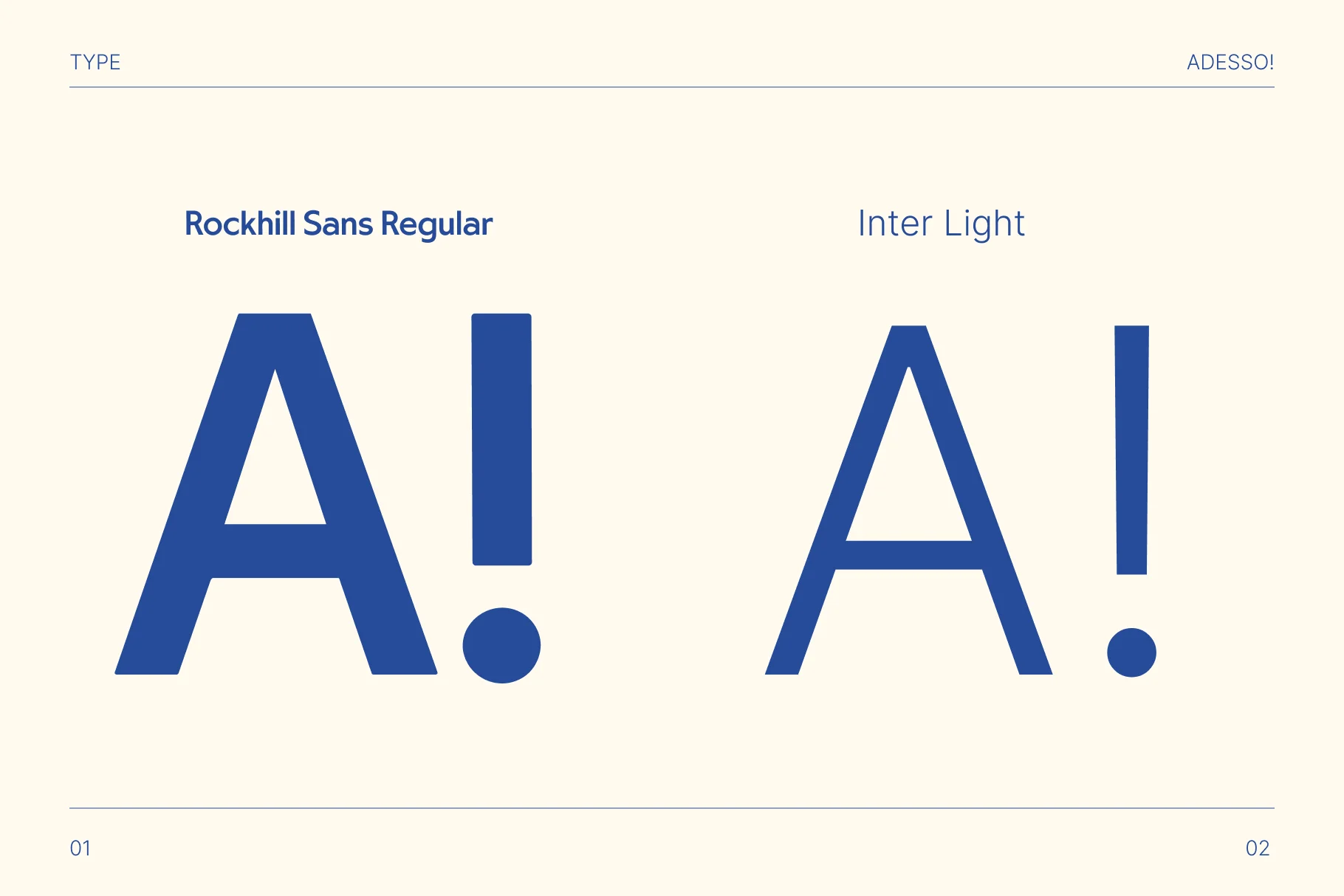
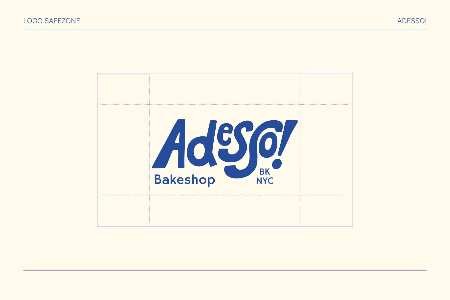
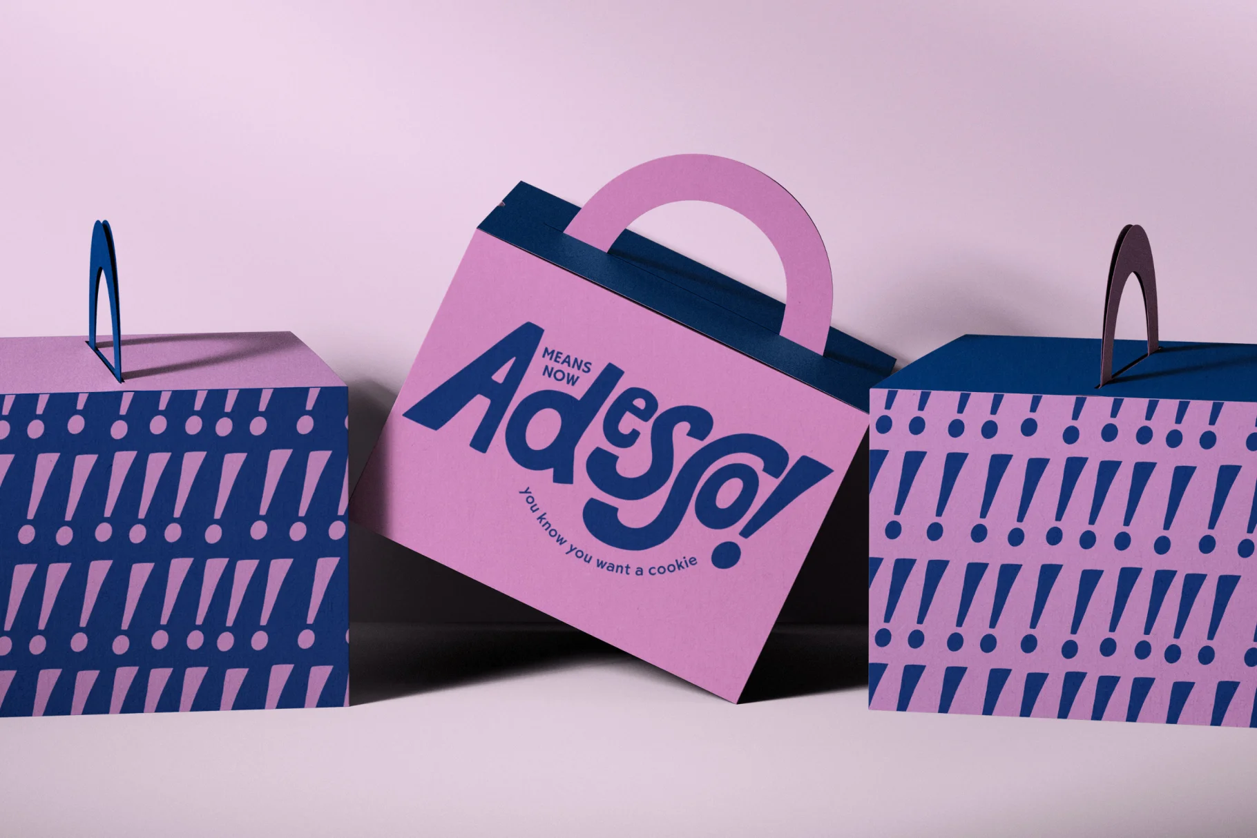
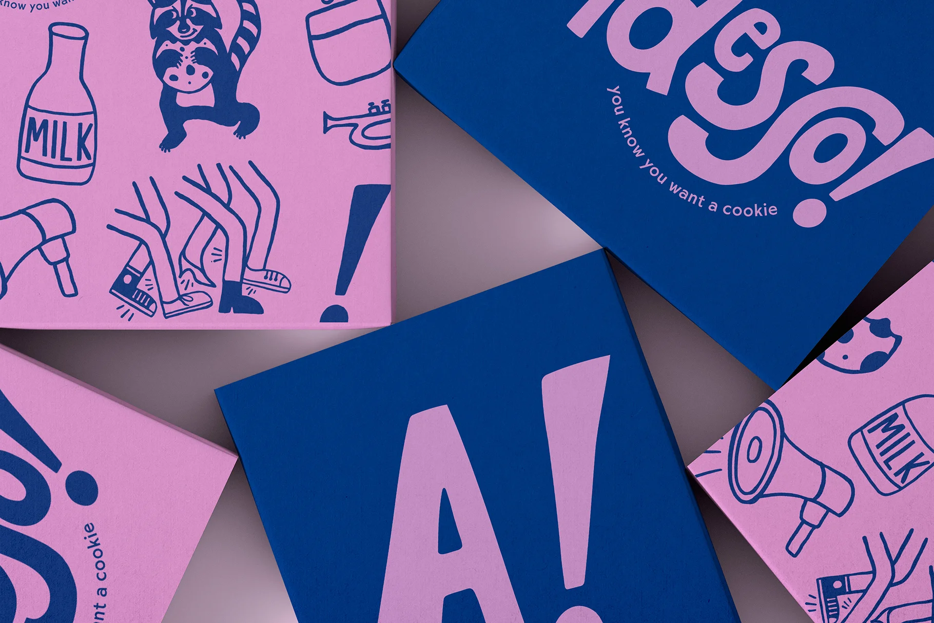
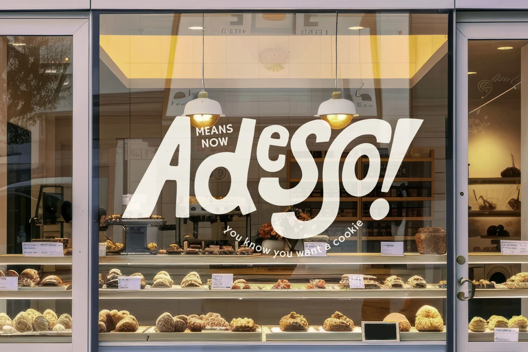
The project brief was to create a meaningful brand identity that would make Adesso!'s stall at the competitive Brooklyn food market pop. ‘Adesso’ is Italian for ‘now’. We wanted to give the hand drawn logotype a sense of urgency to represent the vibrant and often chaotic nature of New York. It features a mix of upper and lower case letters that weave in and out of other, much like the diverse and vibrant Brooklyn community. To add personality, authenticity and an artisan touch we created hand drawn icons to deepen the brand narrative.
Results
It was a true pleasure to hear from the Adesso! team that their market debut was a resounding success, with all products selling out. The icing on the cake was the incredible feedback they received from customers, who loved the branding.
Reccomended Projects


This Could Be Your Brand
Take your brand from DIY to dynasty in just 1 month with our Iconic Brand Blueprint.