
Baba's Kabab Shop
This could be your brand
Our Process
Paul walks through the project goals, challenges, solution and results for this brand.
Process
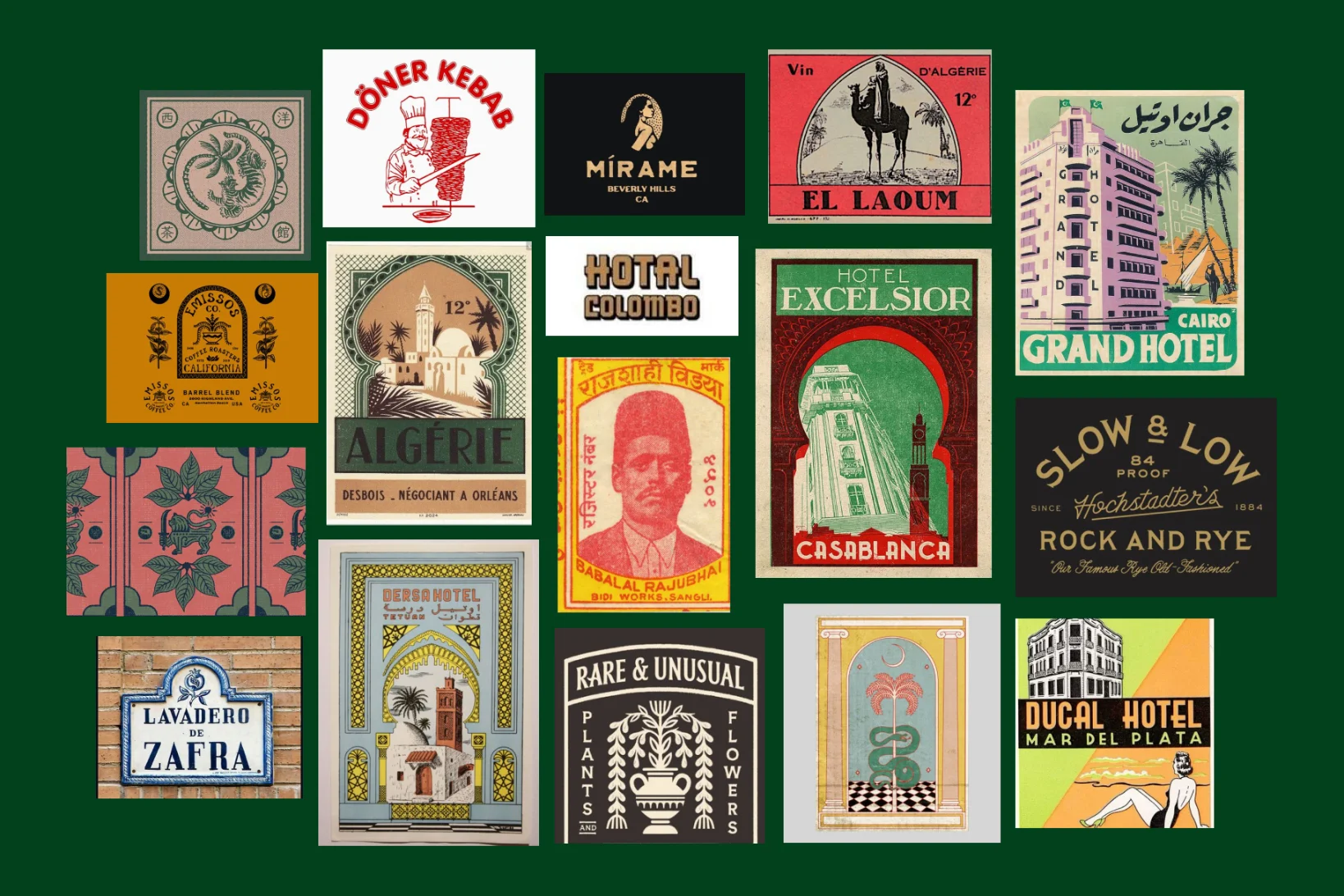
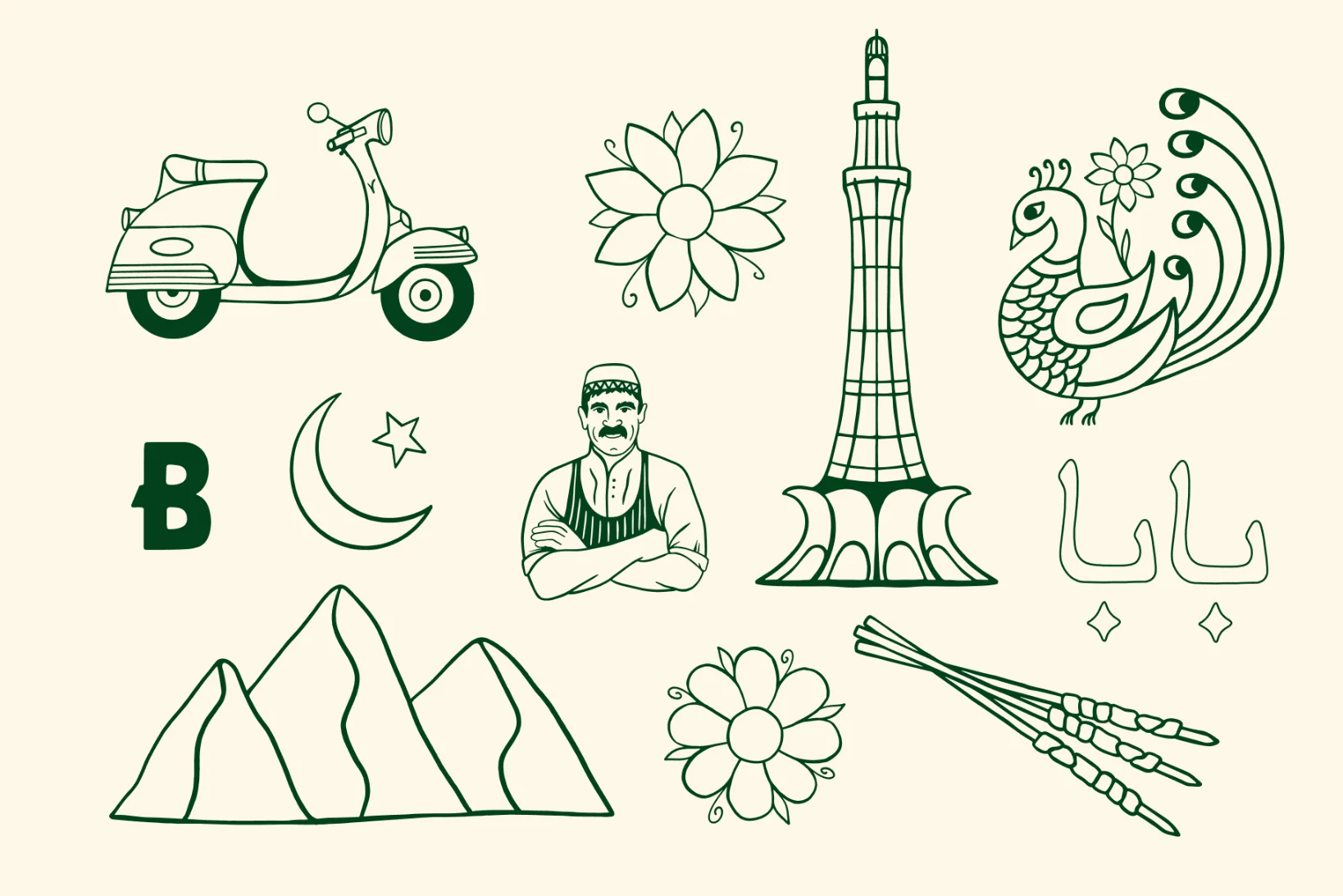
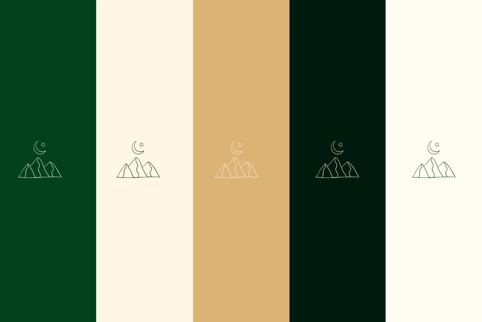
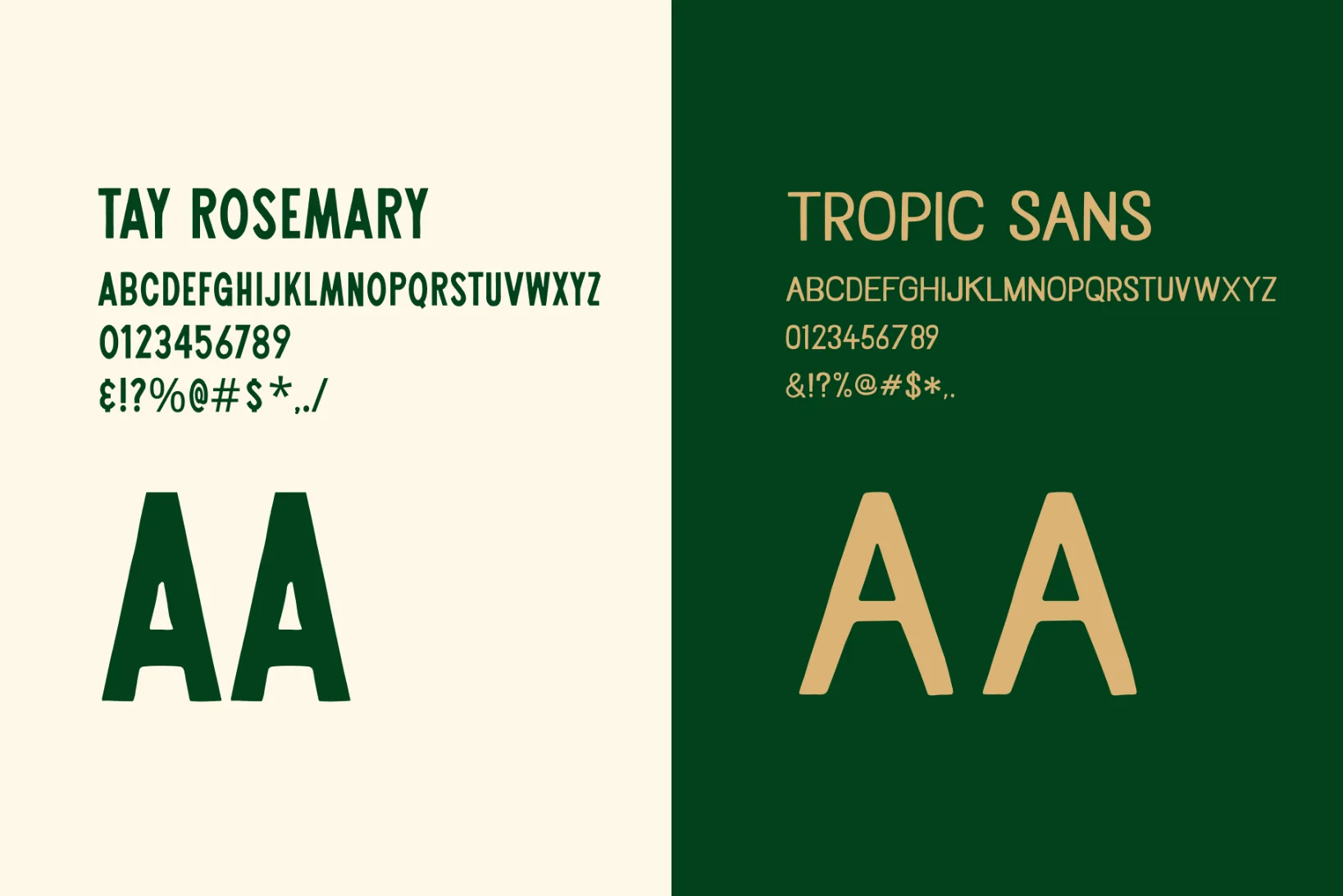
Our mood board for Baba's is nostalgic, elevated with a humble charm. Taking inspiration from vintage hospitality branding from South Asia and the Middle East. The type has an art deco influence, is bold and memorable. The color is warm and welcoming and the illustrations are simple yet refined.
The challenge
Kebab shops are often associated with low quality late night takeaway. The challenge was to create a brand that felt as elevated as this premium and modern concept.

Solution
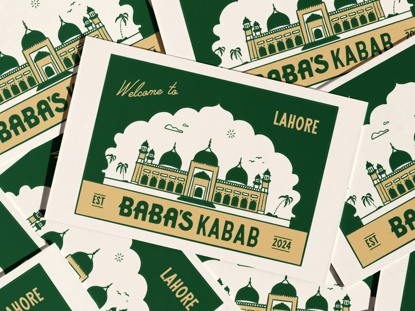
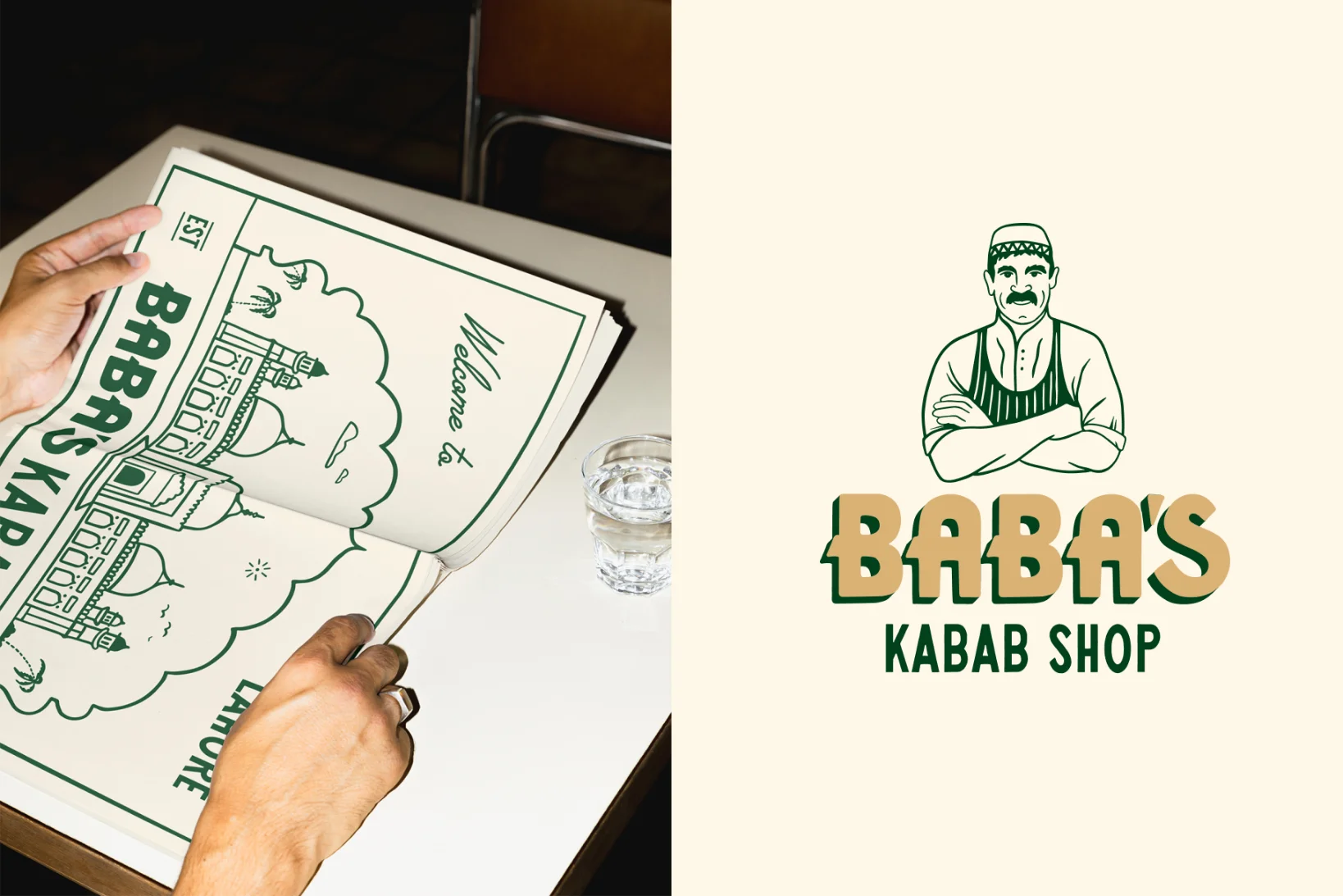
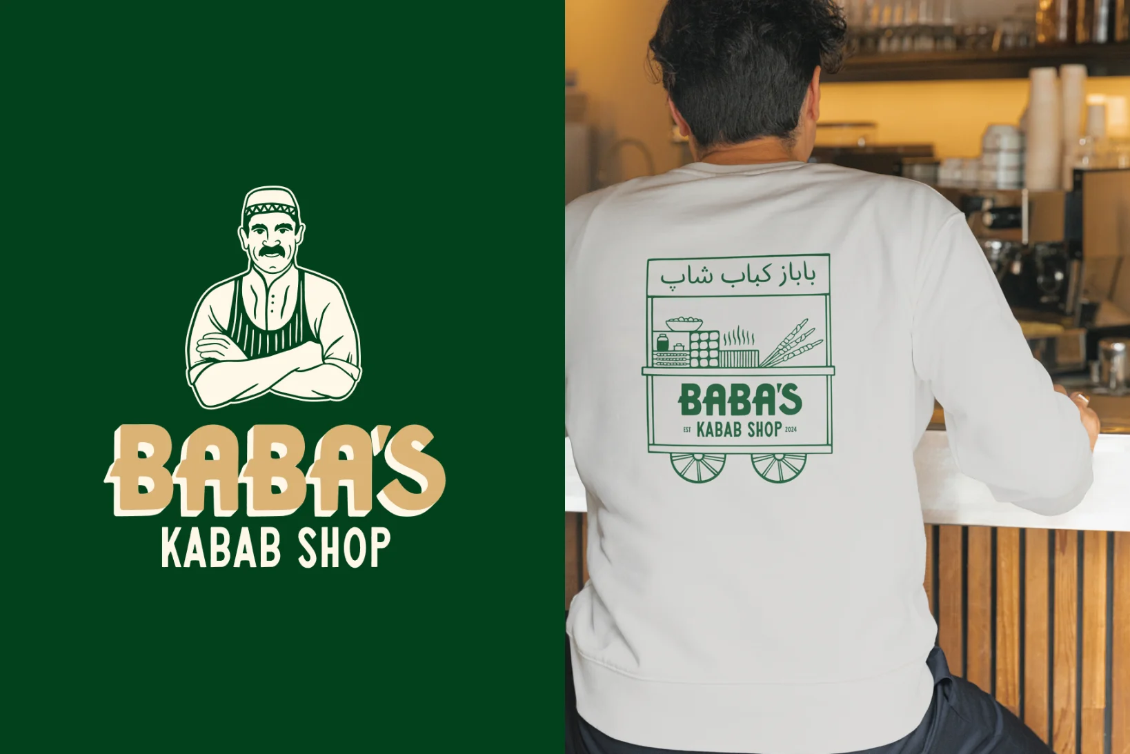
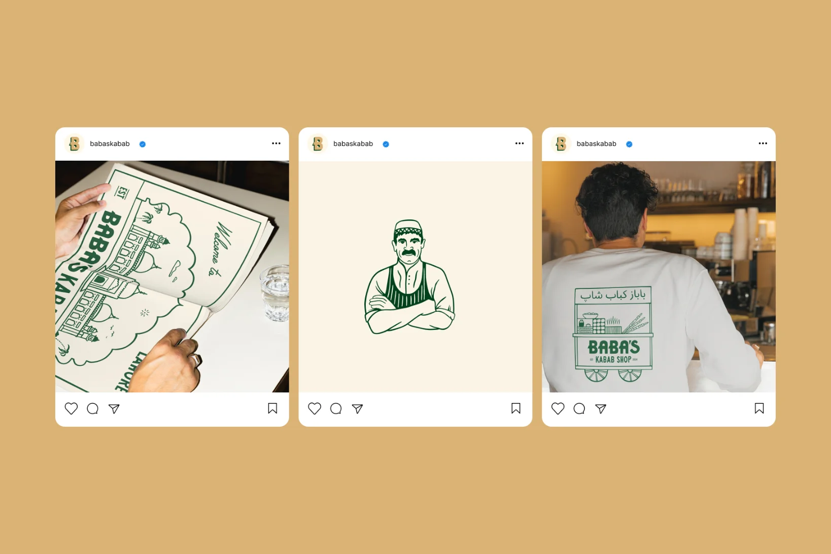
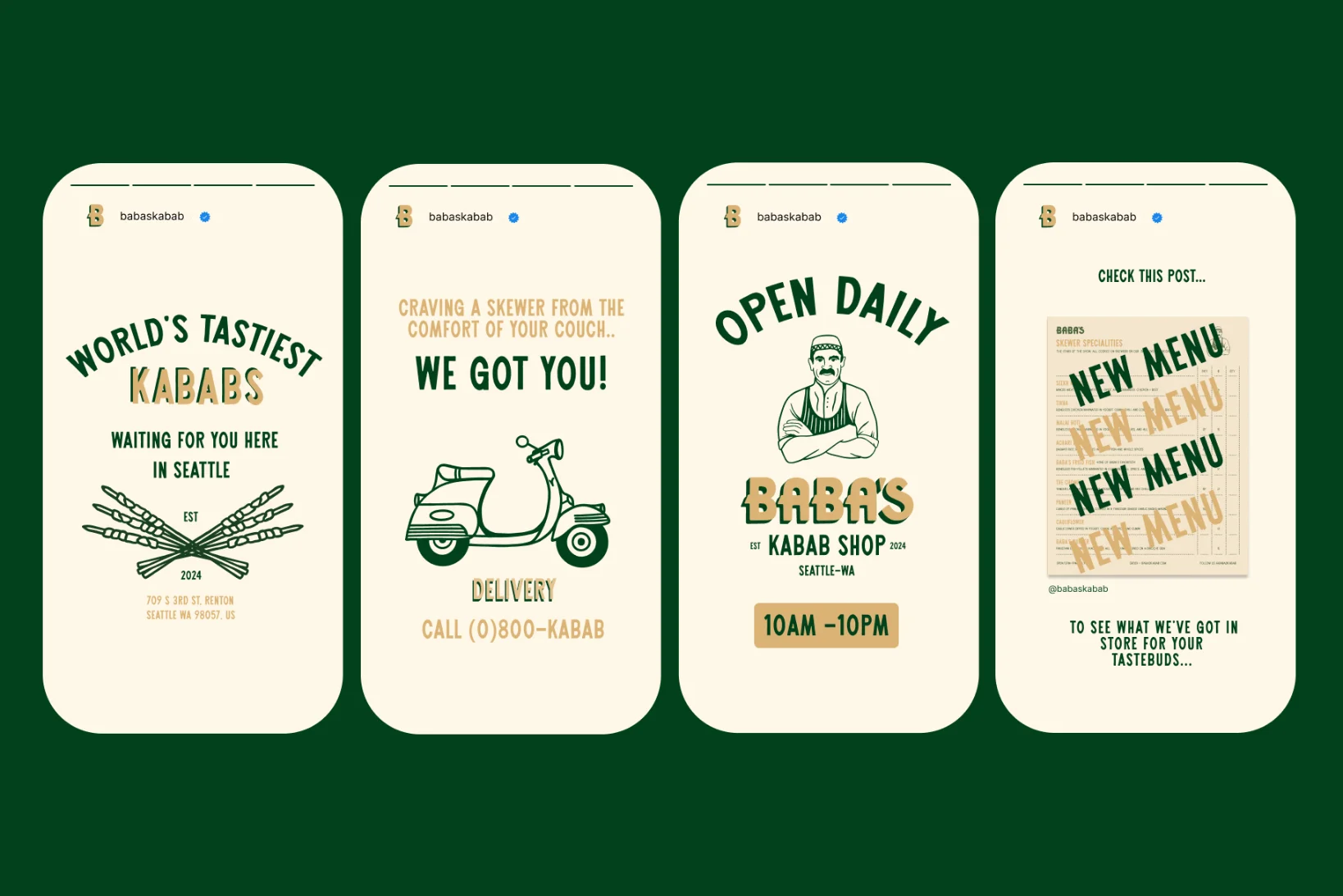
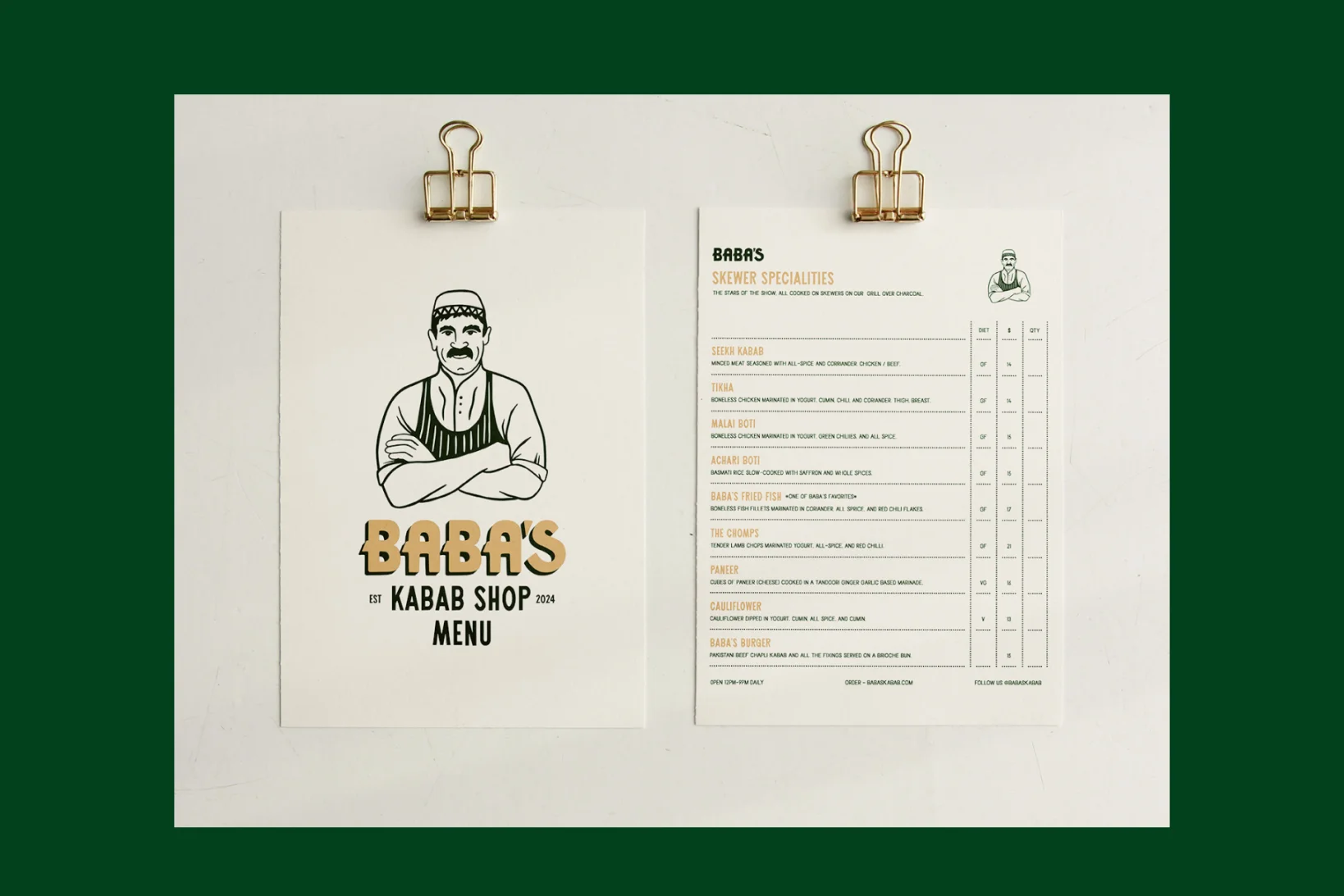
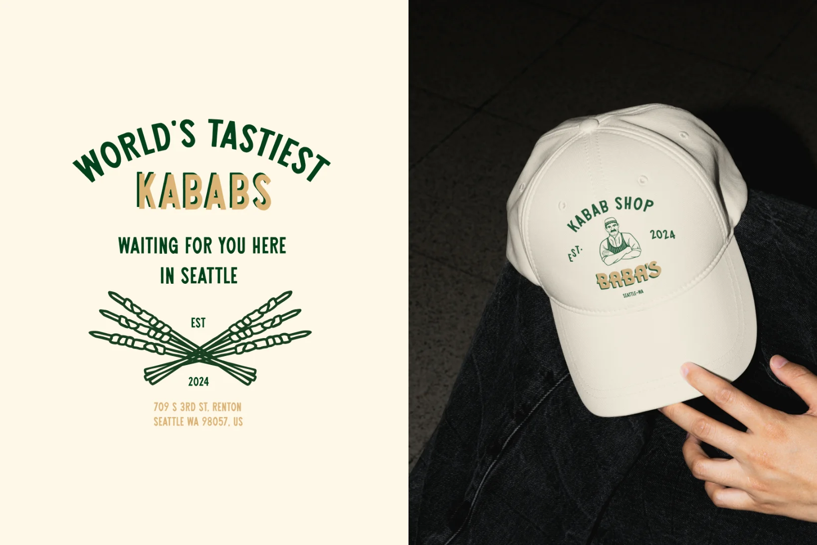
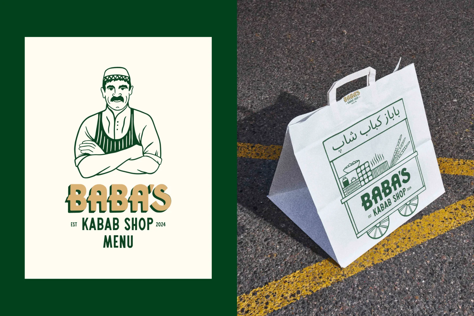
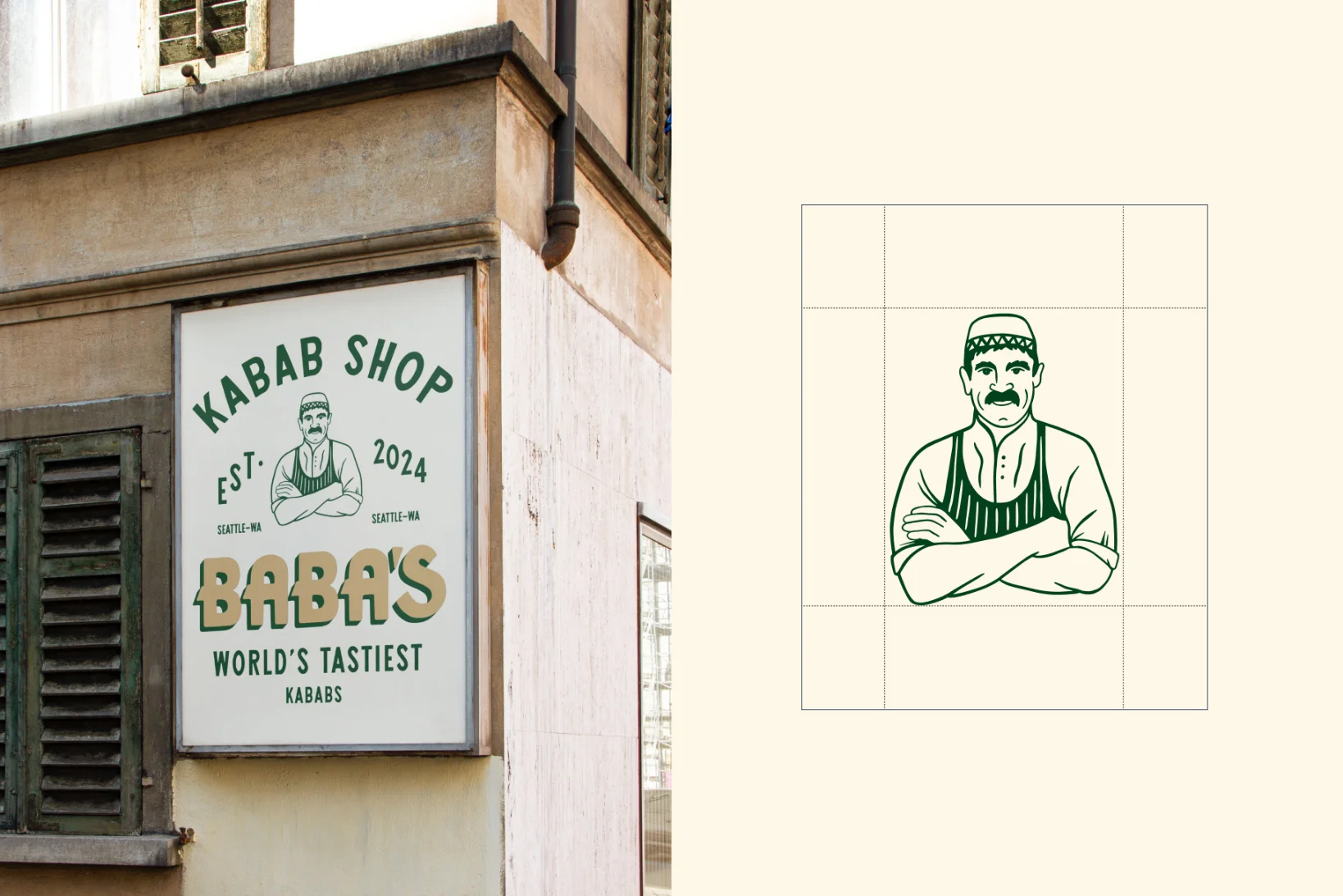
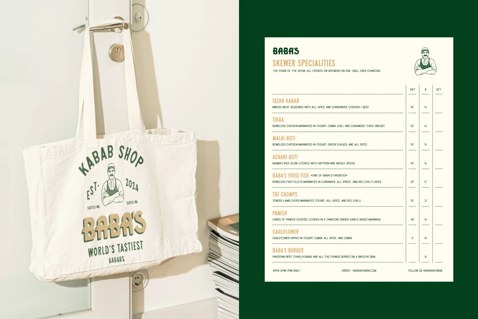
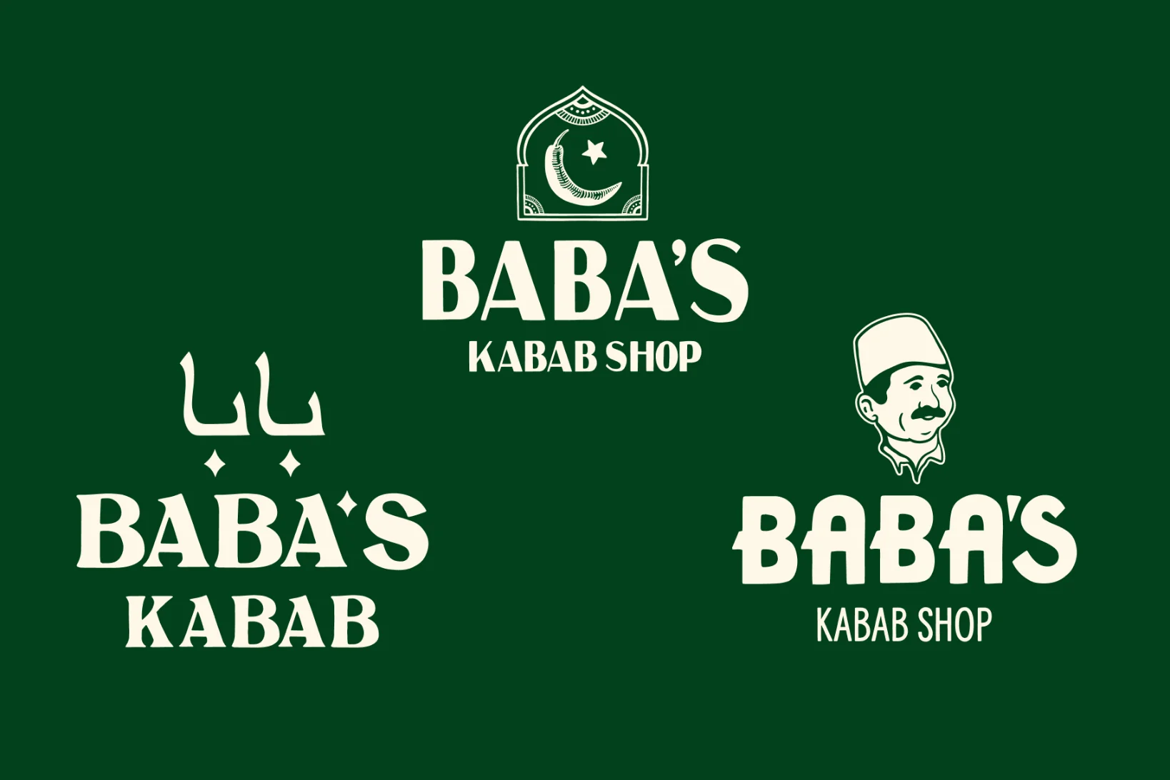
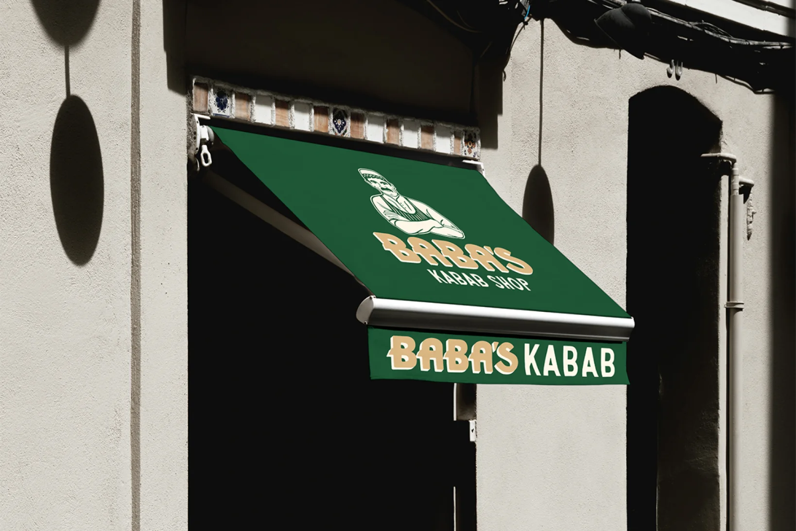
Baba in Pakistan is a term of endearment for older gentlemen. The concept we chose to develop into the final identity is a personification of this term. The brandmark is a simplified illustration that takes inspiration from this term. The hand drawn logotype is inspired by art deco typography from the 1920s and has a premium feel. We have put the emphasis on ‘Baba’ which encourages the user to think of Baba as the person who owns the restaurant. This adds a personal touch. Baba's look and feel is authentic, trustworthy and approachable.
Results
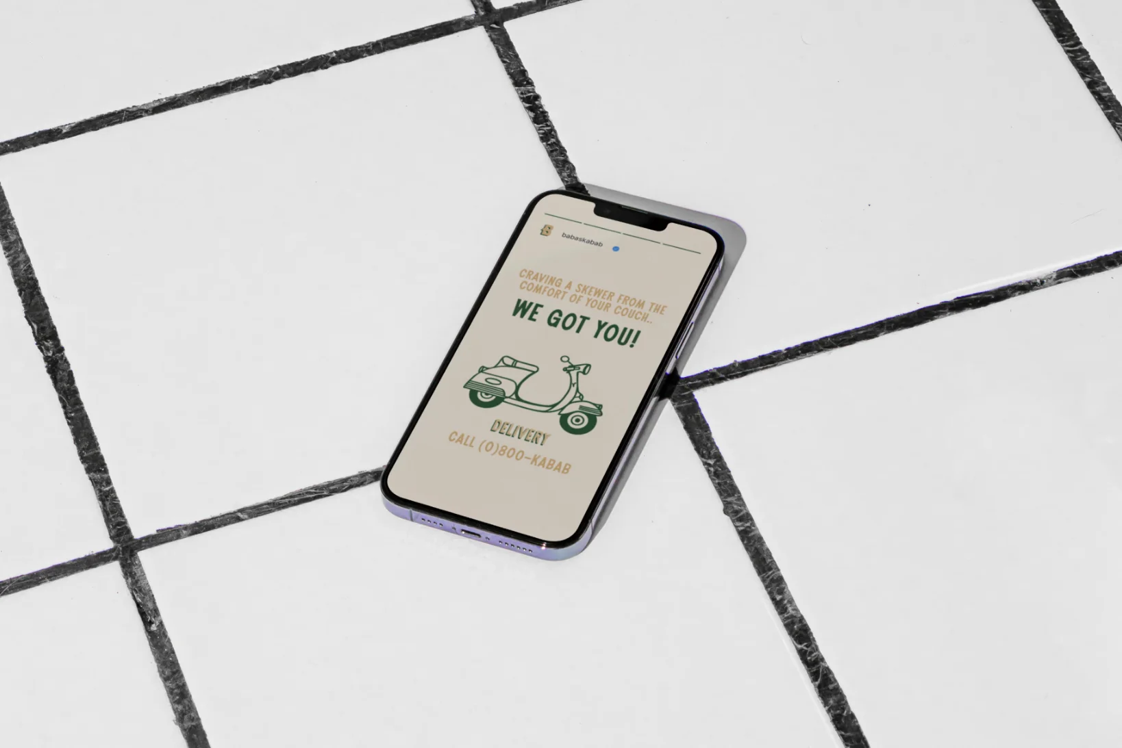
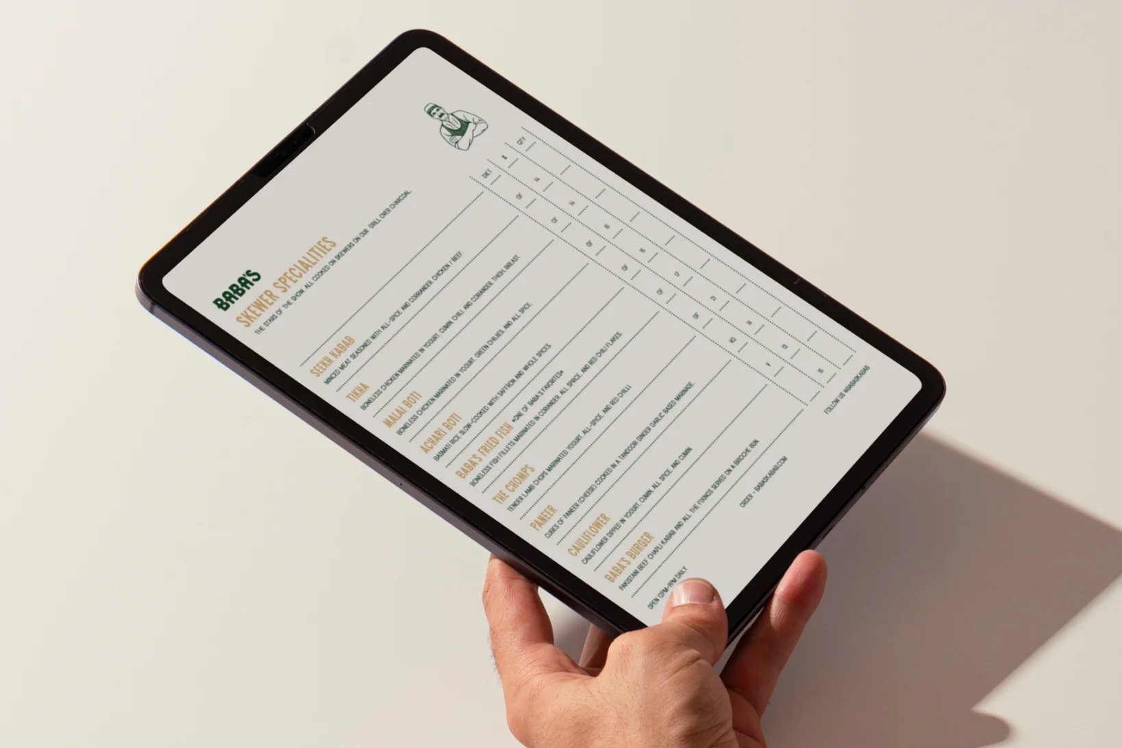
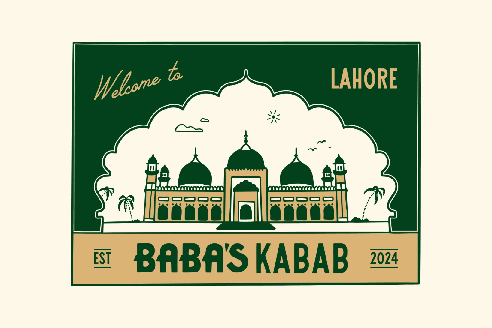
This versatile identity was developed into merch and collateral designs, including menus, signage, food packaging and business cards that will be scalable for Baba's Kebabs to franchise and expand globally.