Nostalgic Ice Cream Truck Branding
Our Process
Paul walks through the project goals, challenges, solution and results for this brand.
The challenge
Byron Bay is a very popular tourist destination, with a high stand of food offerings. Our challenge for Berry Babe was to create a brand Identity that would make this new ice cream stall stand out in the local food markets.
Process
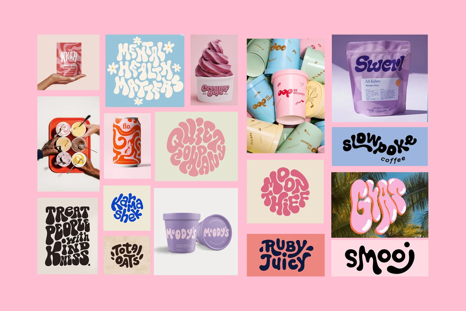
Our moodboard for Berry Baby is equal parts playful, expressive and sweet. These contemporary influences helped shape an identity that would tug on nostalgia whilst flourishing in a contemporary market.


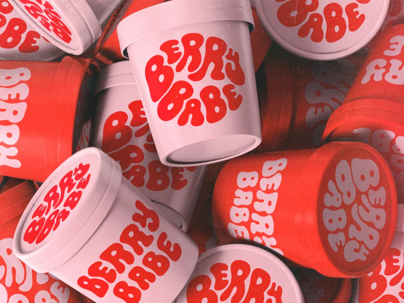
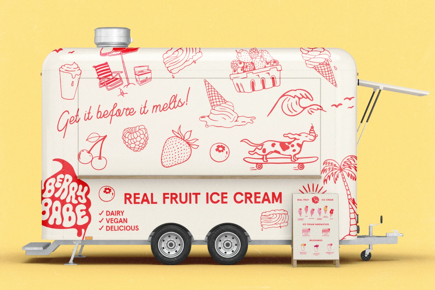
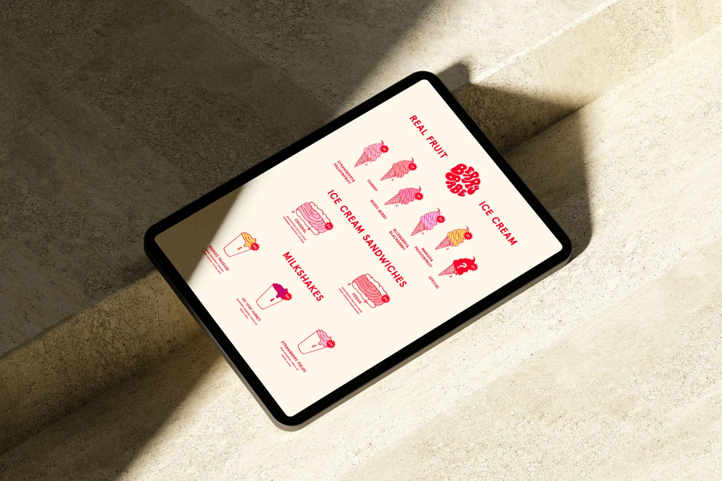
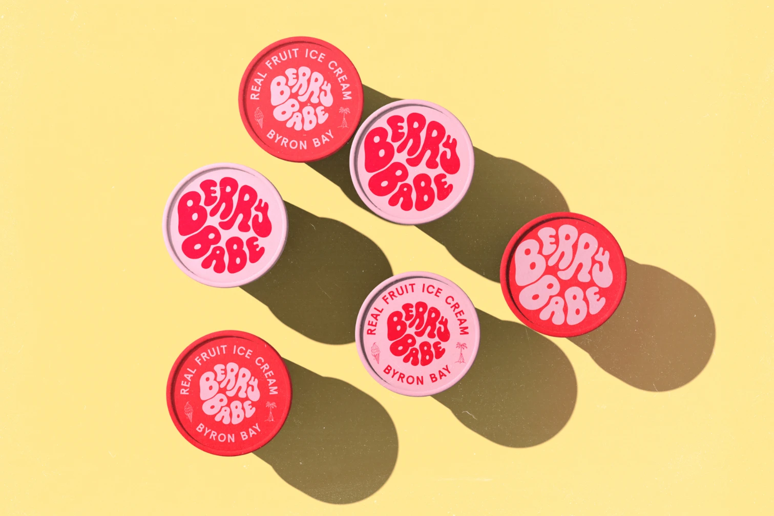
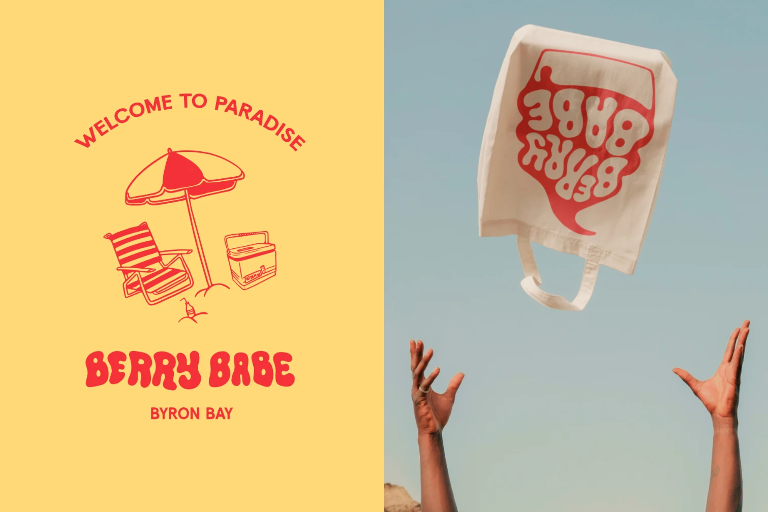
Solution
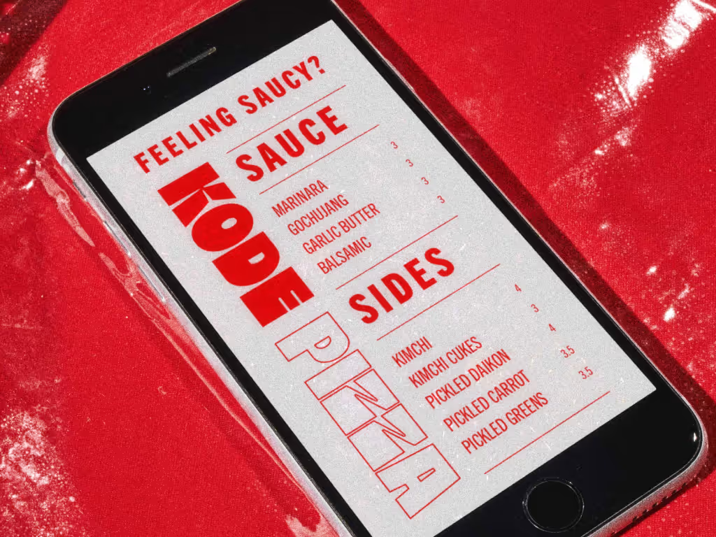
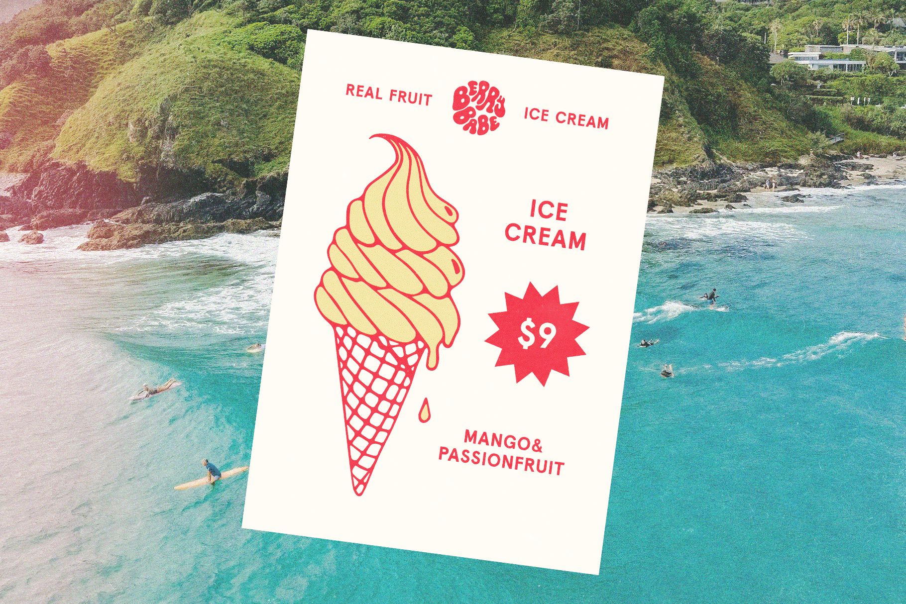
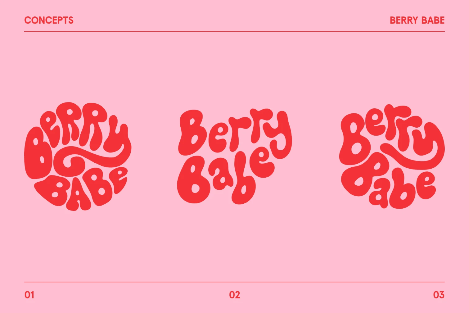
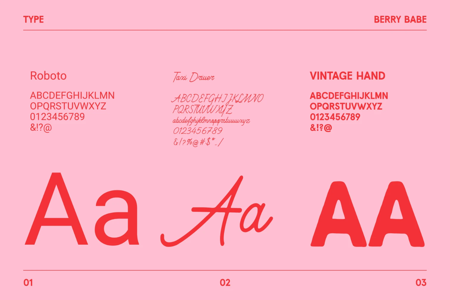
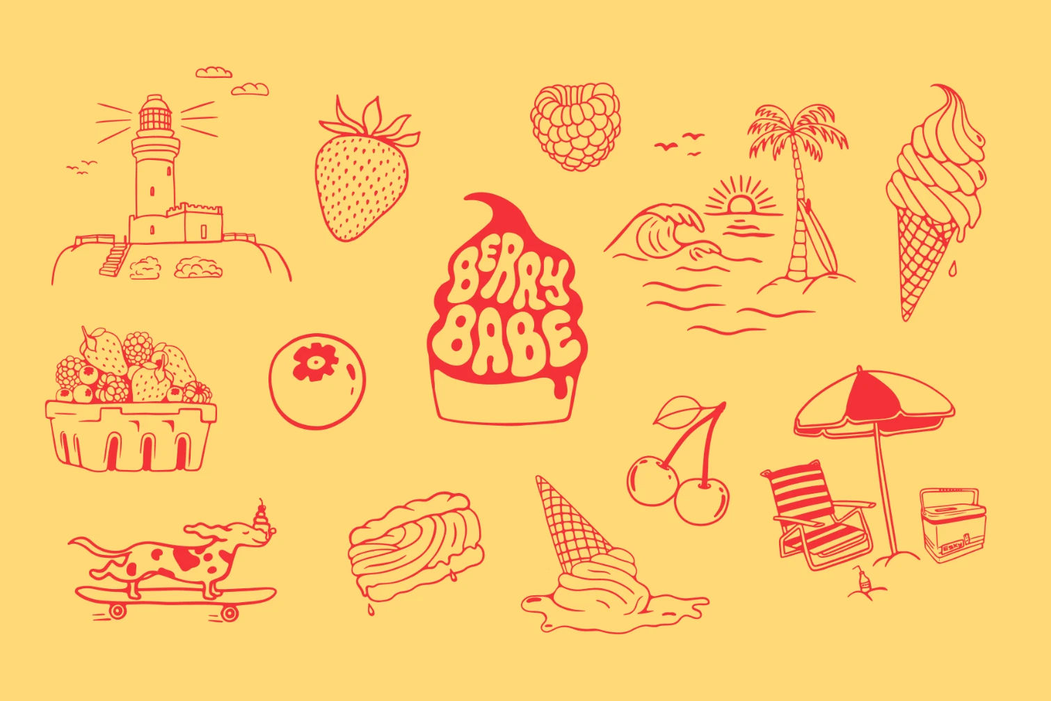
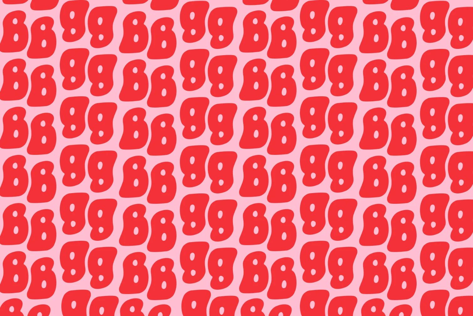
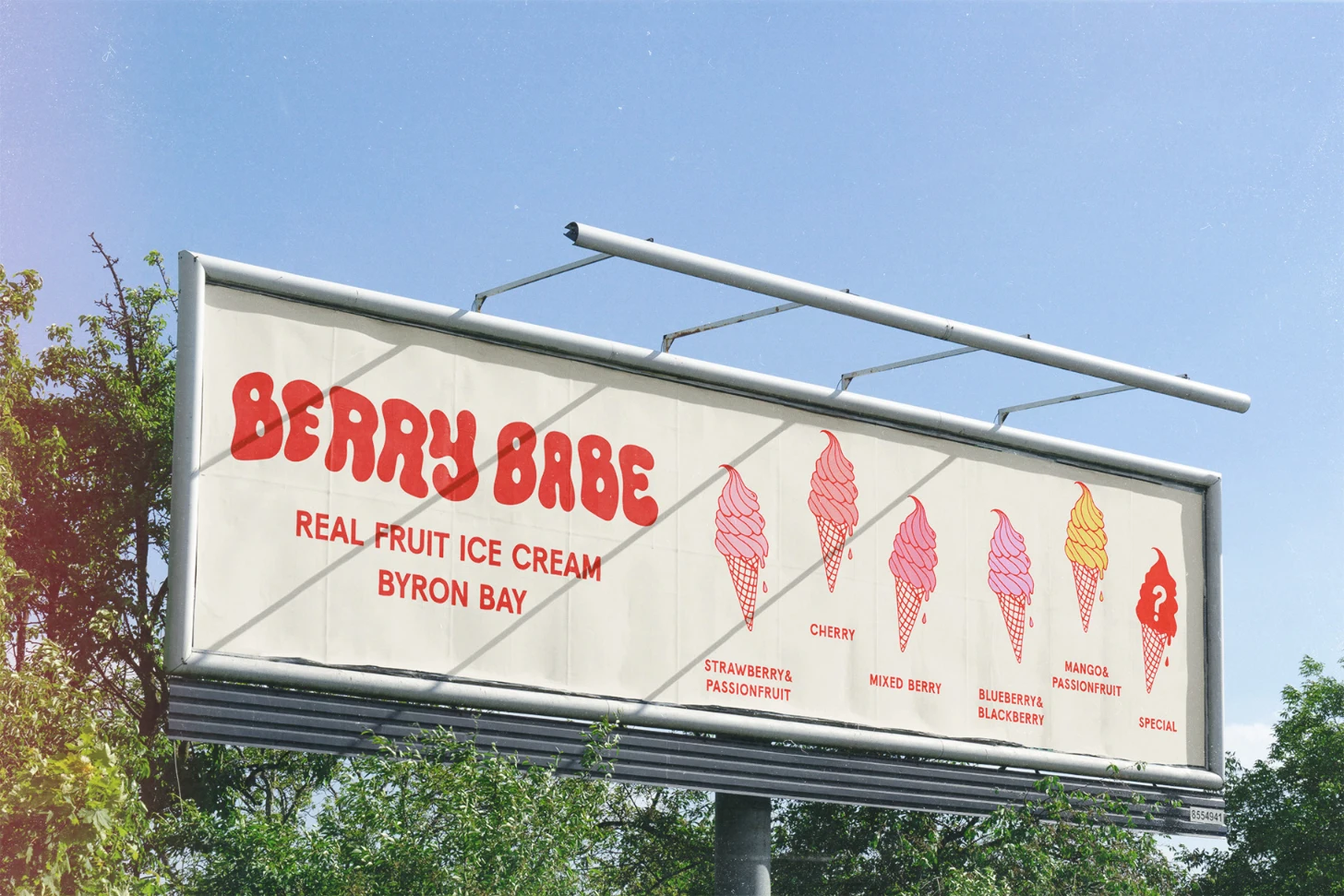
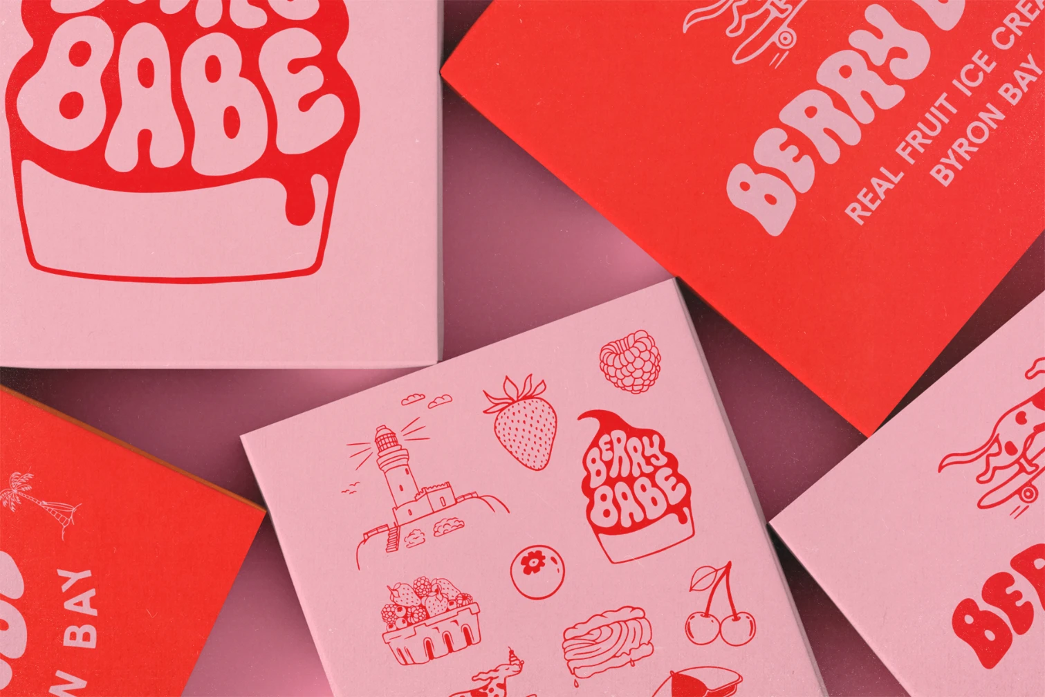
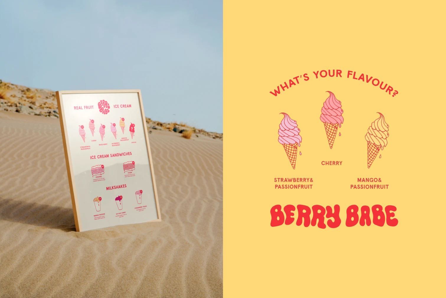
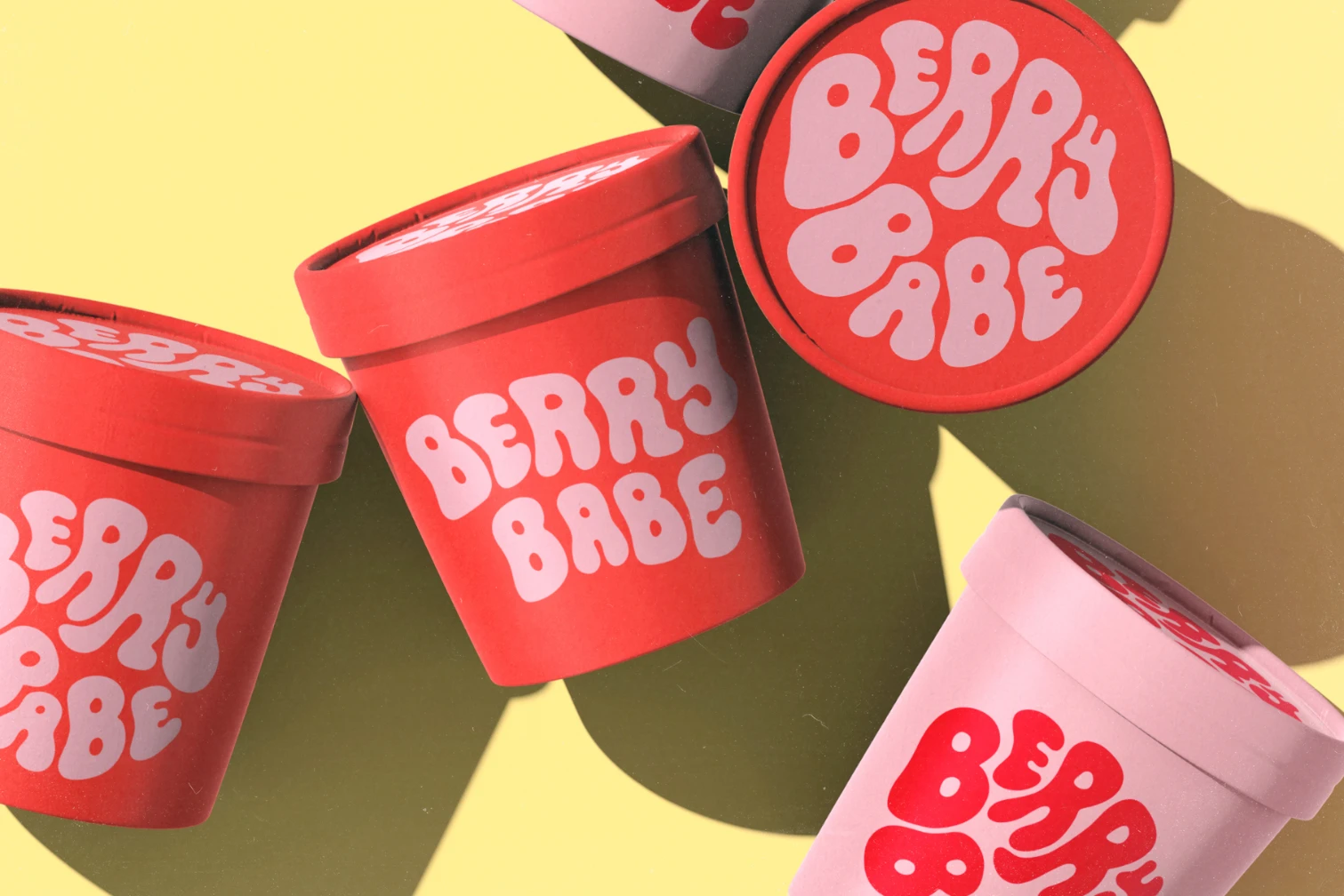
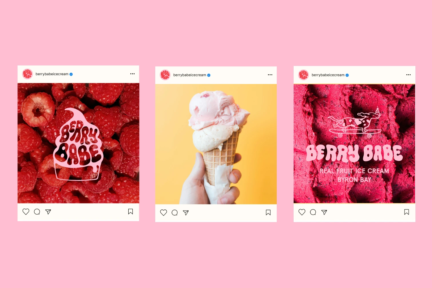
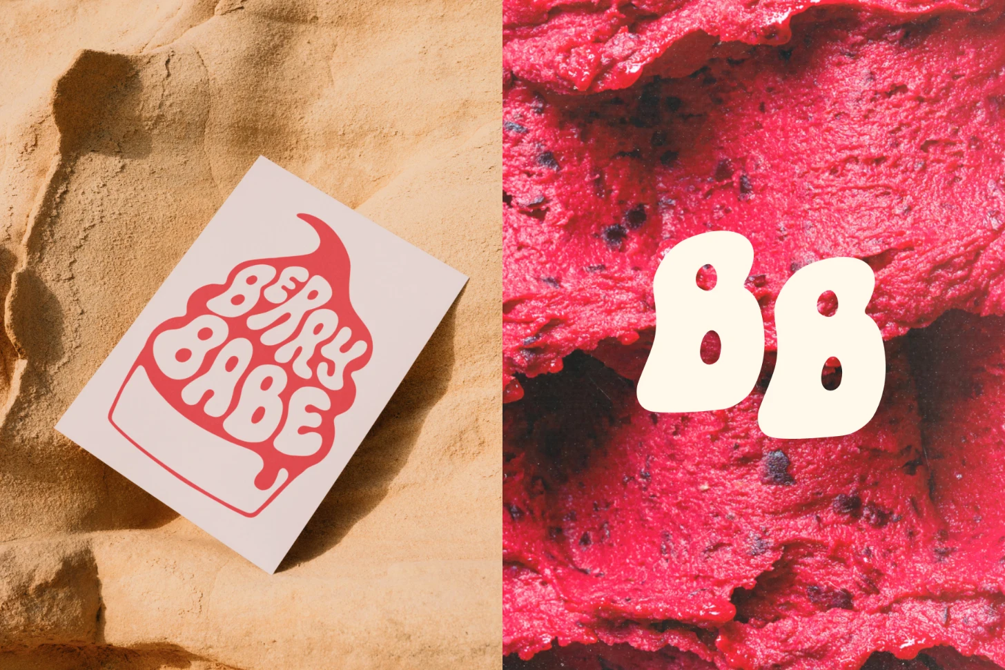
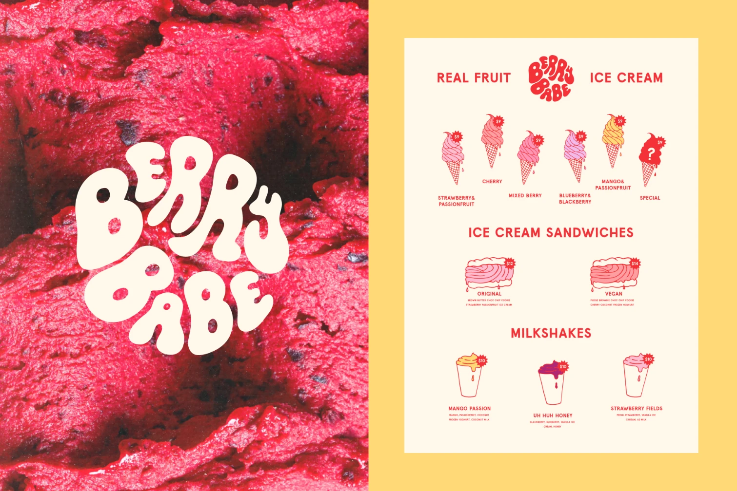
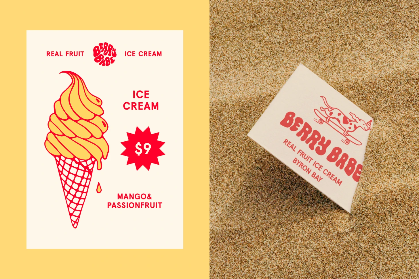
The concept we chose to take forward is representative of the ice cream itself. Its hand drawn custom letters are full of movement. The combination of their gloopy, drippy nature and the sweet colour palette echoes the nature of this all natural berry ice cream. The playful illustrations represent the brand, local produce and Byron Bay Surf culture. The menu is inspired by old school ice cream vans, using the nostalgic stars for price tags as a throwback to when Mr Whippy would turn up at your door.
Results
The result of this project was a nostalgic yet contemporary, playful yet sophisticated brand identity that will make Berry Babe stand out in the food market of Byron Bay. Its identity carries the strength to allow this brand to expand to locations Australia wide. This high impact identity stands out in the crowd, leaving a lasting impact on customers. Our brand identity for Berry Babe transports its clientele to a sweet vacation of nostalgic delights, aesthetic pleasure and culinary magnificence.
Reccomended Projects

This Could Be Your Brand
Take your brand from DIY to dynasty in just 1 month with our Iconic Brand Blueprint.