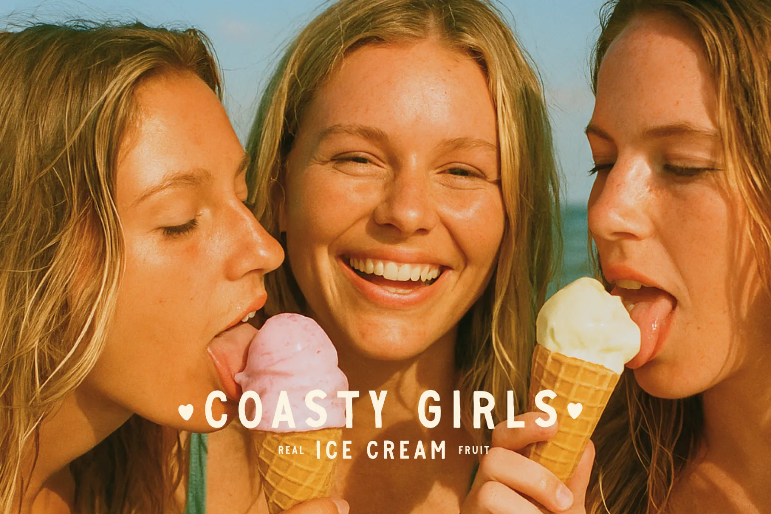
Natural Ice Cream Brand Identity Design
Our Process
Paul walks through the project goals, challenges, solution and results for this brand.
The challenge
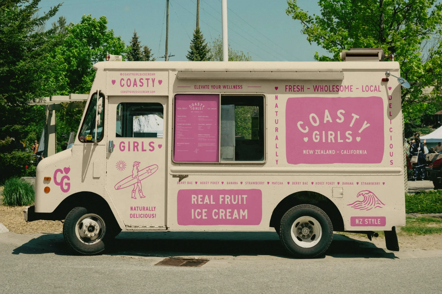
Coasty Girls Ice Creamery is preparing to hit the San Francisco market scene with their natural, real-fruit ice cream. It was already a hit in product testing, but in a city full of food trucks, they needed a brand that would turn heads from day one.
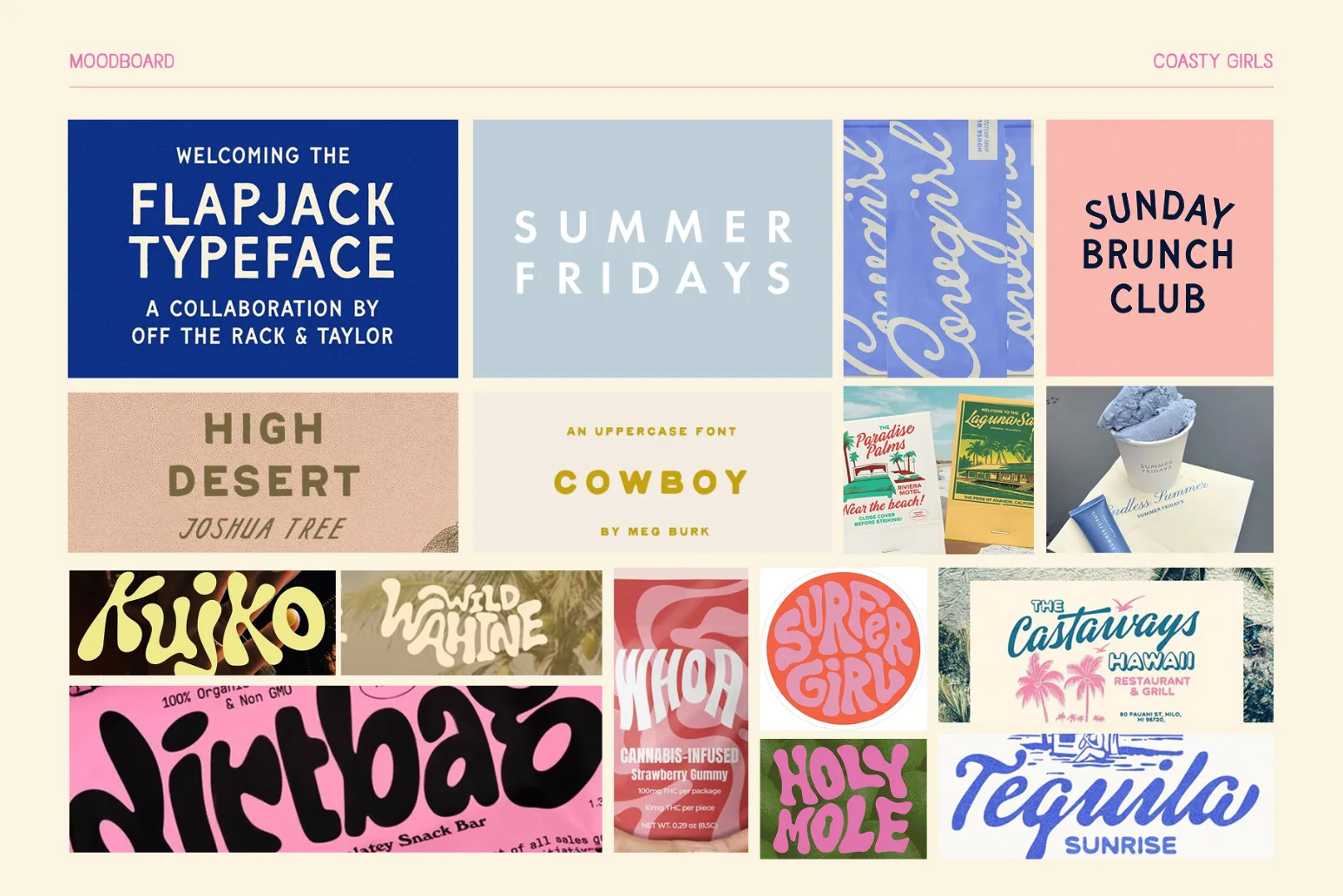
Process
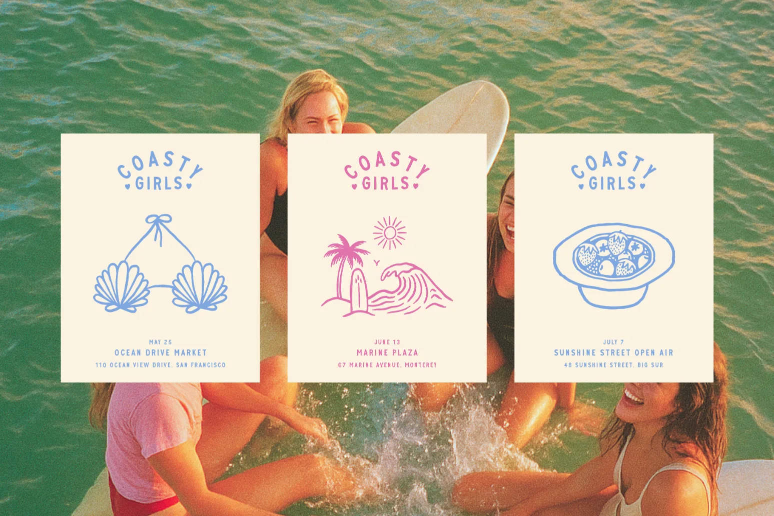
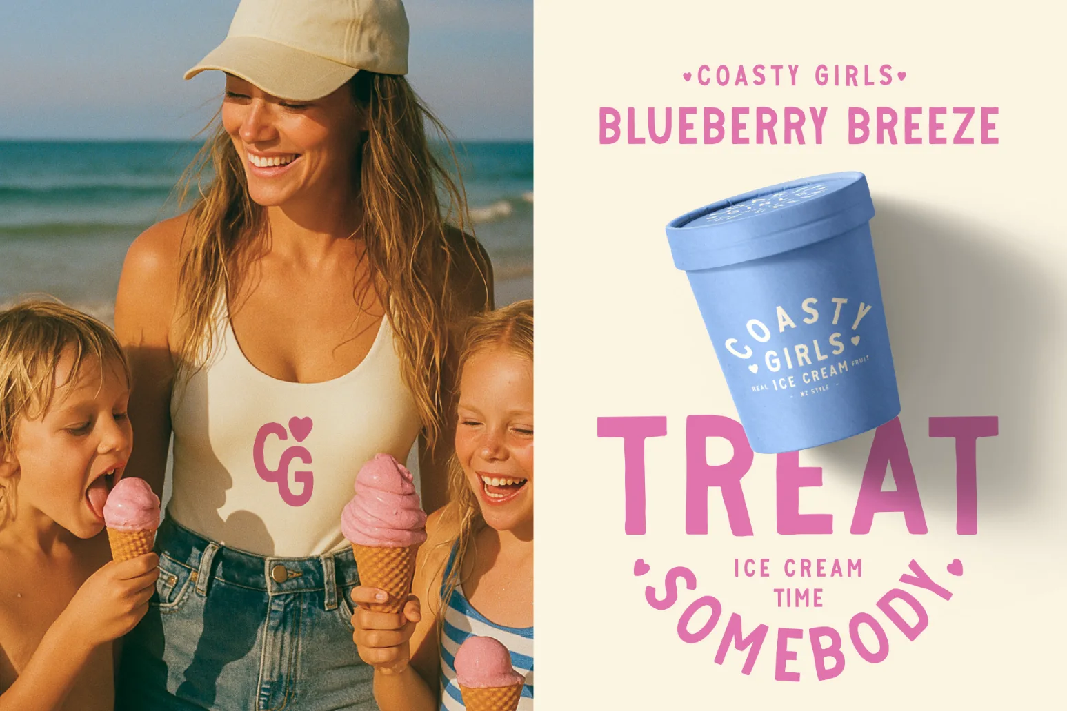
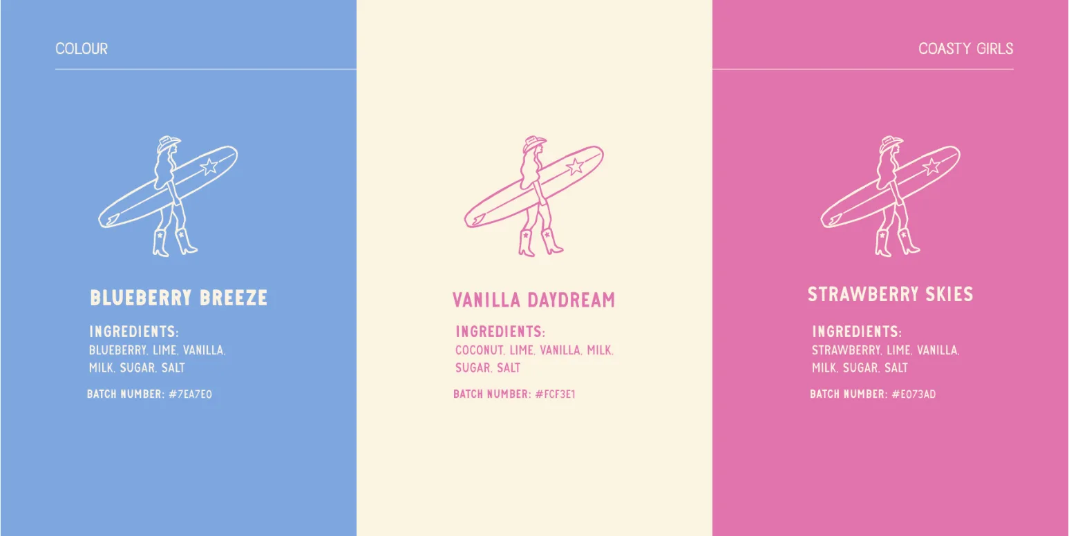
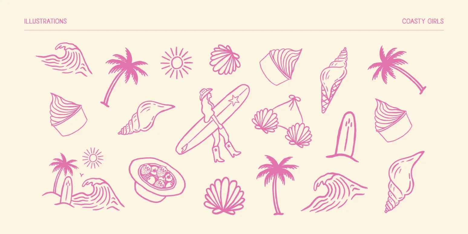
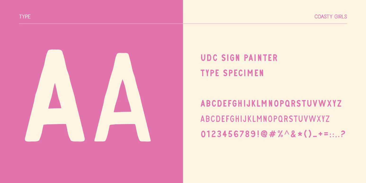
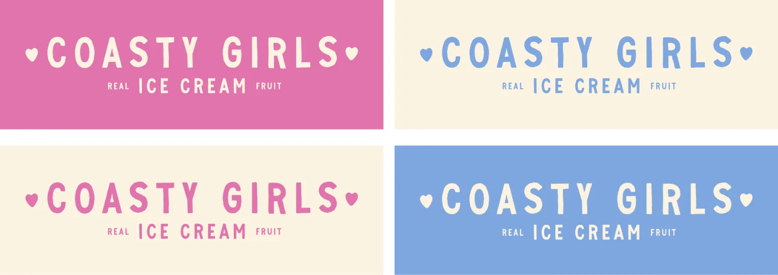
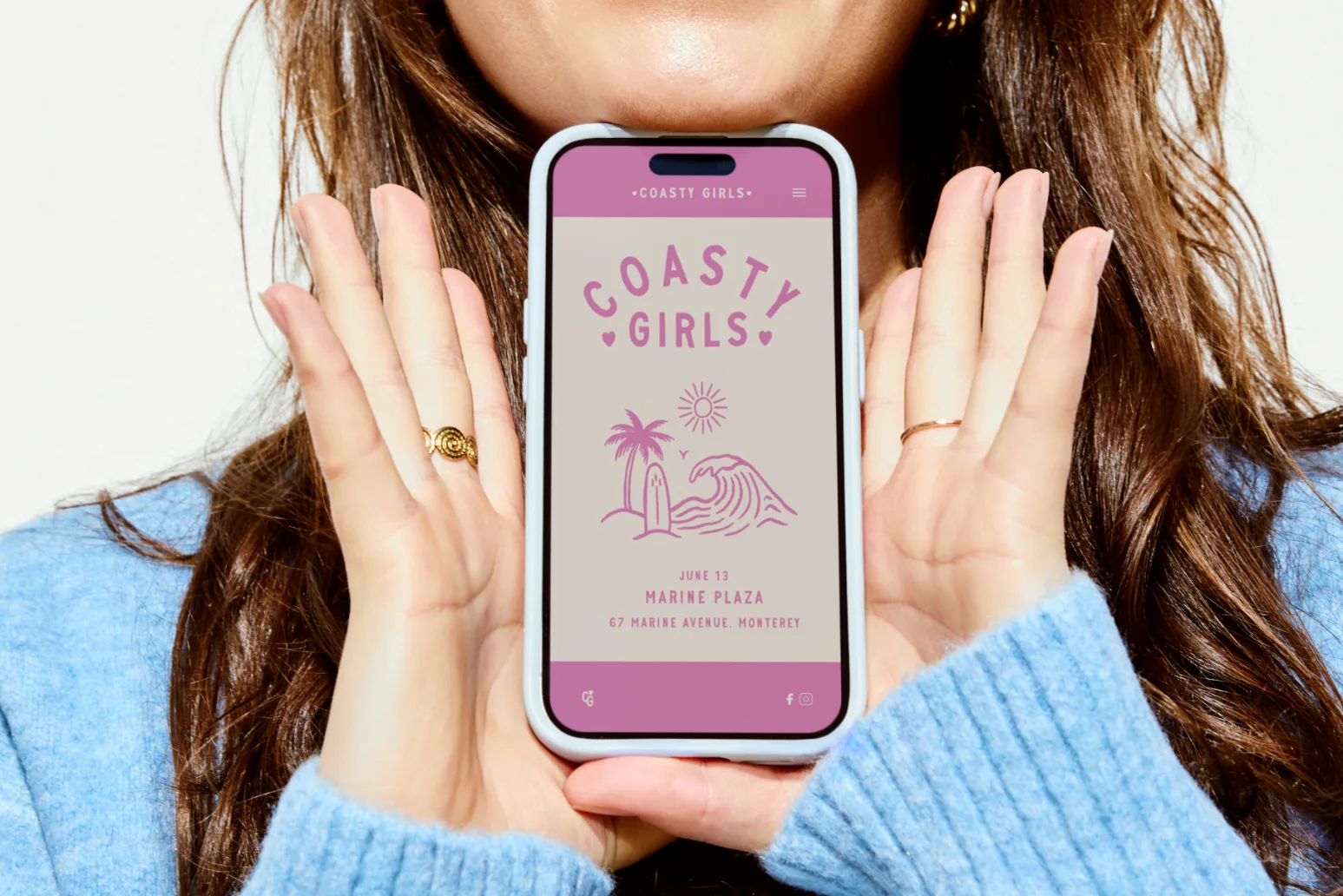
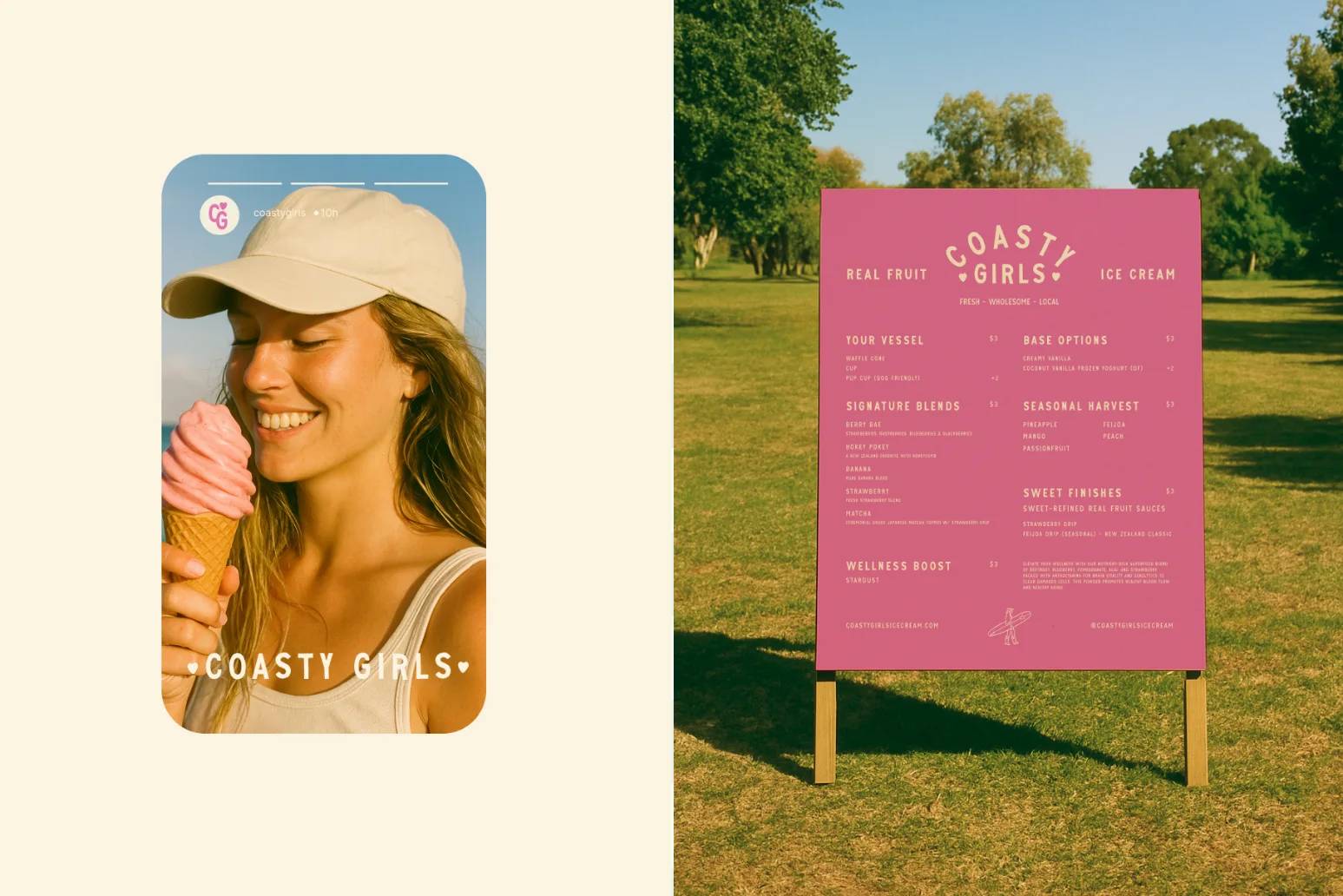
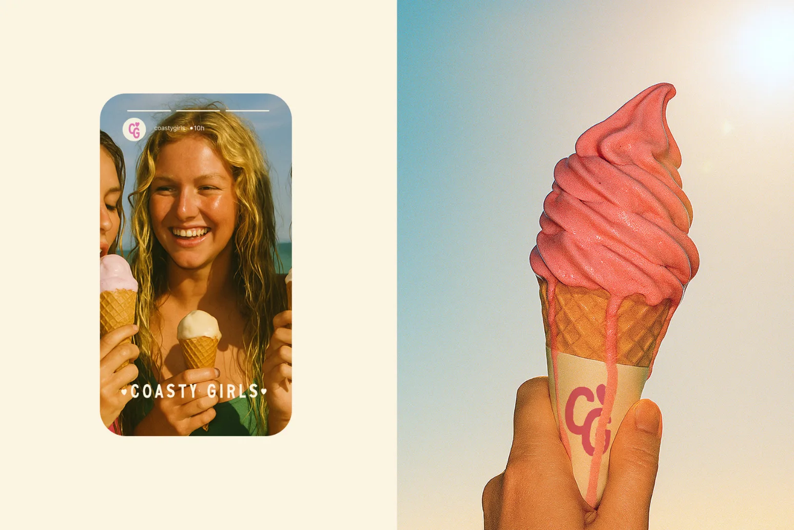
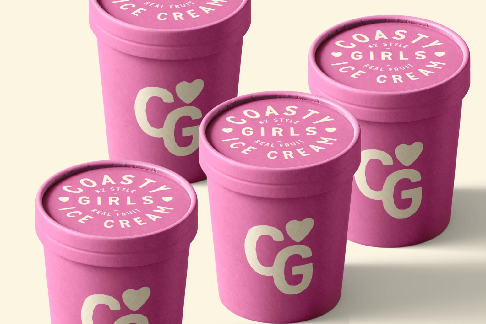
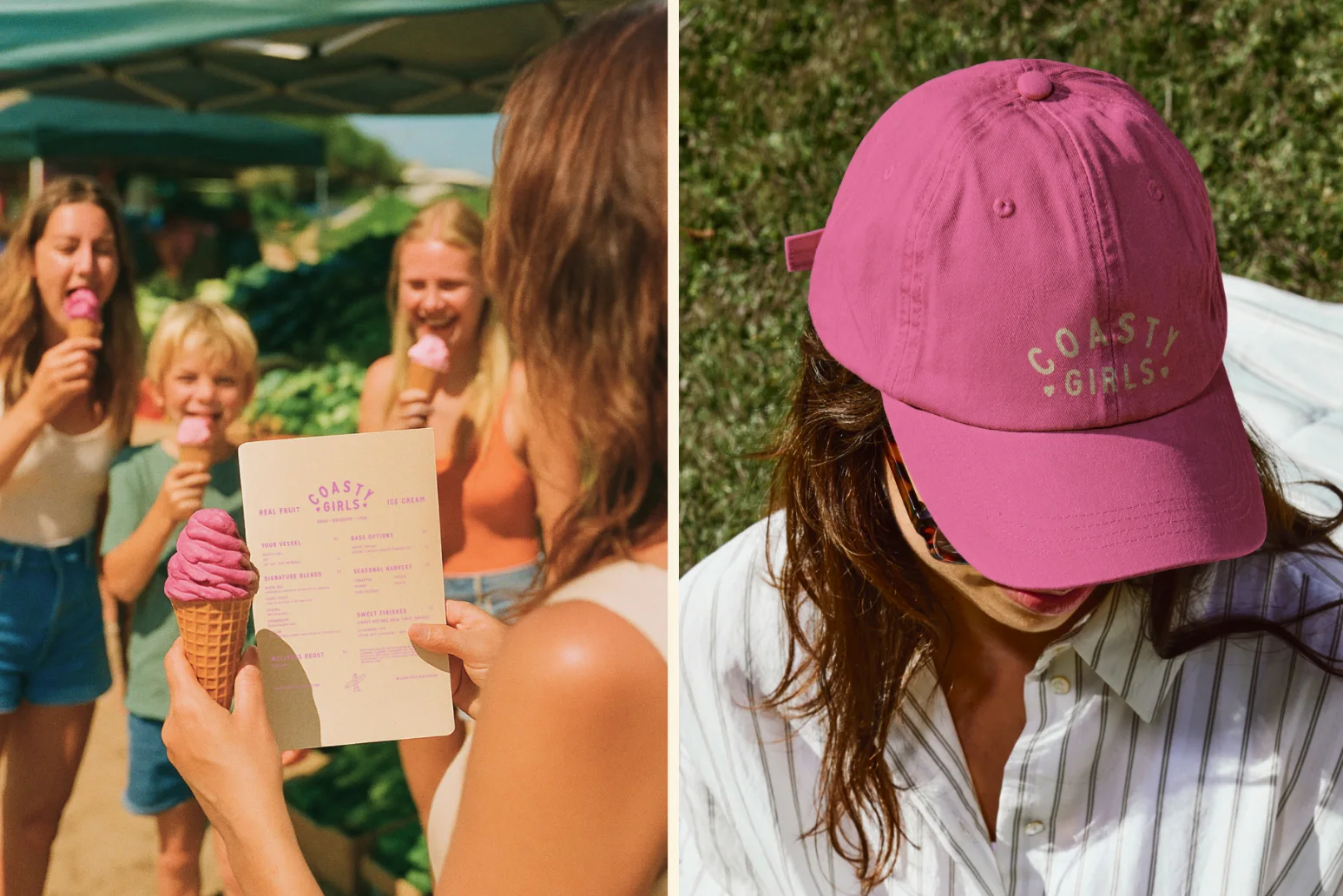
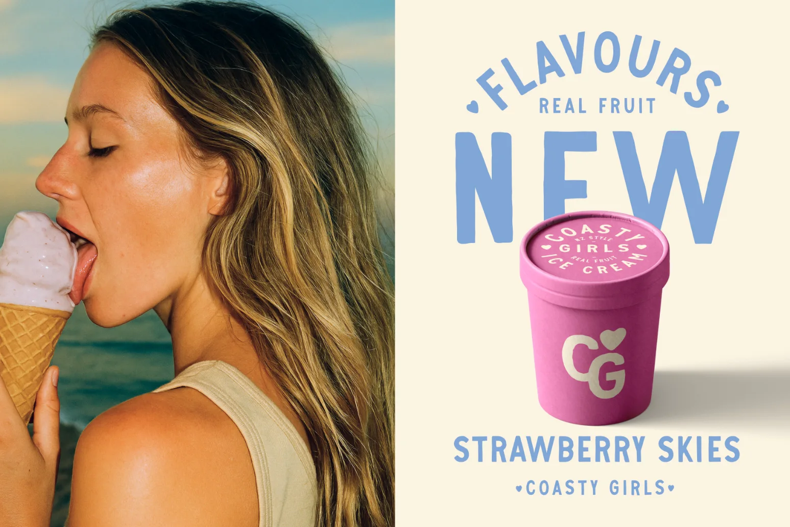
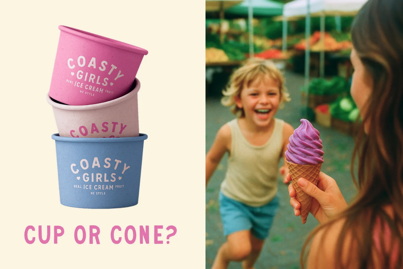
We designed a playful yet refined identity system that balances vibrancy with approachability. The visual language celebrates real fruit with bold colour palettes, organic textures, and hand-crafted design details. Packaging and collateral were built to feel both natural and joyful, while adaptable enough to resonate with eco-conscious families and free-spirited coastal communities alike.
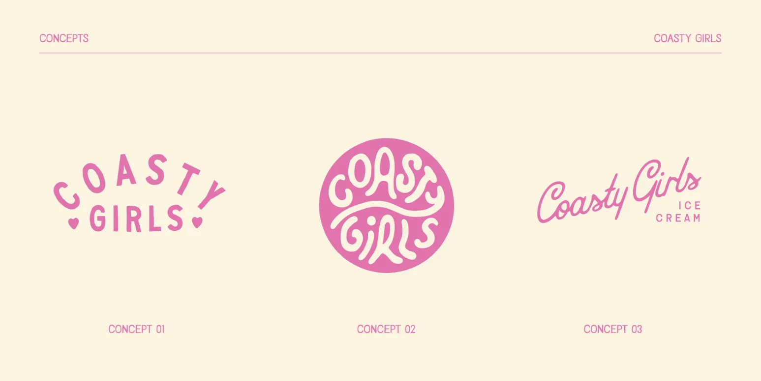
Solution
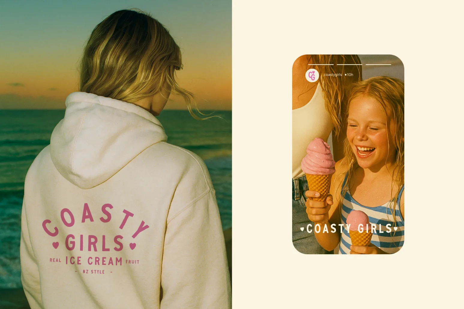
We created a full identity system that blends hand-drawn typography with pastel tones and playful illustrations. The truck wrap was designed to embody the nostalgia of ice cream trucks from childhood memories, with a coastal Californian theme. The tone of voice was carefully crafted to remain playful, authentic, and inclusive—avoiding artificial or exclusive cues. This allowed the brand to stand apart from competitors by speaking with clarity and honesty, while still capturing a sense of fun.
Results
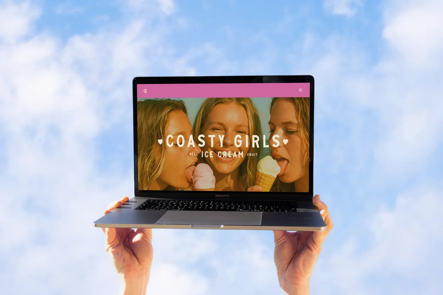
The final identity presents Coasty Girls as a confident, community-led brand ready to stand out on shelves and at the beach alike. The system translates seamlessly across packaging, merchandise, and guidelines, ensuring brand recognition while leaving space for playful expressions that reflect the brand’s personality.

Reccomended Projects


This Could Be Your Brand
Take your brand from DIY to dynasty in just 1 month with our Iconic Brand Blueprint.