Brand Identity for Pizzeria
Our Process
Paul walks through the project goals, challenges, solution and results for this brand.
The challenge
KODE launched in a thriving and popular food court in Seattle. The challenge was to grab attention in this hotly contested location. If successful, the opportunity for growth was huge.
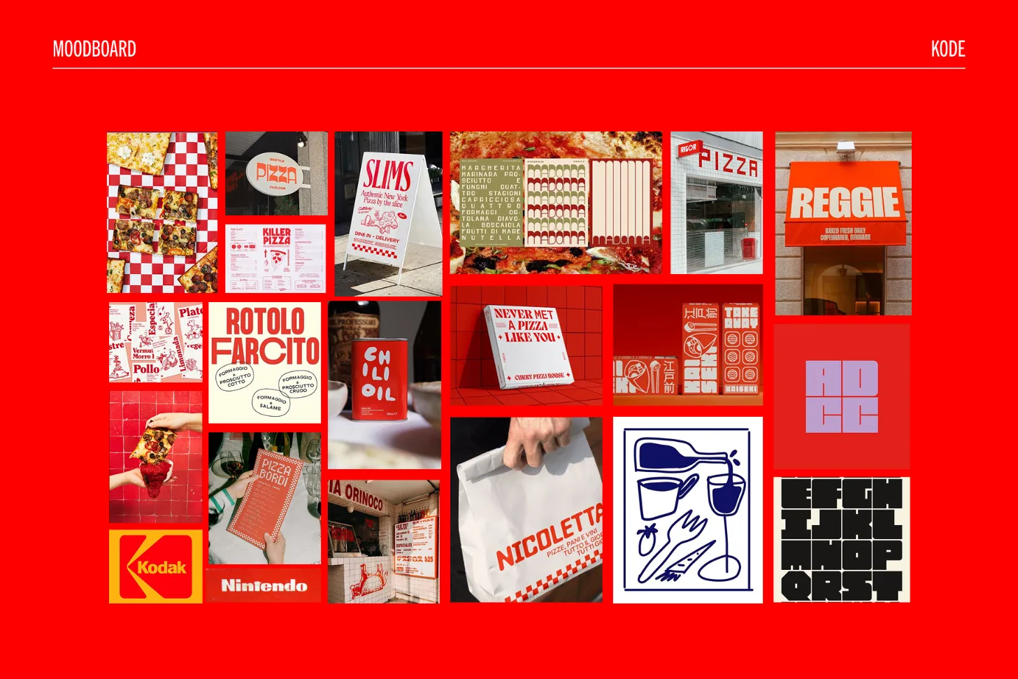
Process
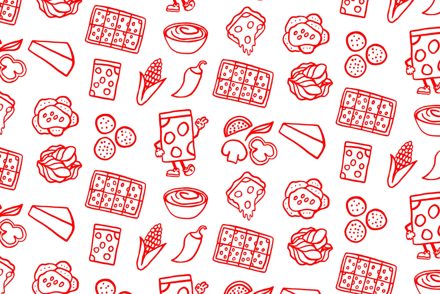
Our mood board for KODE was filled with high-contrast, vibrant, and bold type, paired with playful hand-drawn illustrations. We explored dynamic lettering and the creative use of negative space. These influences shaped a visual identity that's impactful and ready to make a lasting impact in the restaurant scene’s competitive market.
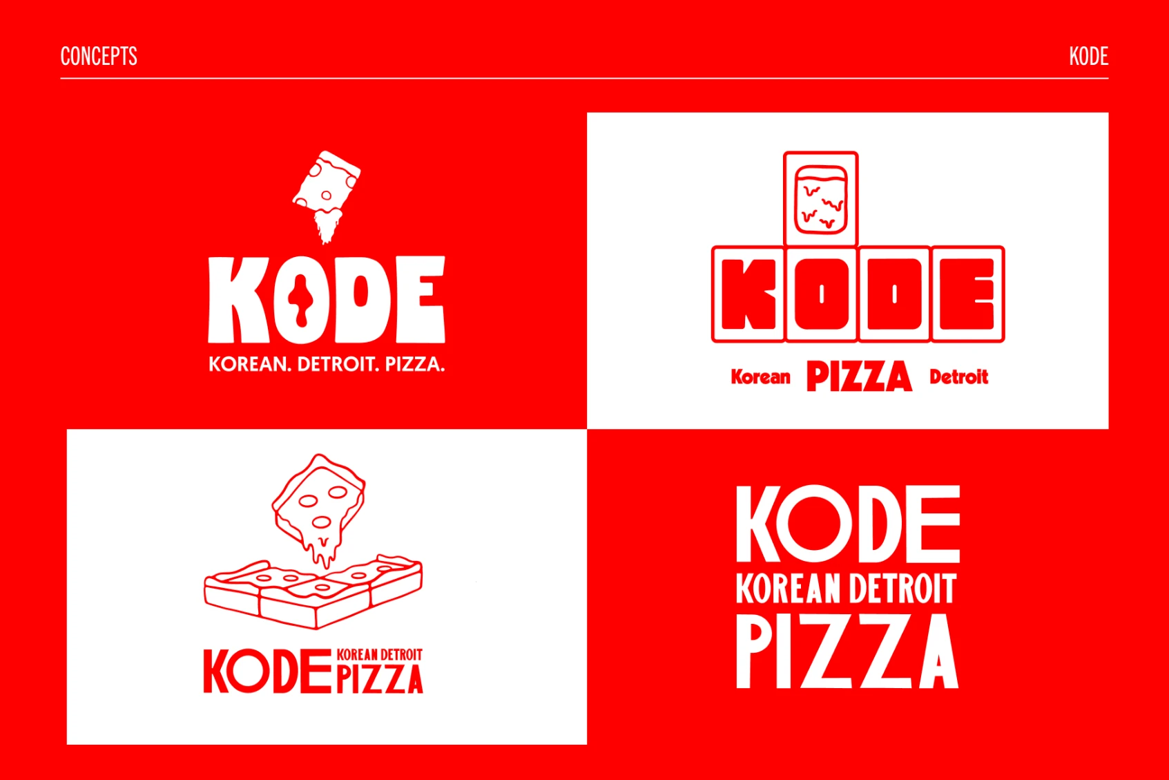

Solution
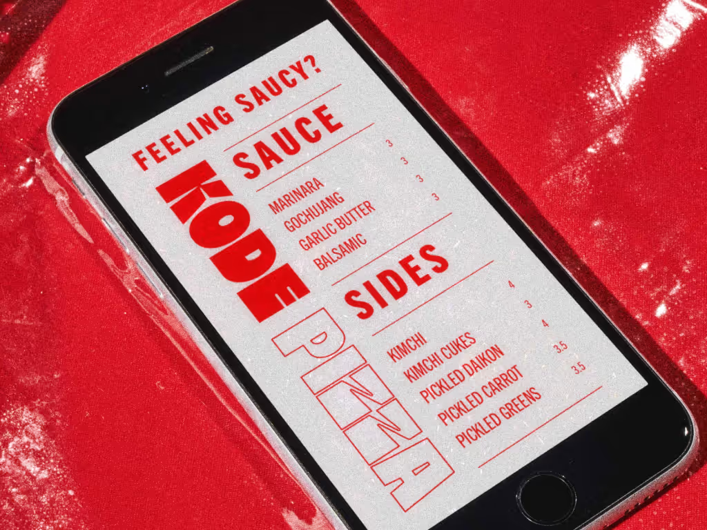
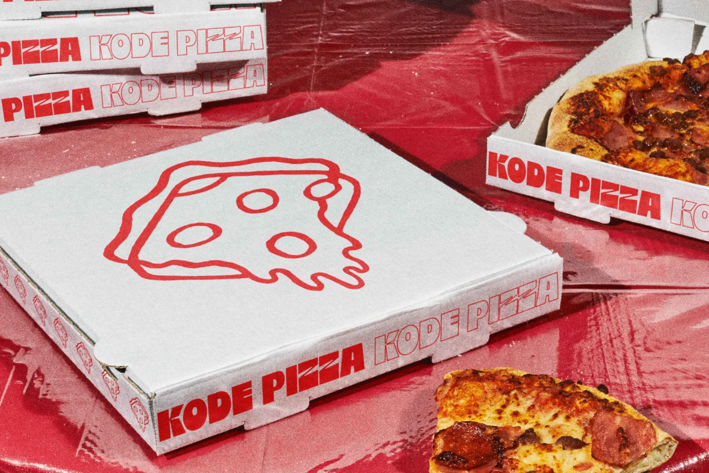
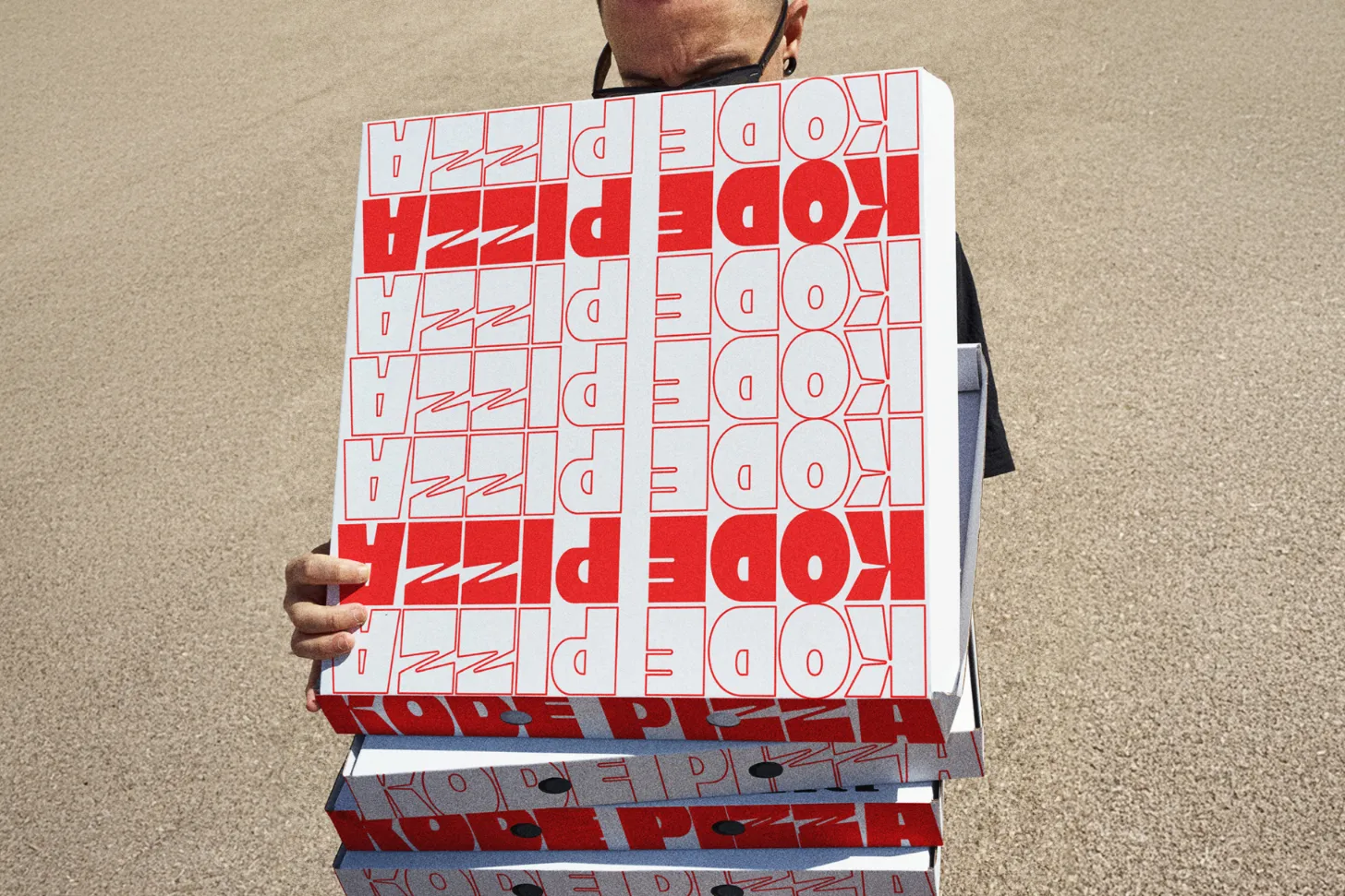
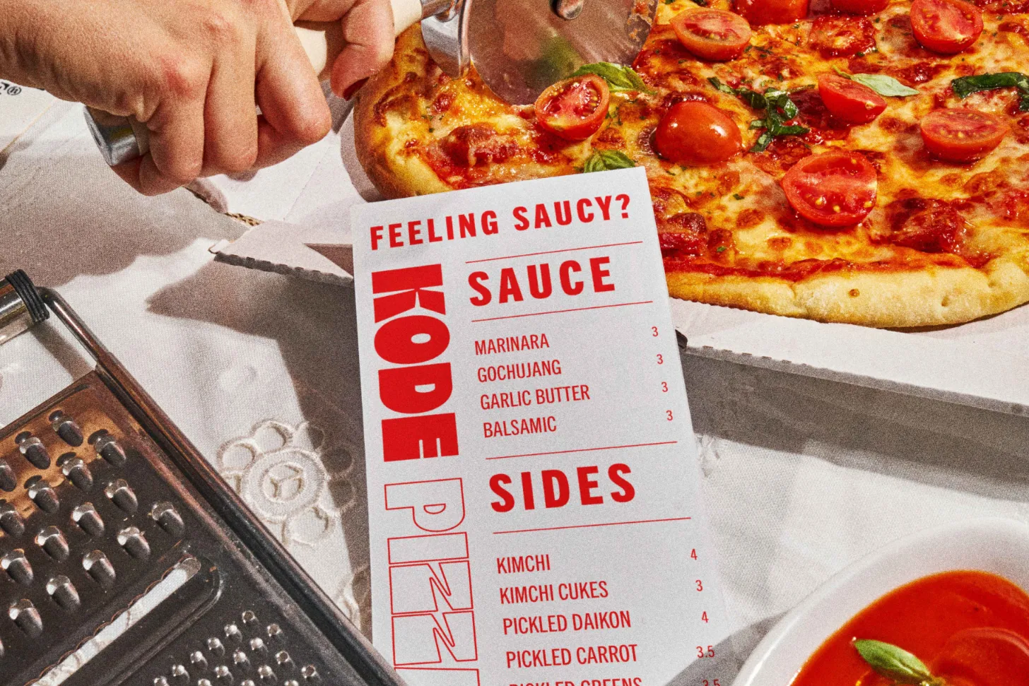
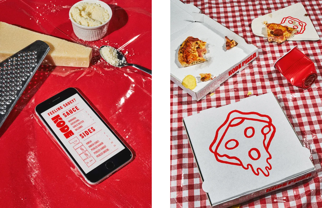
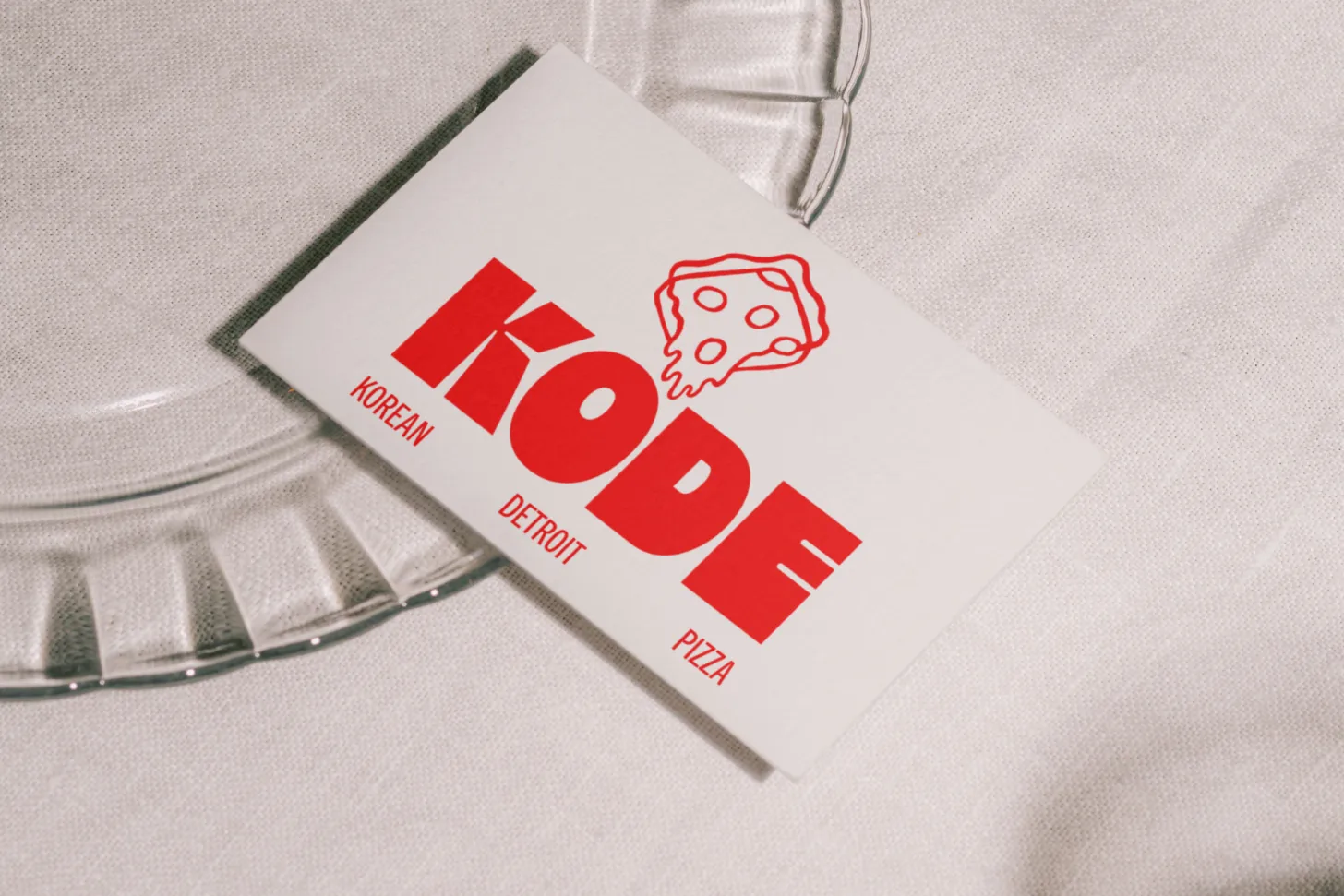
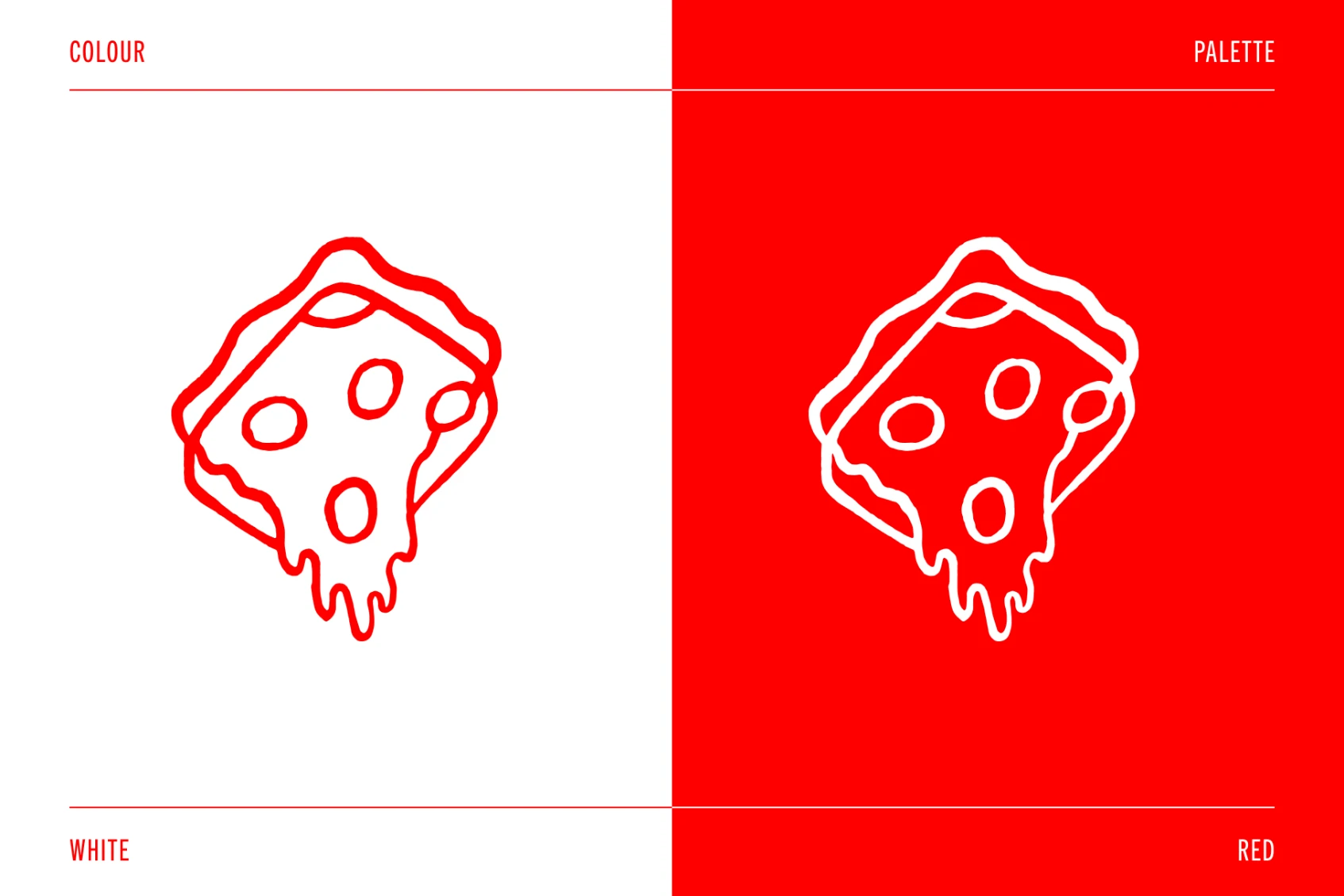
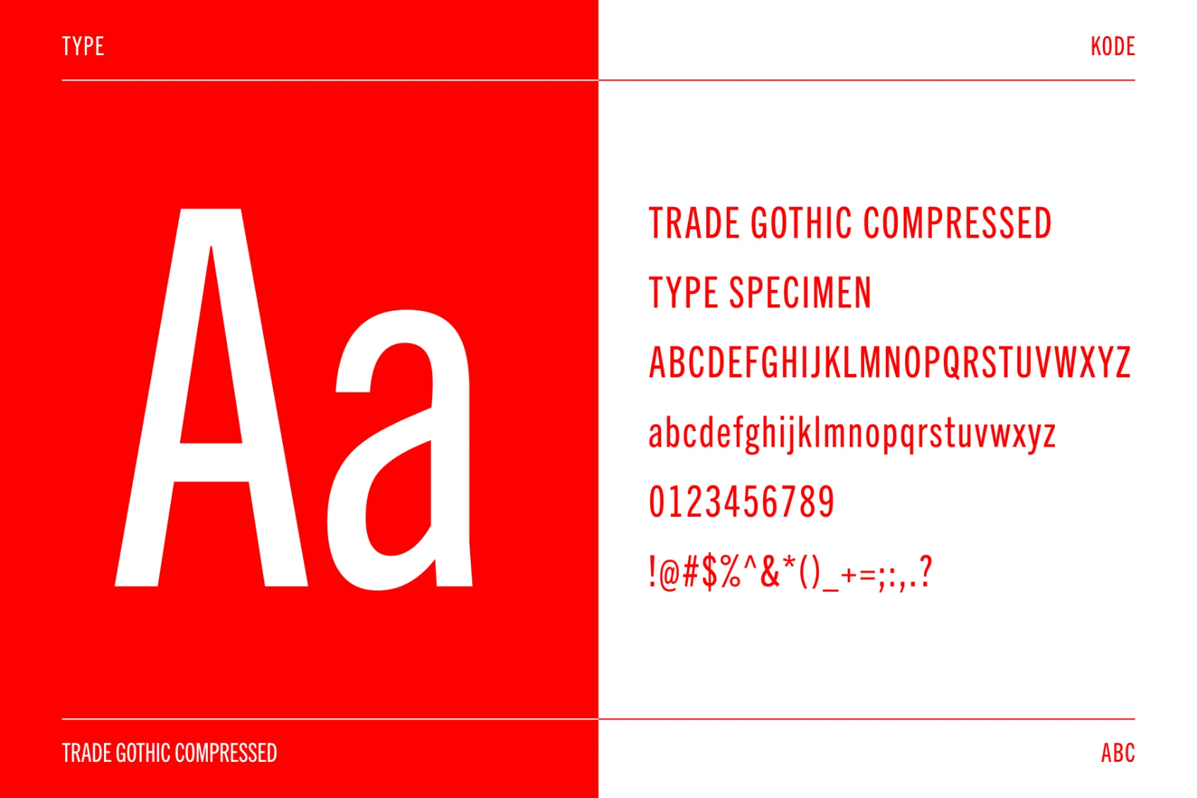
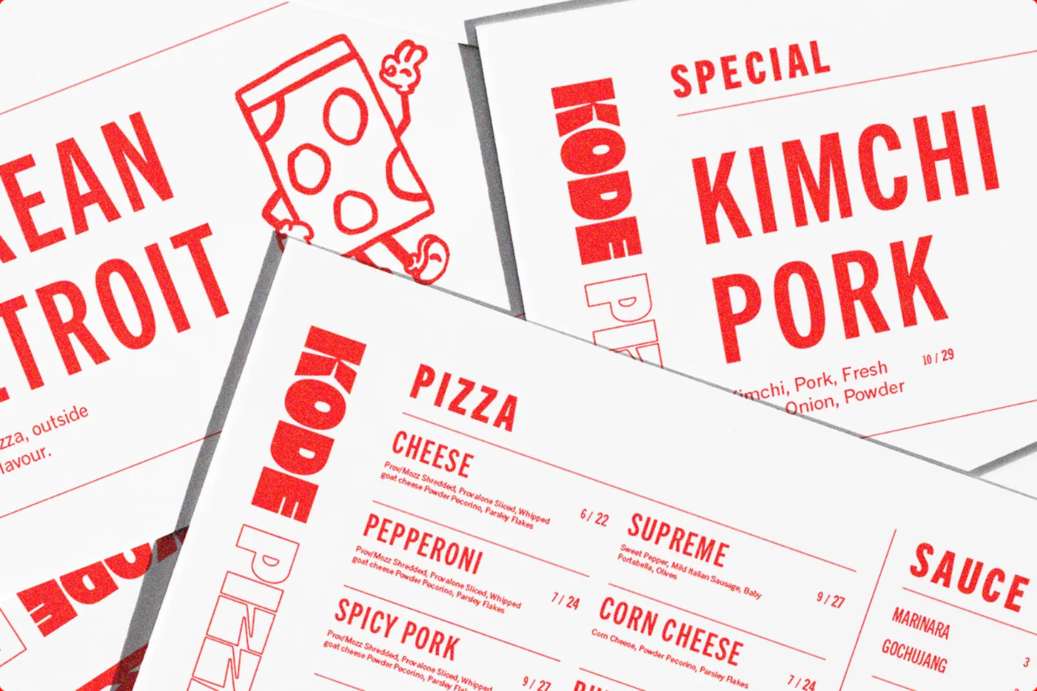
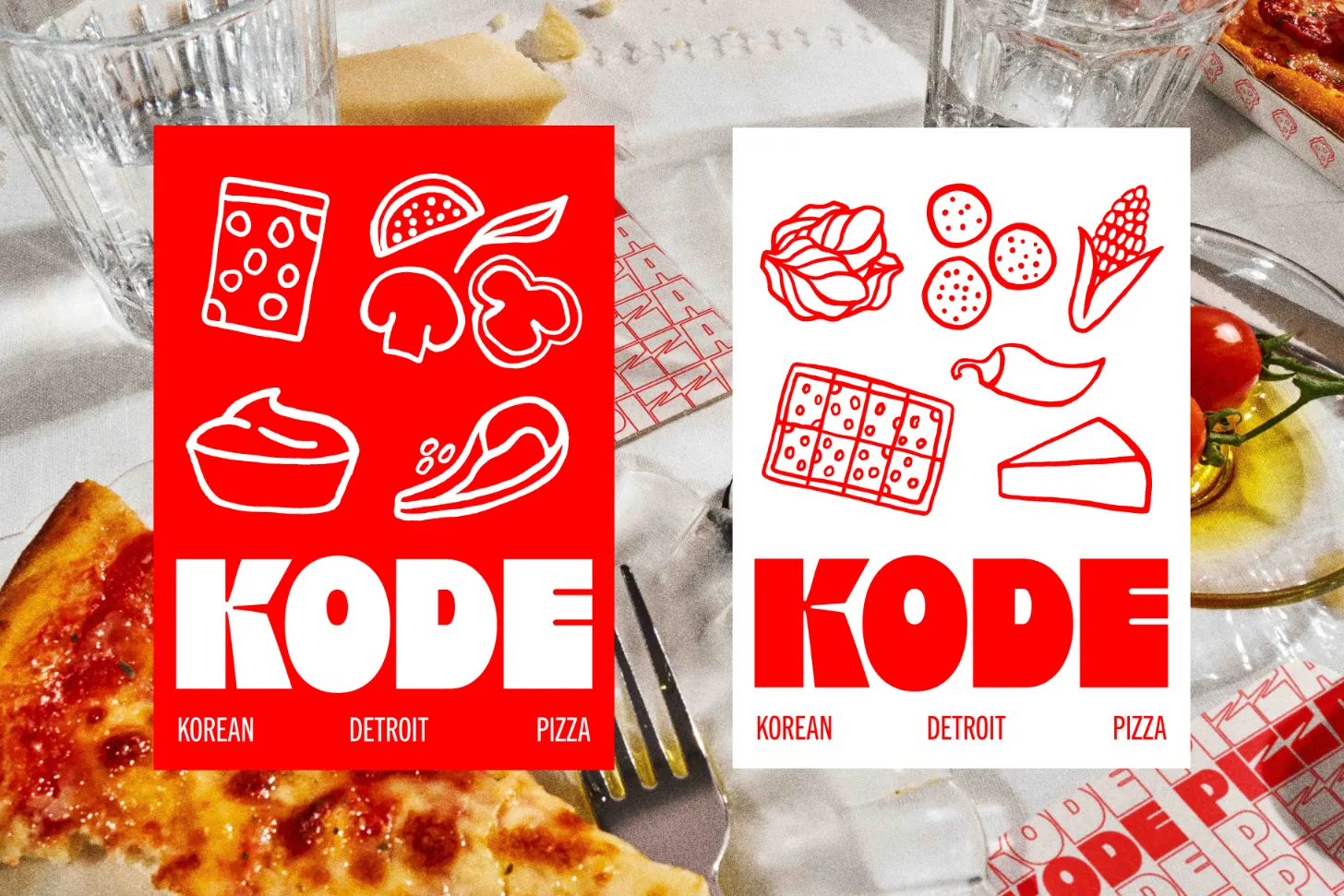
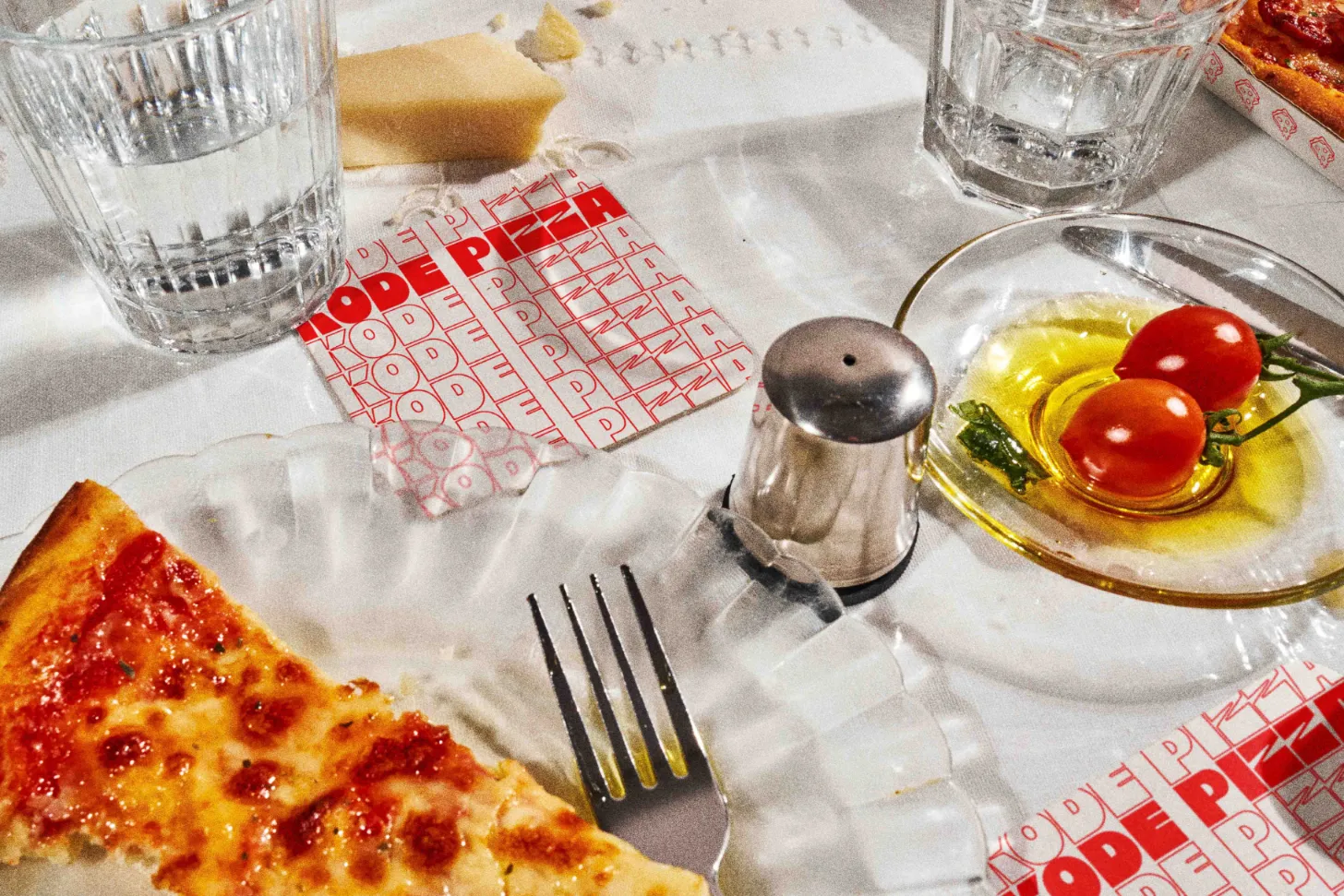
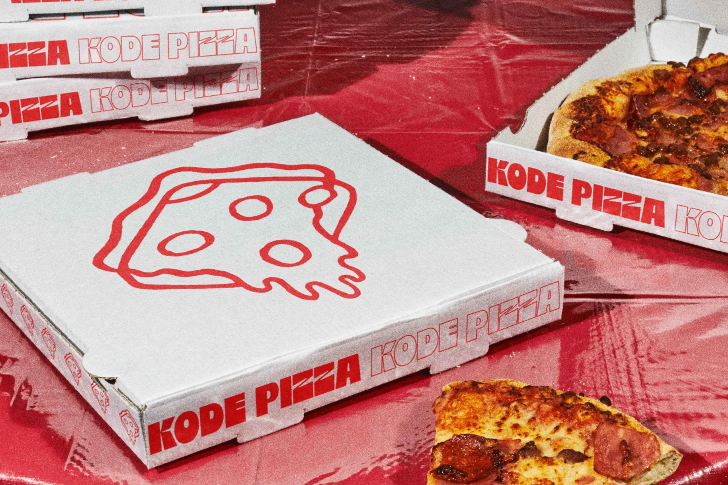
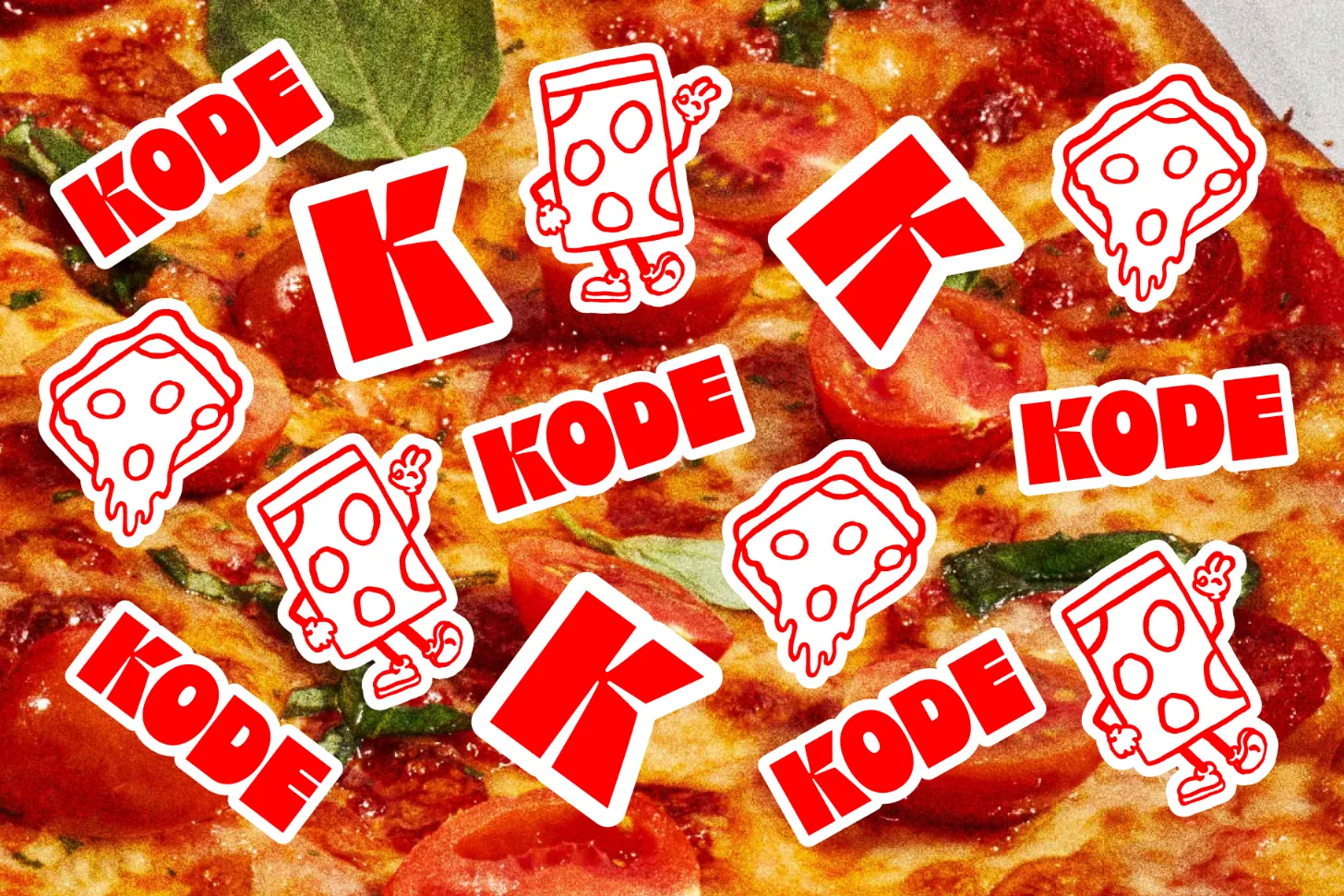
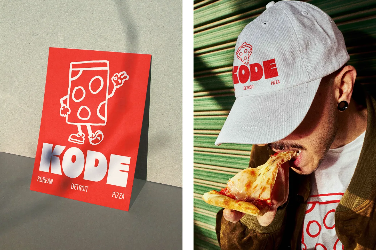
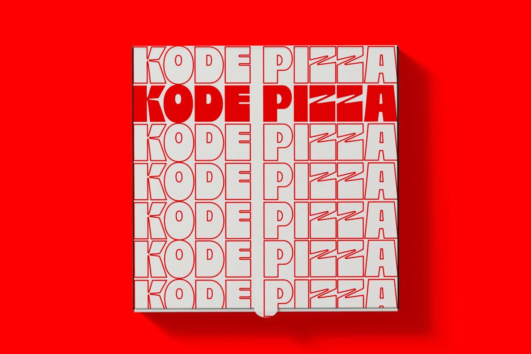
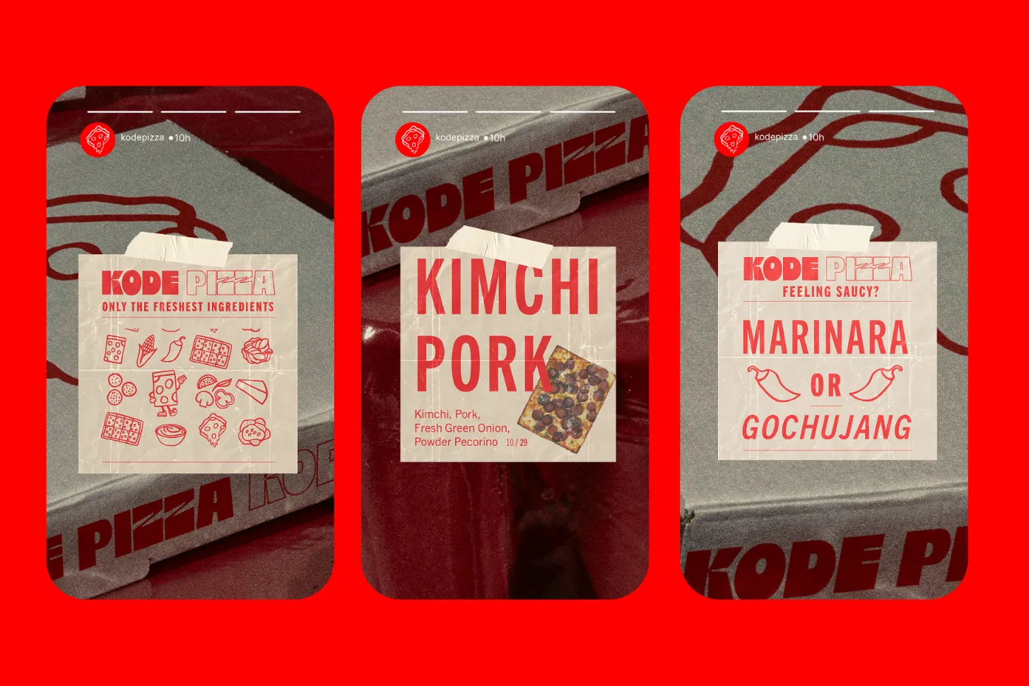
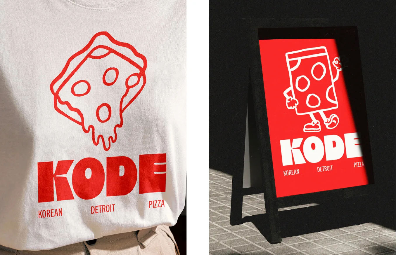
The concept we developed is bold, innovative and sophisticated, much like KODE itself. The custom logotype features chunky, rectangular letters that mimic the thick Detroit-style pizza slices. To keep the design modern and versatile, we paired the logotype with a clean, contemporary sans-serif typeface. A tall, condensed secondary font is used for headings, while a more subtle sans serif serves for copy, giving the identity a progressive, innovative feel. Accompanying the logotype is a hand-drawn brand mark that is playful and memorable, with a dynamic balance that complements the main logo. The colour palette features a vibrant red, paired with brilliant white for bold contrast, creating a modern, eye-catching identity.
Results
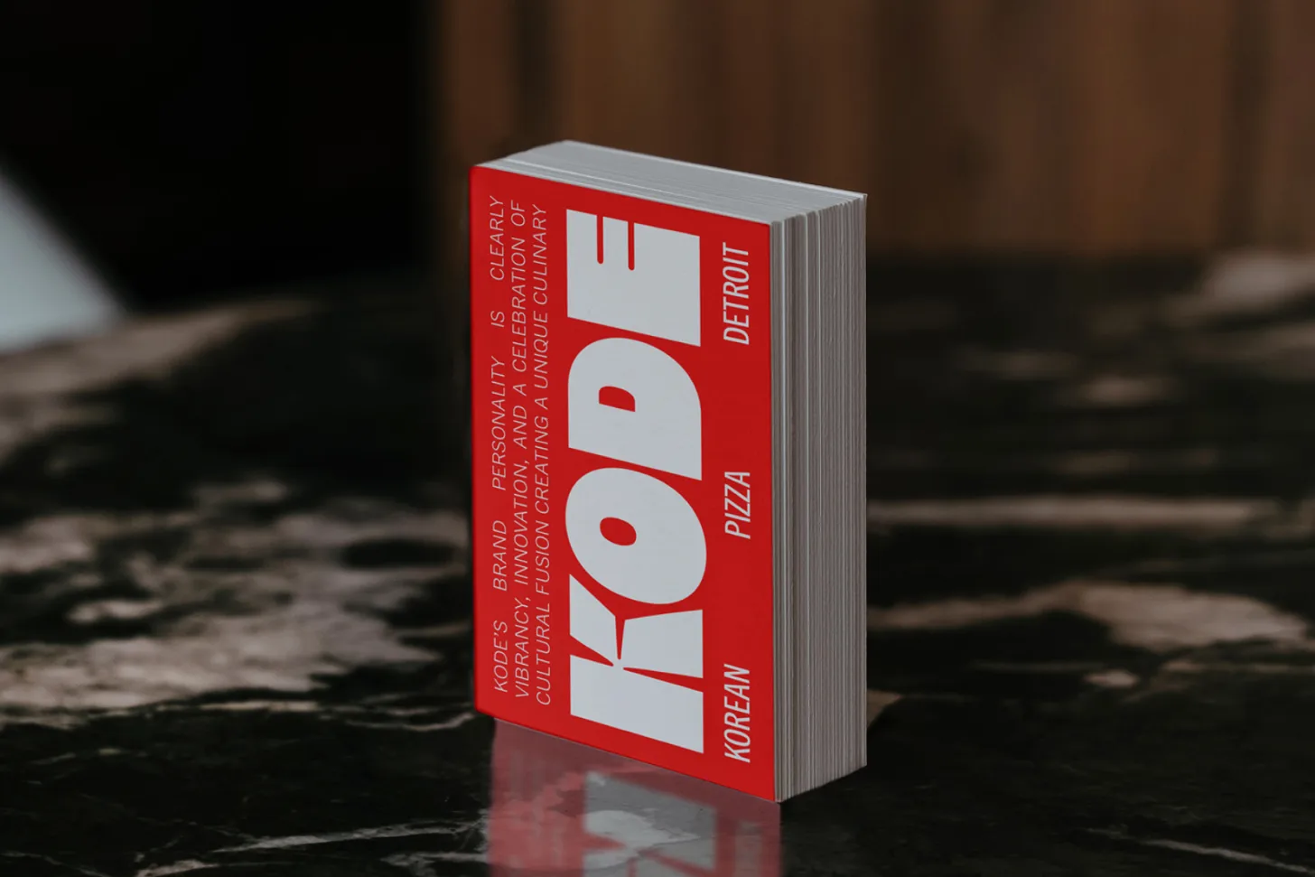
The result is a dynamic identity that perfectly captures KODE’s unique culinary offering that sparks hunger at the first glance. The KODE brand identity blends bold design with playful, hand-drawn details, creating a visually striking and memorable brand. The custom logotype and brand mark reflect KODE’s fusion of Eastern and Western influences. The modern typography delivers a cohesive and professional brand message that ensures it stands out in a contemporary market.
Reccomended Projects

This Could Be Your Brand
Take your brand from DIY to dynasty in just 1 month with our Iconic Brand Blueprint.