Artist Spotlight: Ulysses Design Co.
We were honored to be featured Banabae in their Dreamers series. In this piece, we talk about balancing running a branding agency and family life.
Hey Ulysses Design Co! Tell us who you are.
Hey Banabae! Ulysses Design Co is a brand identity design studio run by husband and wife Paul and Shalina. We specialise in hand-drawn brand identity design for food and drink brands.
As fellow locals to Thirroul, what do you love about living here? Any hidden spots or favourite places you can share?
We are relatively new to Thirroul, but we have already fallen in love! It makes such a big difference to our mood and mental health being able to walk down to the beach each day. Seeing the ocean before we jump into our design work really helps with creativity and productivity. The thing we love the most, though, is the beautiful local community. We have been here for just over six months and have already made so many wonderful new friends with like-minded families. Our favourite spots are Franks Wild Years, Ciros Pizza and Sandon Point Beach.
We’re obsessed with your nostalgic designs! Can you tell us the story behind Ulysses Design Co?
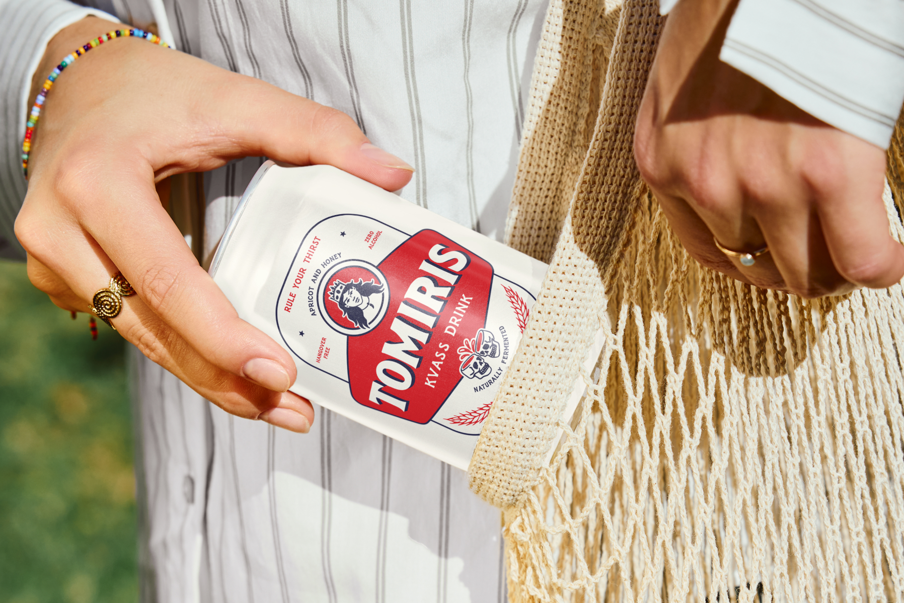
Thanks so much! We love to hear that. We started Ulysses Design Co in 2019 while living in Valencia, Spain. Paul’s background before this was working in creative agencies like Vice and Cornerstone in London. Shalina’s background is in fine art at the National Art School and visual merchandising for luxury brands like Channel. We wanted to work on something more creative and hands-on with more independent brands. We are so lucky that all our clients are super like-minded and lovely to work with. The branding journey we go on with our clients to bring their food and drink brands to life is so fun and collaborative that we love the process.
Is there a particular project you’ve worked on that stands out?
We just finished up the brand identity for a stage at Glastonbury Festival called San Remo. This was such a fun concept to work on. The brand narrative was inspired by the beat poet literary classic On The Road by Jack Kerouac. Specifically, the part when Kerouac and Neil Cassady’s characters, Sal Paradise and Dean Moriarty, travel south of the border to Mexico. We created a brand identity inspired by a Mexican roadside cantina, complete with hand-painted signage and iconography for the stage. For the lineup poster, we took inspo for hand-screen printed lucha libre posters. We love the off-kilter type setting and lush gradients of this style of poster.
Where do you draw your inspiration from?
We are mainly inspired by the ocean and surf culture. Living this lifestyle helps put us in the right headspace to create artwork. In terms of design, we take inspo from letterpress printing, woodcut typography, vintage hospitality branding and hand painted signage. We love the imperfections and human touch of this kind of design. This plays a big part in our work.
What’s it like working together, especially in terms of balancing family life and your relationship dynamics?
We love our home studio set-up and feel very grateful to be able to see so much of our son Nico while we work.