Brand Identity for Cannabis Brand
Our Process
Paul walks through the project goals, challenges, solution and results for this brand.
The challenge
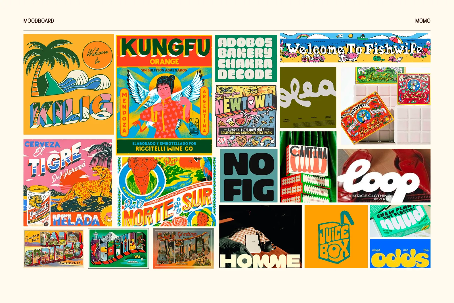
During our competitor analysis we found cannabis product packaging was either too medical and sterile, or too groovy and far out. The challenge for this branding project was to create something fun and nostalgic, while not pandering to cannabis cliches.
Process
We set out to design a unique and cohesive brand identity that would position Momo as the trusted leader in the cannabis product industry. To achieve this, we wanted to create a playful yet grounded brand identity that would represent the natural ethos of the brand and appeal to their cross generational consumer.
Solution
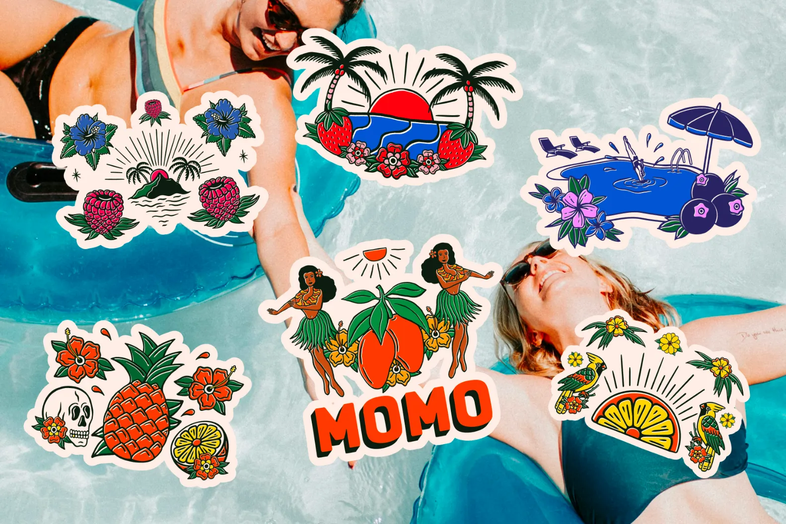
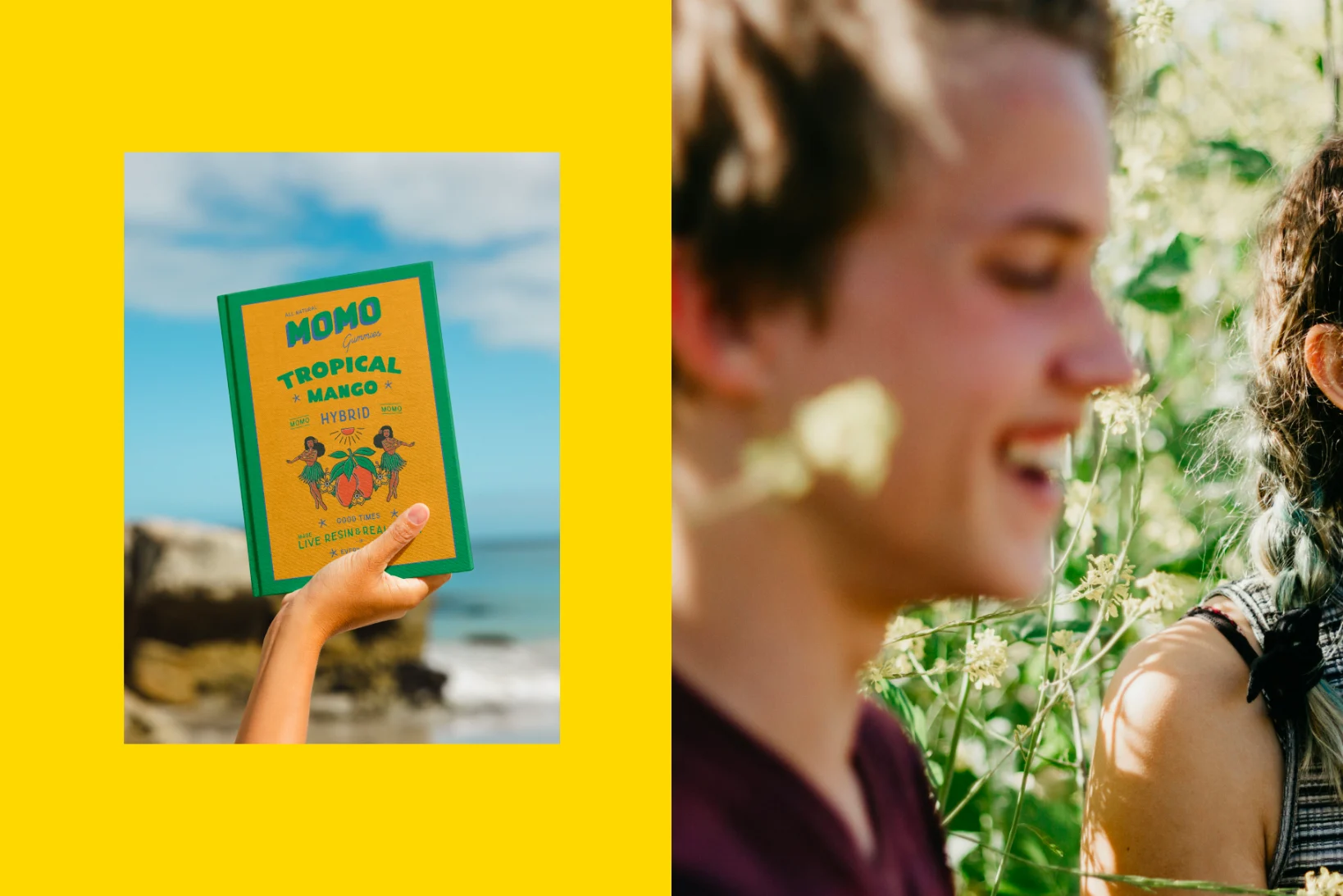
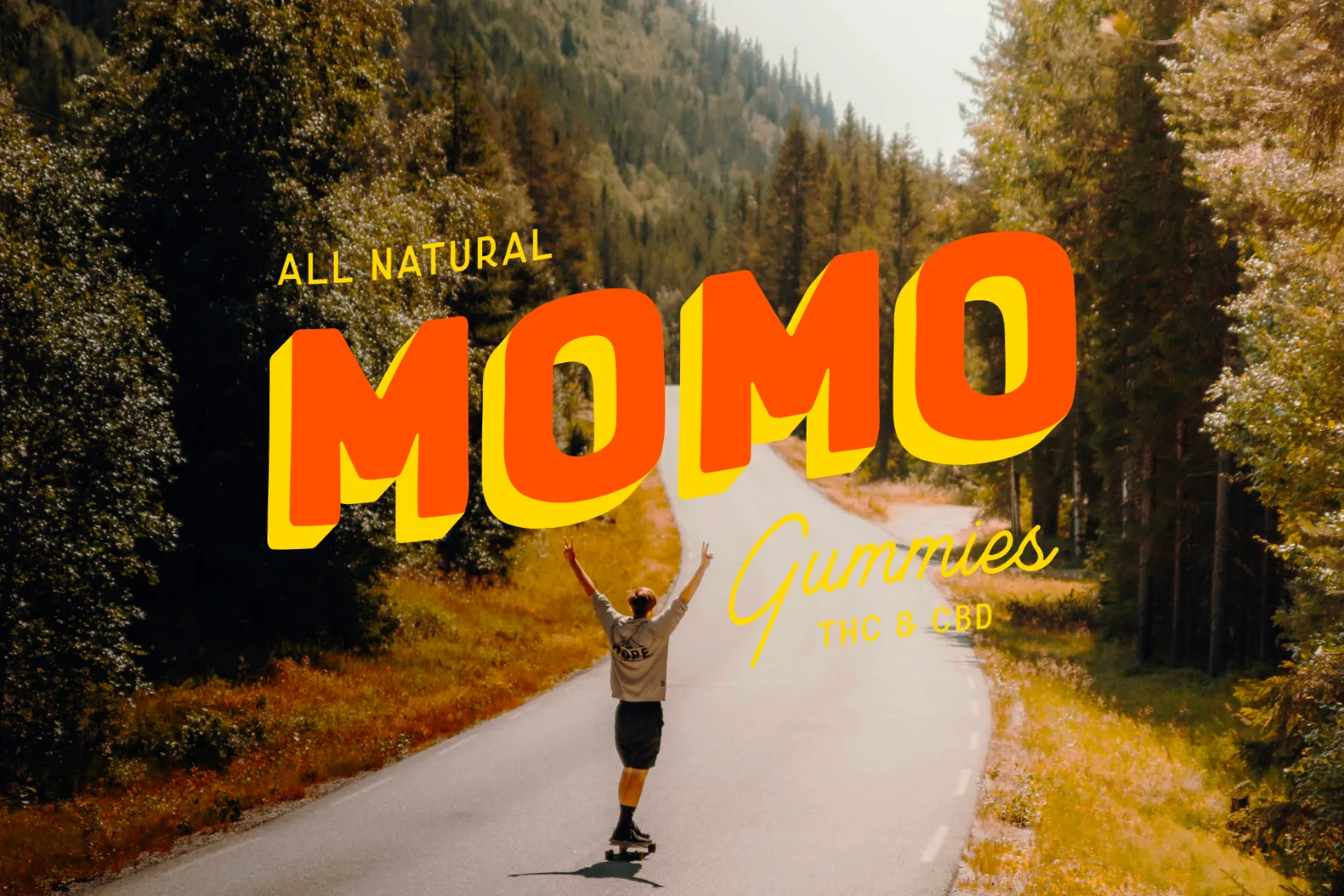
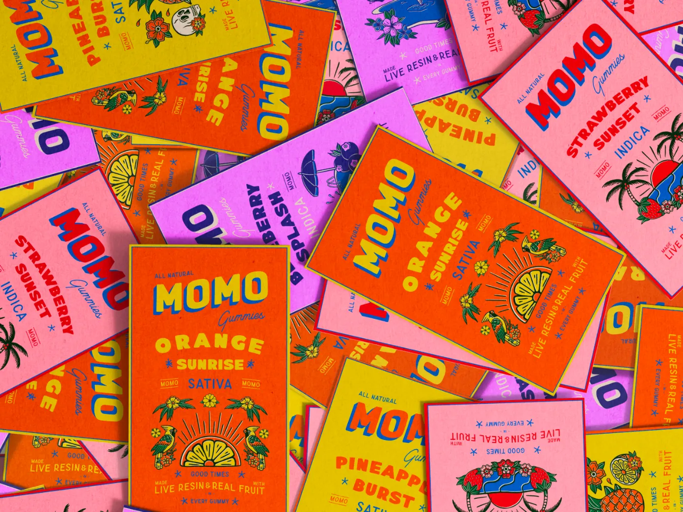
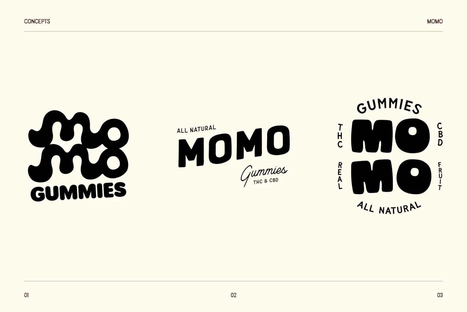
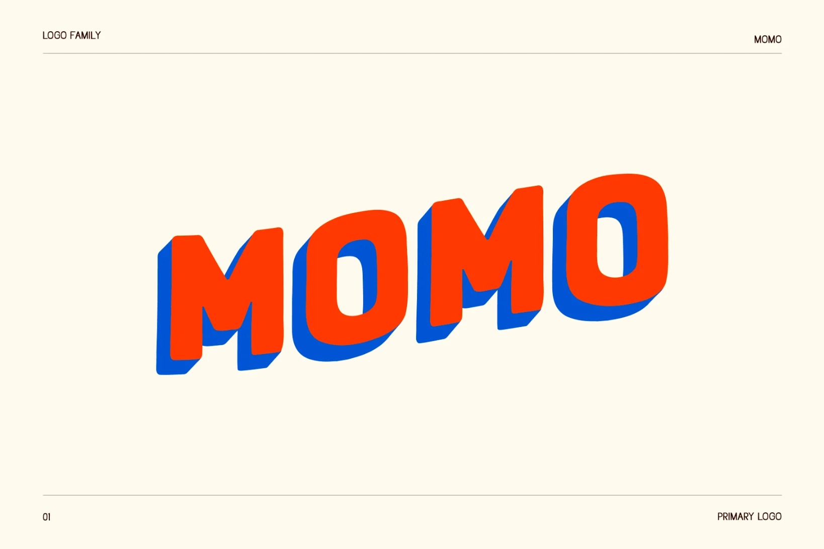
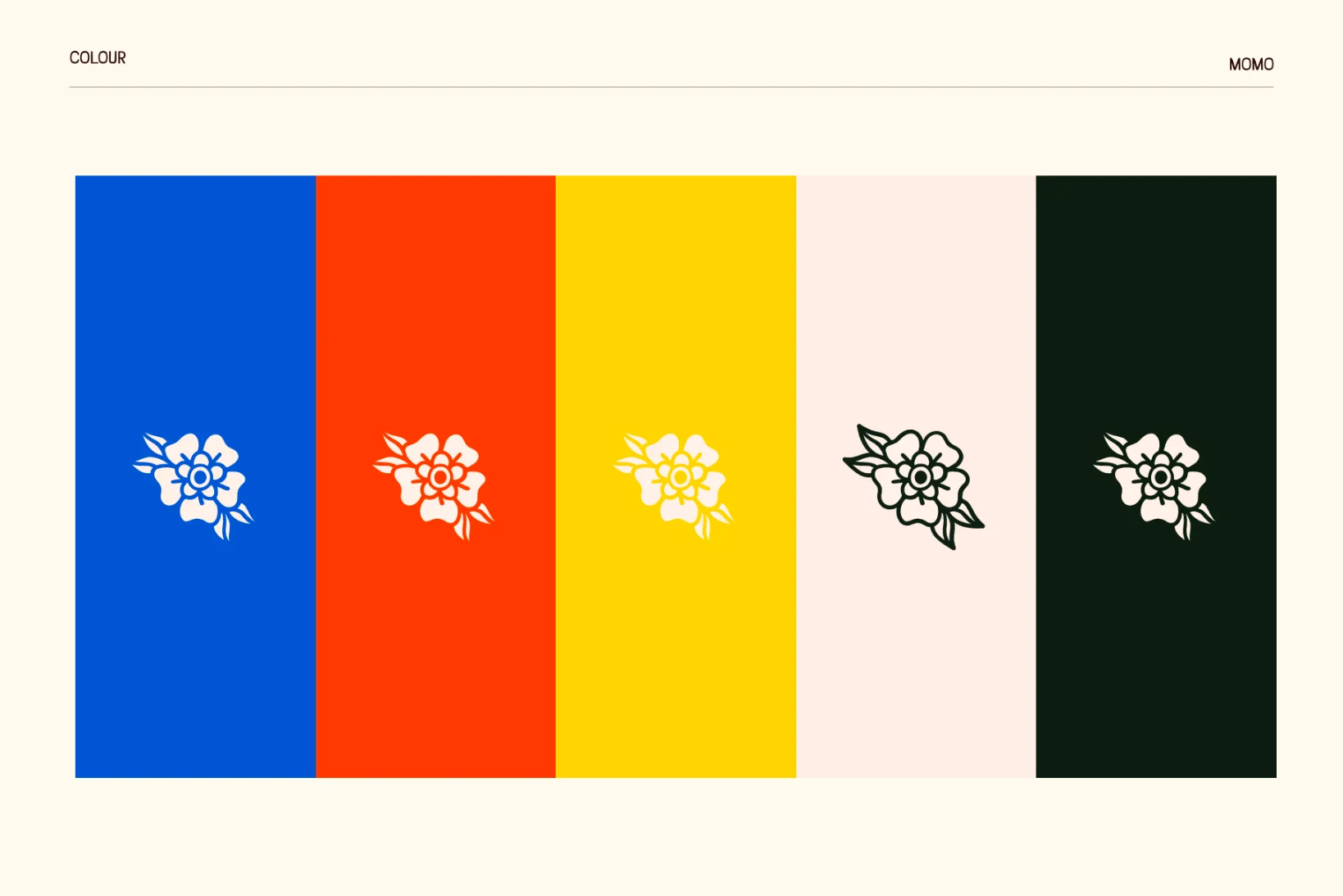
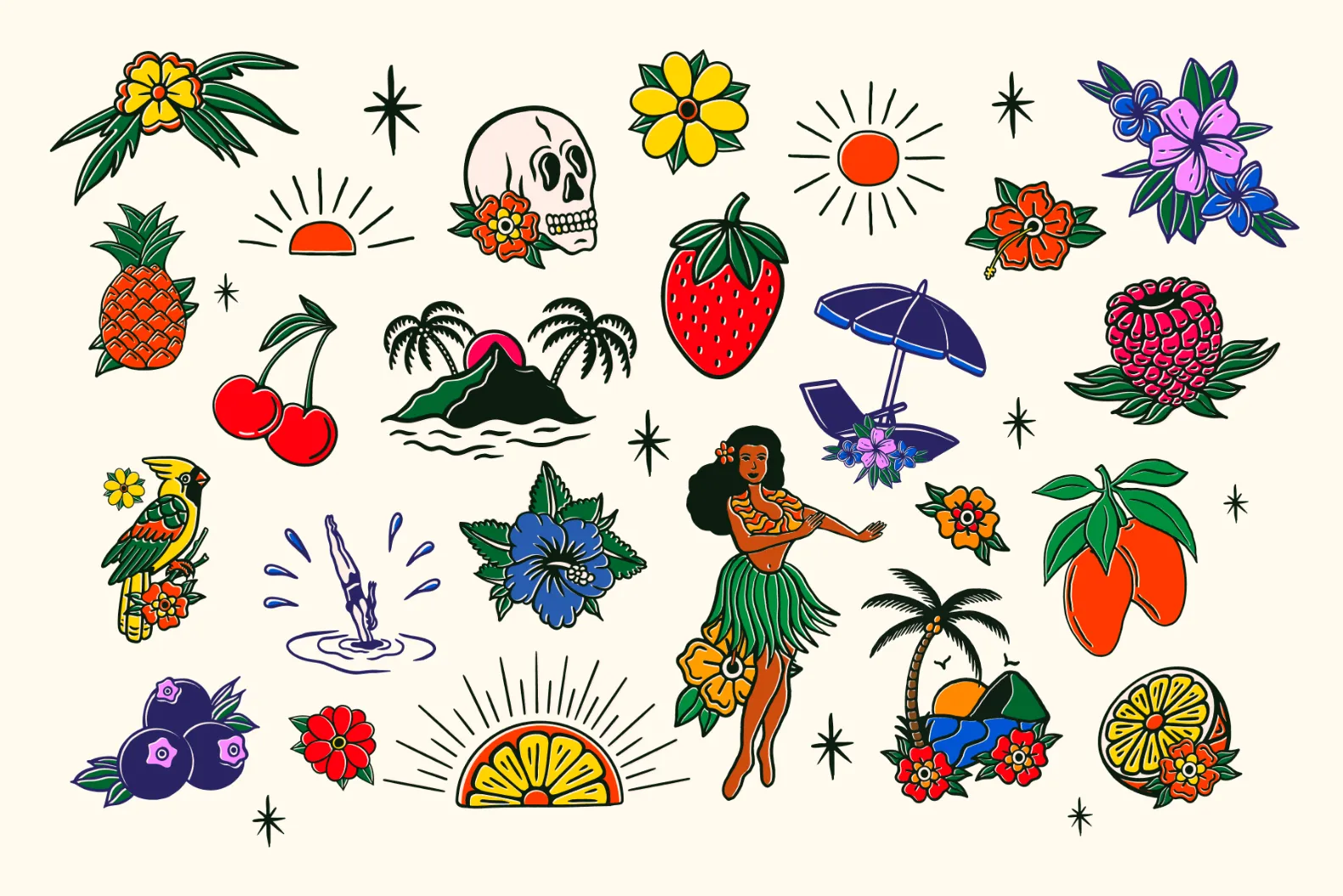
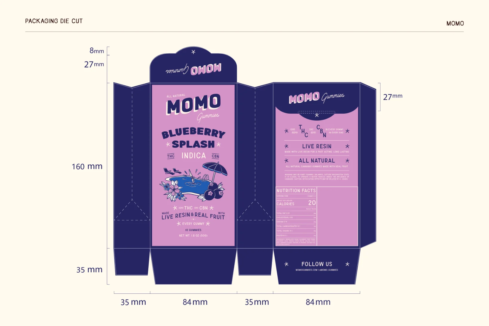
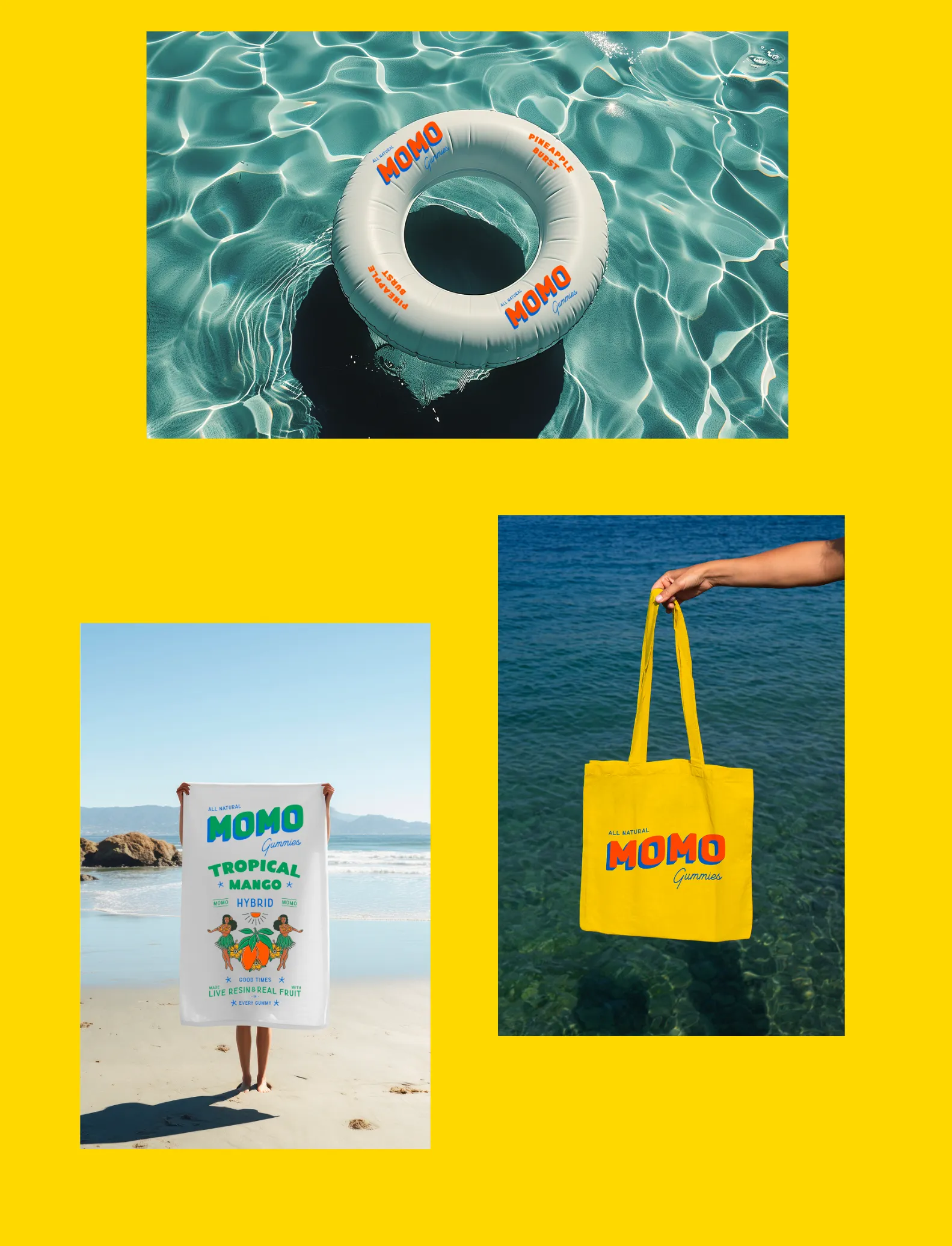
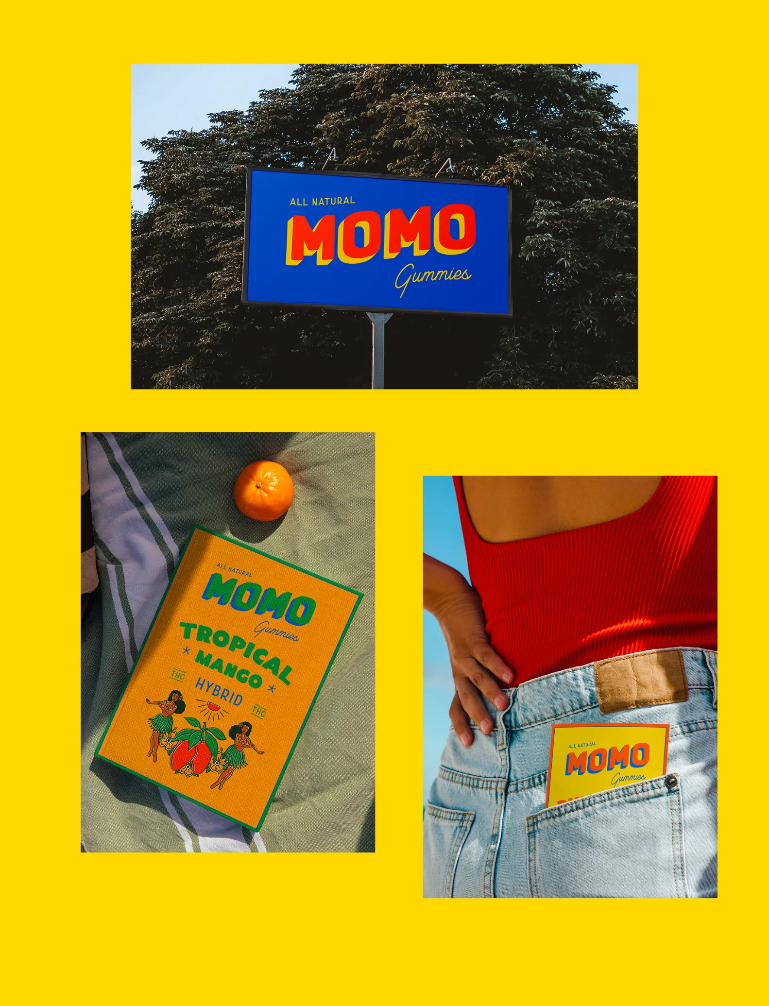
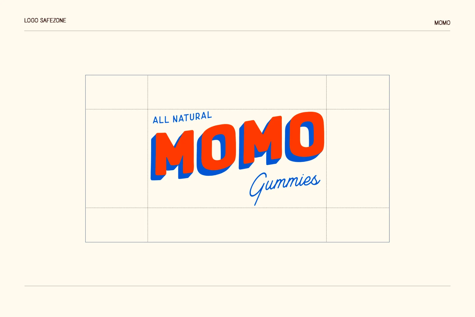
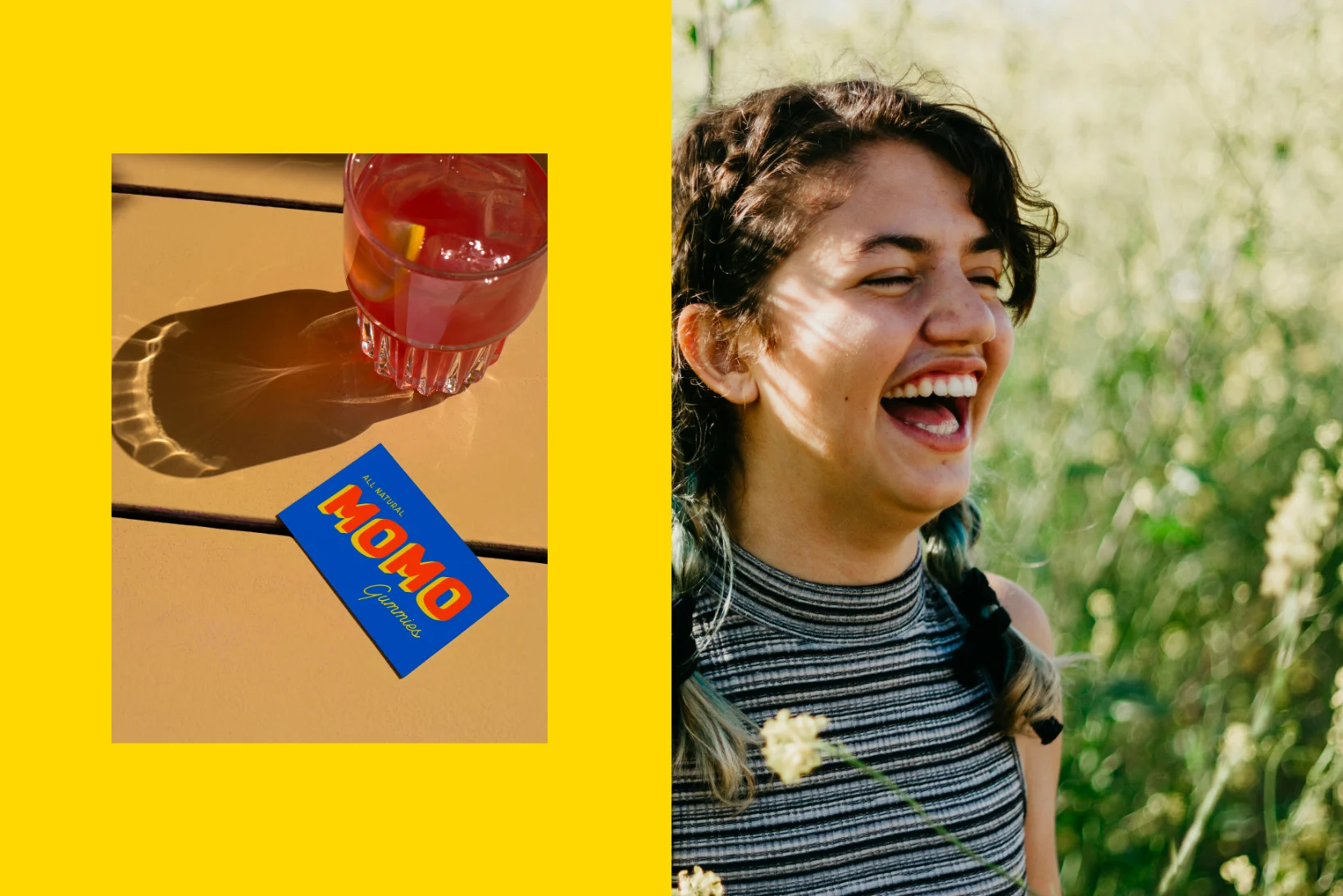
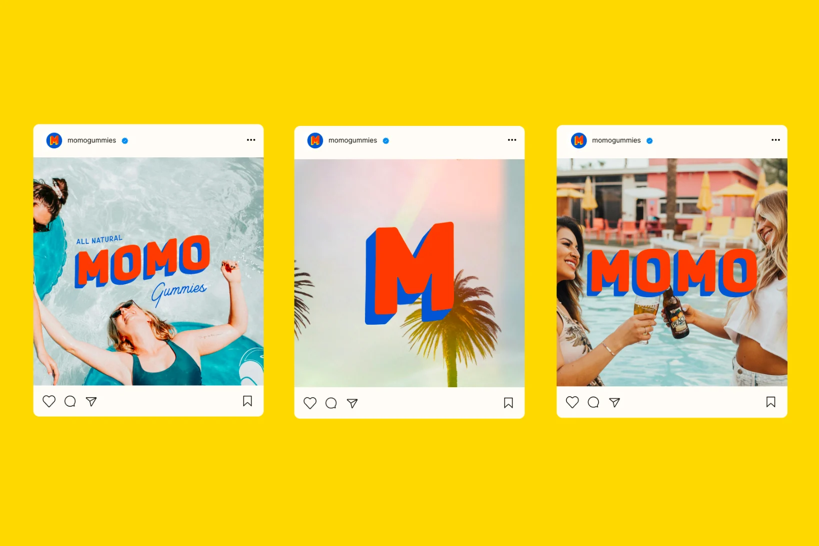
We created an identity that infused bold, vibrant colours with a playful logotype. A brand that oozed ‘Good Times in Every Gummy’. We created a cohesive packaging range that looks like a family, but with each flavour having it’s own individual identity. The brand was brought to life, with an extensive set of playful, old school tattoo inspired, holiday themed icons.
Results
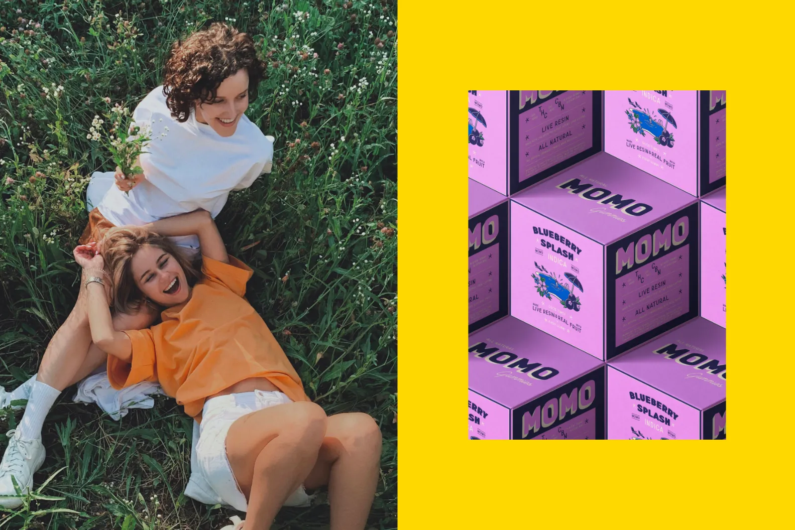
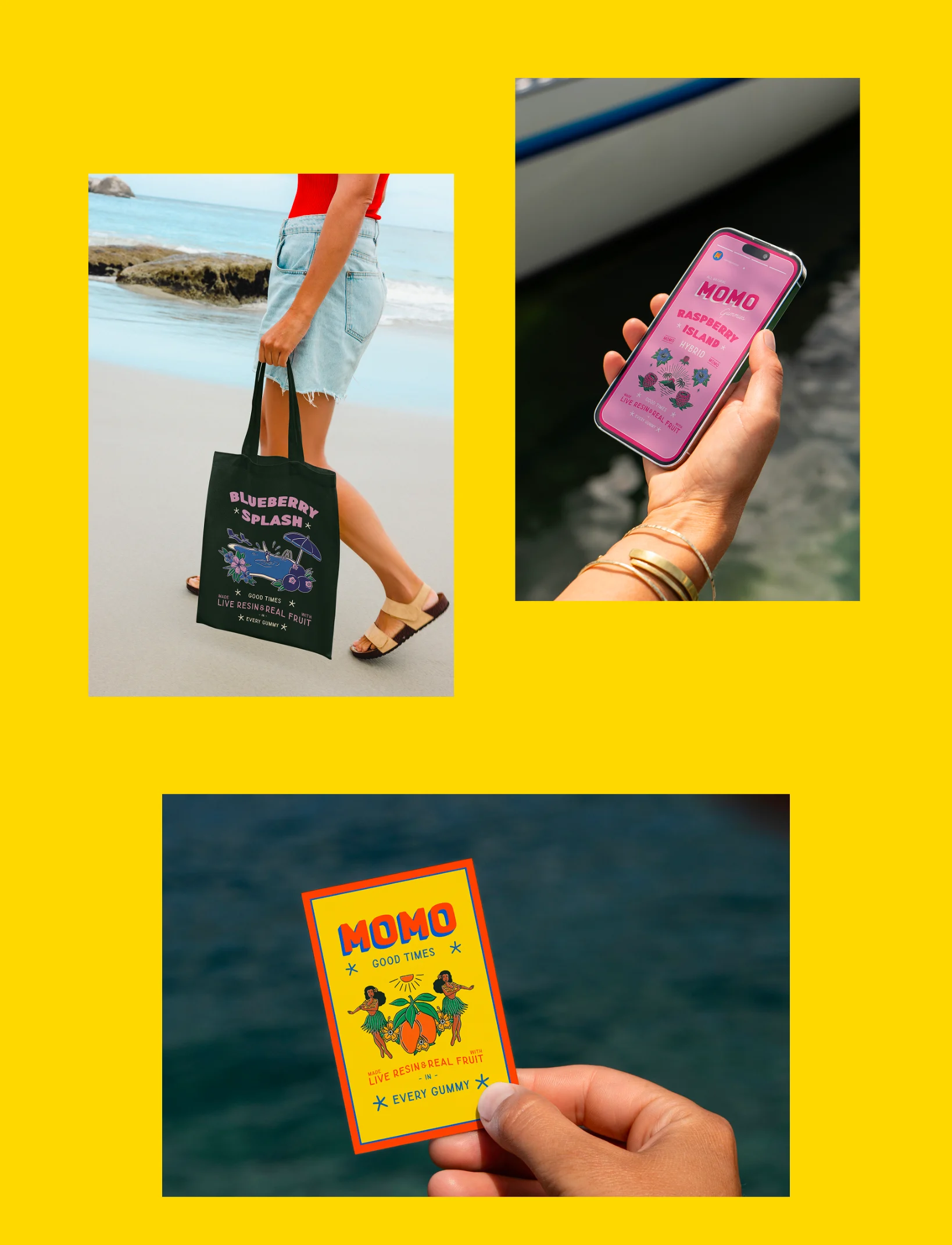
The result from our Momo brand identity design project was a nostalgic and natural brand that embodied the slogan we created, ‘Good Times in Every Gummy’.
Reccomended Projects


This Could Be Your Brand
Take your brand from DIY to dynasty in just 1 month with our Iconic Brand Blueprint.