

Paper Tiger Coffee Roasters



This could be your brand

Our Process
Paul walks through the project goals, challenges, solution and results for this brand.
Process
We kept what worked and rebuilt the rest. The wordmark and brandmark were redrawn and expanded into a complete logo family. A refined type system, defined colors, and new illustrations gave the brand room to grow.


The challenge
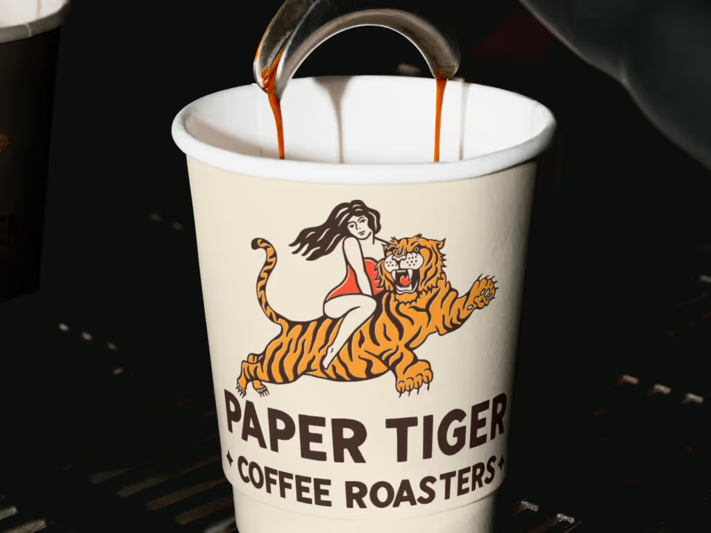
The old logo, inspired by vintage tattoos, had personality but lacked structure. There was no full identity system, no consistent packaging, and no clear color palette.

Solution
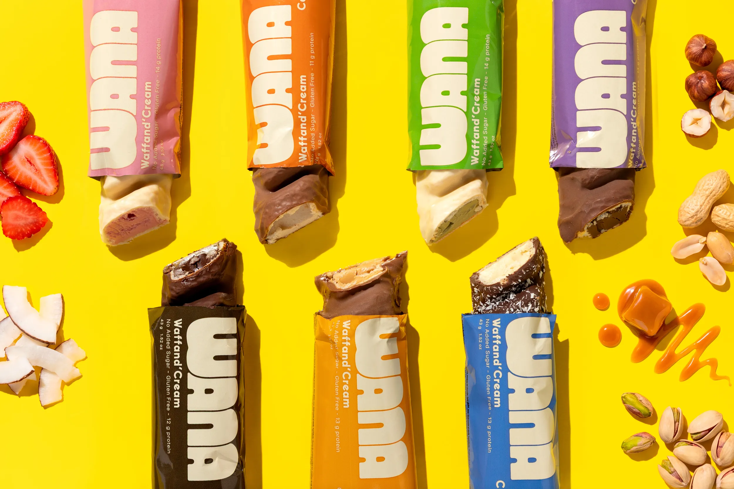
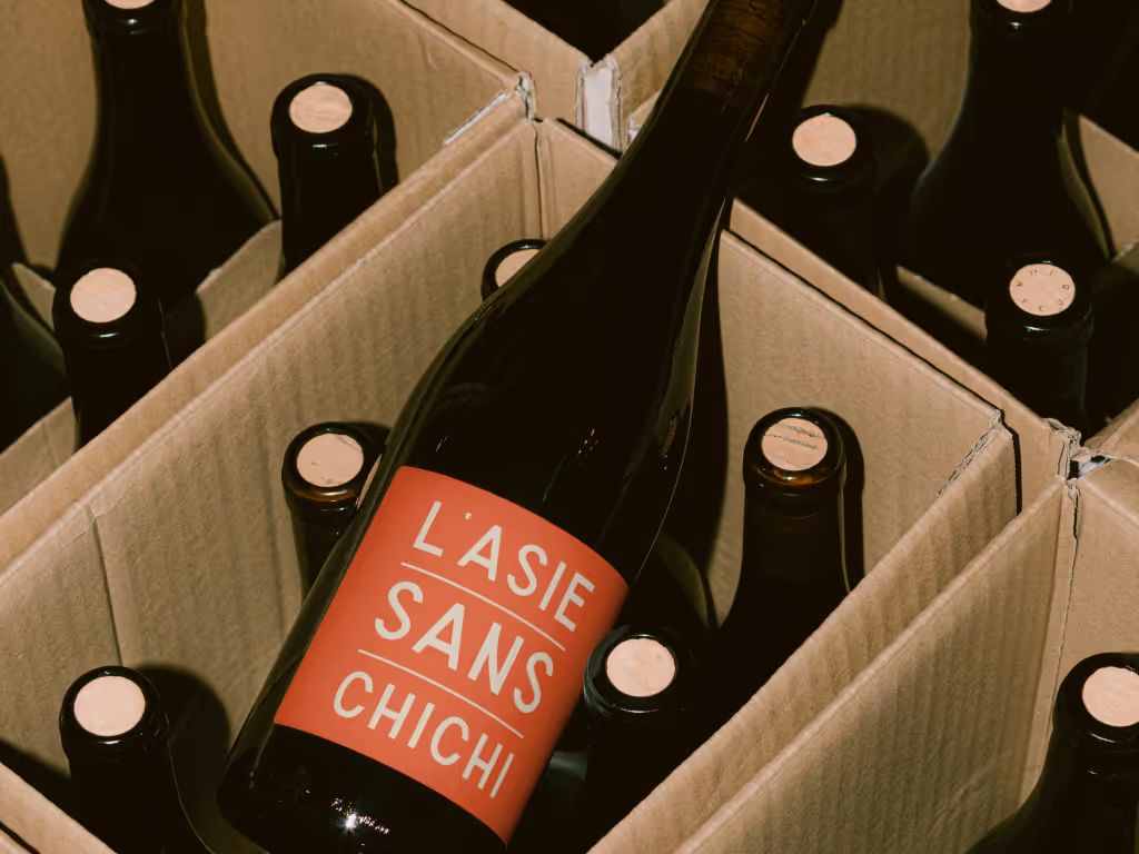
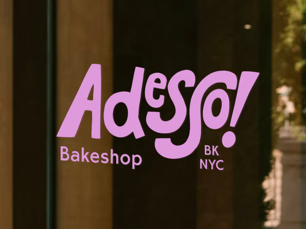
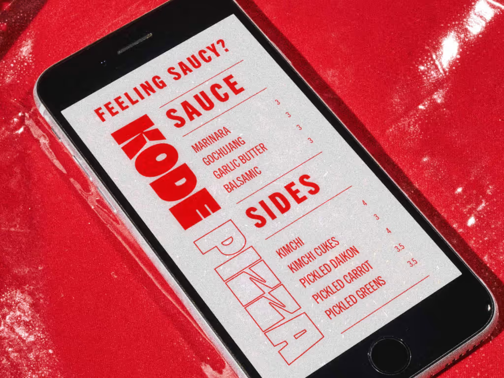
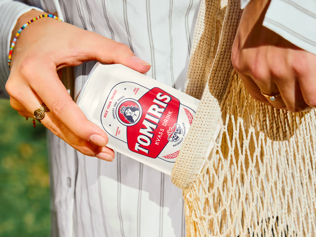
We created a vintage tattoo inspired brand identity system that worked cohesively across all brand applications including packaging, social media, signage and merch. The coffee packaging range featured a different hand drawn tattoo style icon to represent each roast.
Results
The result is a full packaging range that feels authentic, premium, and distinctly Paper Tiger, a brand identity that finally represents both the product and the owner behind it. When brand strategy and identity align, a strong product becomes a strong brand.